It’s a good year in (design-)books.
Although I always think, it’s getting harder and harder to surprise or intrigue me, I brought back at least as many kg of books as in the past years.
Outstanding finds and developments:
Most significantly Lars Müller Publishers delighted me with excellent new titels on international modernist graphics added to the great books they have already.
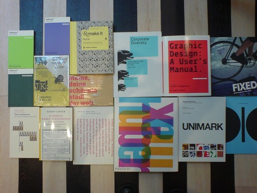
I bought them all: Unimark, Corporate Diversity. Advertising by Geigy, Celestino Piatti + dtv. The latter is a title from the new series labor visuell in cooperation with my former place of activity FH Düsseldorf. Smaller format, light, superb paper and binding, lovely to flip through. Also interesting is a second A5 series of readers on design—mainly texts by Buckminster Fuller—and great new titels on urbanism/architecture.
I am very much looking forward to a book about Maharam textile design and Jasper Morrison they announced for next spring.
Besides that Lars and his colleagues were in exceptional good mood. Since 1.10.09 they are independent again, after three years being owned by Birkhäuser.
Different next door at Birkhäuser. They were sold recently by Springer, but have no new owner at the moment. Insecure times thus, maybe the reason they didn’t thrill me with a titel after the gorgeous Frutiger last year. Strangely enough they hadn’t had that at the fair. Out of print?
I recall a splendid book about finishing in print—Extra. Best titles though were the ones from partner Princton Architectural Press, f.e. the small Lupton-dominated design brief paperbacks. Forgot to buy lettering and type.
Let’s complete the swiss round with Niggli and some good prospects. Hendrik Weber, designer of the brilliant Lirico, will publish his research on »Kursiv« there, probably ready in spring. très sûpér! (had a glance already). A comprehensive thick A4 round up about Type and Layout by two french is in the pipe, as kind of replacement for the Turtschi ones. And last and least they reprinted my Buchstaben. no comment.
now over to London:
HyphenPress, as mentioned before, is one of my favourite publisher and I own most of the books already. Today I filled an ancient gap with Fellow Readers, a small volume from 1994 by Kinross himself and another title from the backlist—Harry Carter’s View of Early Typography—as well as two new books, The Transformer about Otto Neurath and Isotype and a special edition of Typography Papers, Modern Typography in Britain.
HyphenBooks are well edited, well printed and designed in a quiet, carefull style mostly set in typefaces by Fred Smeijers. And so is this year’s catalogue.
I haven’t seen Fred’s latest and controversially discussed typeface Ludwig in print, but I must say, it does not look weird at all. Instead it leaves a totally natural impression in small text. I even would say it works beautiful (although I’m a bit disturbed by the spacing of »a«, but can’t tell excactly cause it’s digitally printed).
Compared to past years Thames & Hudson had nothing special on offer. Kind out of compassion with Neal Whittington, illustrator and proprietor of Present and Correct, I bought a quite nicely done book about sustainable design called remake it. home
Next door at Laurence King I took a look at the Sizes May Vary workbook again, but was still unimpressed by the empty pages. Instead I gave Graphic Design. A User’s Manual a try, mainly because I read Michael Beirut on the cover, only to discover later, that he just wrote the foreword. Naja. Due to heavy shopping spree I took along that useless hipster book too. My apologies for being so weak.
Phaidon convinced me by taking unlimited credit card payment in pounds (!) with 40% discount. Before discovering that, I grumped about them publishing mainly opulent cook books meanwhile. But then I found Max Huber, of whom, I have to admit, I never heard before. Quite inspiring modernist swiss graphic design international style type of book.
Reminded of my forthcoming trips I equipped myself with some wallpaper* travel guides—and await the invoice.
All in all almost too many books to read in a year.
What have I forgotten to mention in my incomplete and subjective overview?
I recommended the beautiful Atlas der abgelegenen Inseln (Atlas of Remote Islands) by Judith Schalansky repeatedly, but what might be of interest to some of you is, that there will be an english and french edition next year and a second german one to come soon.
I didn’t take a close look at the usual suspects Gestalten, Actar, Hermann Schmidt etc.
You go and buy their books anyway. And I will continue not knowing why.