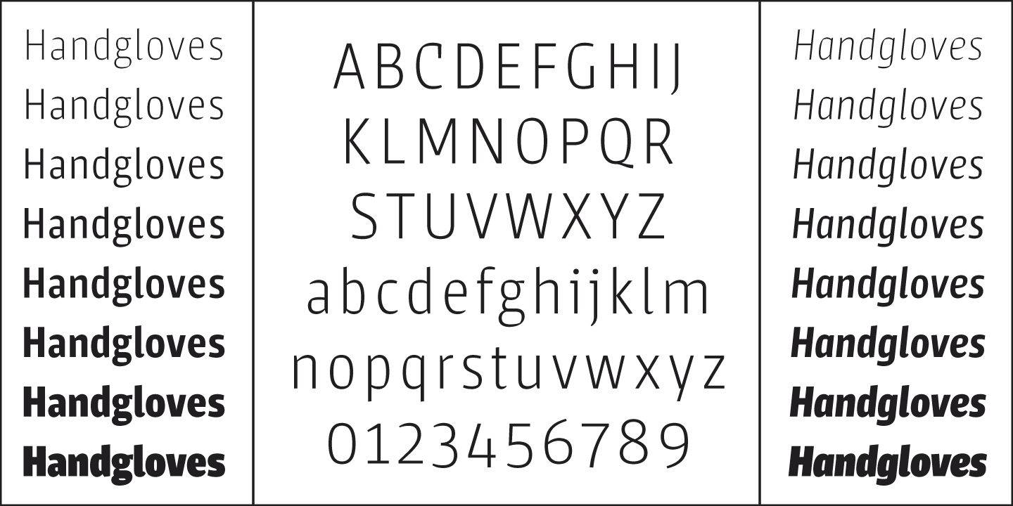
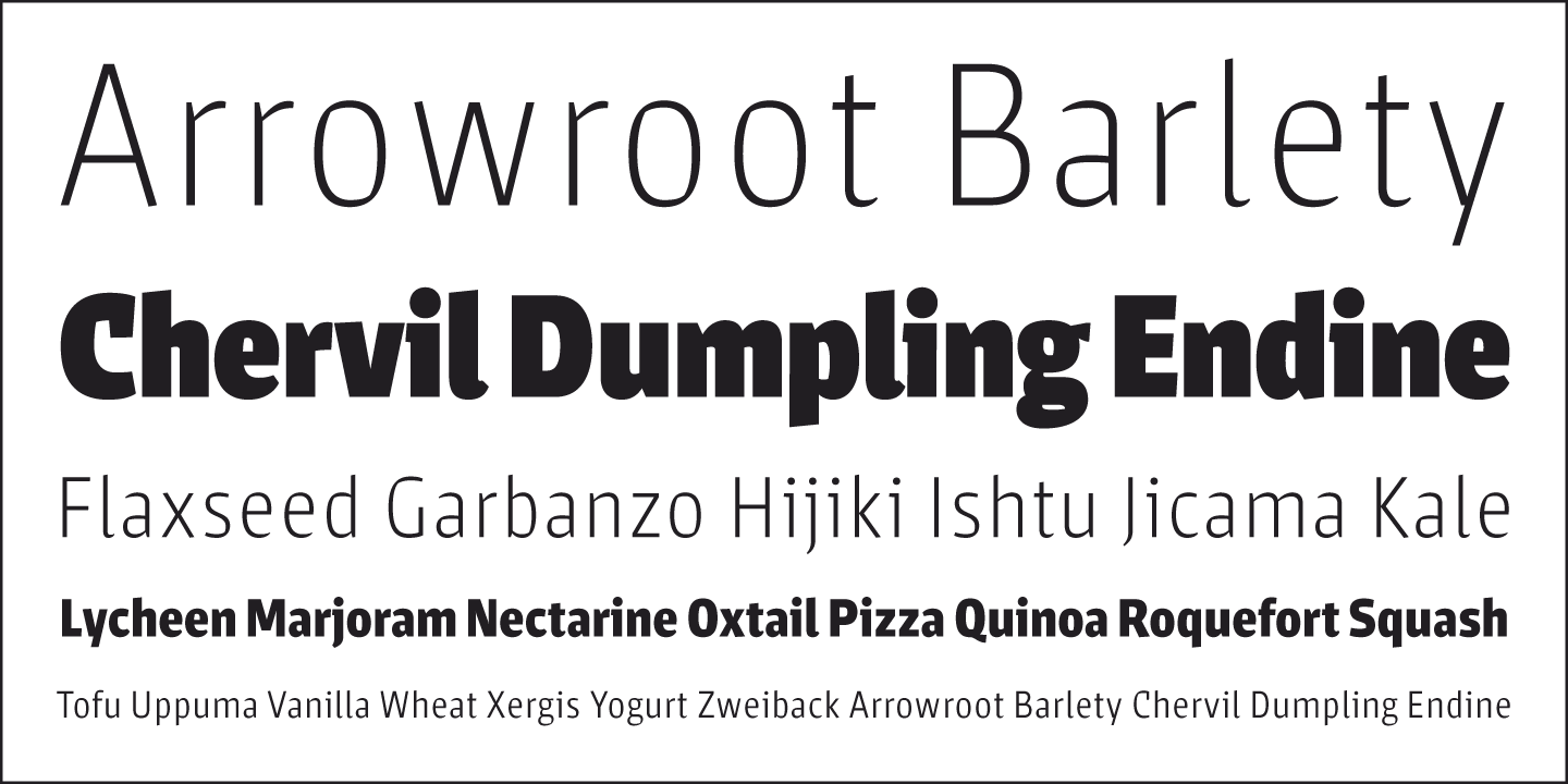
If I was to write about one typeface published in 2013, it would be Sarre by Sascha Timplan of Stereotypes. A bit random, and because I have a soft spot for these compact sans-serifs with angular notches, but an embarrassingly huge part because of its name and regional associations I have. And that although I’m a contributor and supporter of LTypI — mocking the choice of a typefaces for stuff of the same name. But Sarre fits Sarre so well.
All specimen images from MyFonts.
Sarre is the French name for a small region in the outer southern West of Germany at the border to France, spreading along the river Saar/Sarre and mostly made up of the state of Saarland. I work and live there, in Saarbrücken, and so does Sascha Timplan, in nearby Trier.
Given the fact that I know how naming typefaces often happens, it’s ridiculous how much of this region’s characteristics I believe to see in the design — vernacular, industrial, rough, simple but candid and open-minded like its people, quirky Germanness in a corner of inescapable internationality, expressed in edgy curves, others soft and gentle, and in a weight range that is so Sarre: delicate light-heartedness to super heavy punchiness. Coal and culture. Okay, I’ll stop.
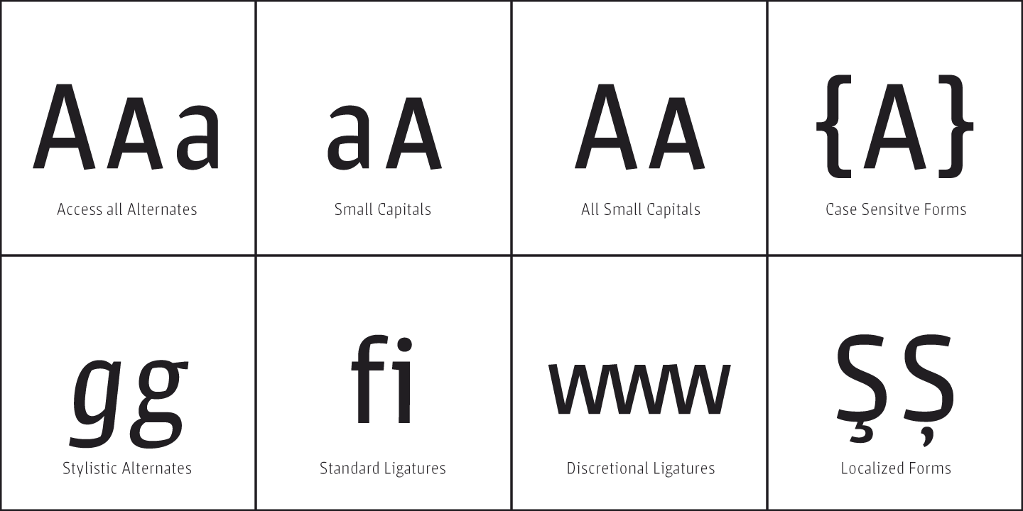
I have no idea if Sascha had any of this even remotely in mind or set out to design something for Sarre, instead of just naming his independently conceived typeface after it. We never talked about it, but he mentions the river in his detailed specimen PDF. Also, this is not really a review. I didn’t properly try out Sarre yet, although I downloaded the test version available on MyFonts here (all the way down at the bottom).
By singling out Saare from a plenty of excellent typefaces issued last year, I also want to recognize the continuously notable work coming from Sascha. He just graduated college last year but can already show an impressive array of typeface designs, some extensive and versatile, others just plain fun headline faces, combining ideas that are in the air with an unbiased, easygoing twist. Here’s to more from him in 2014.