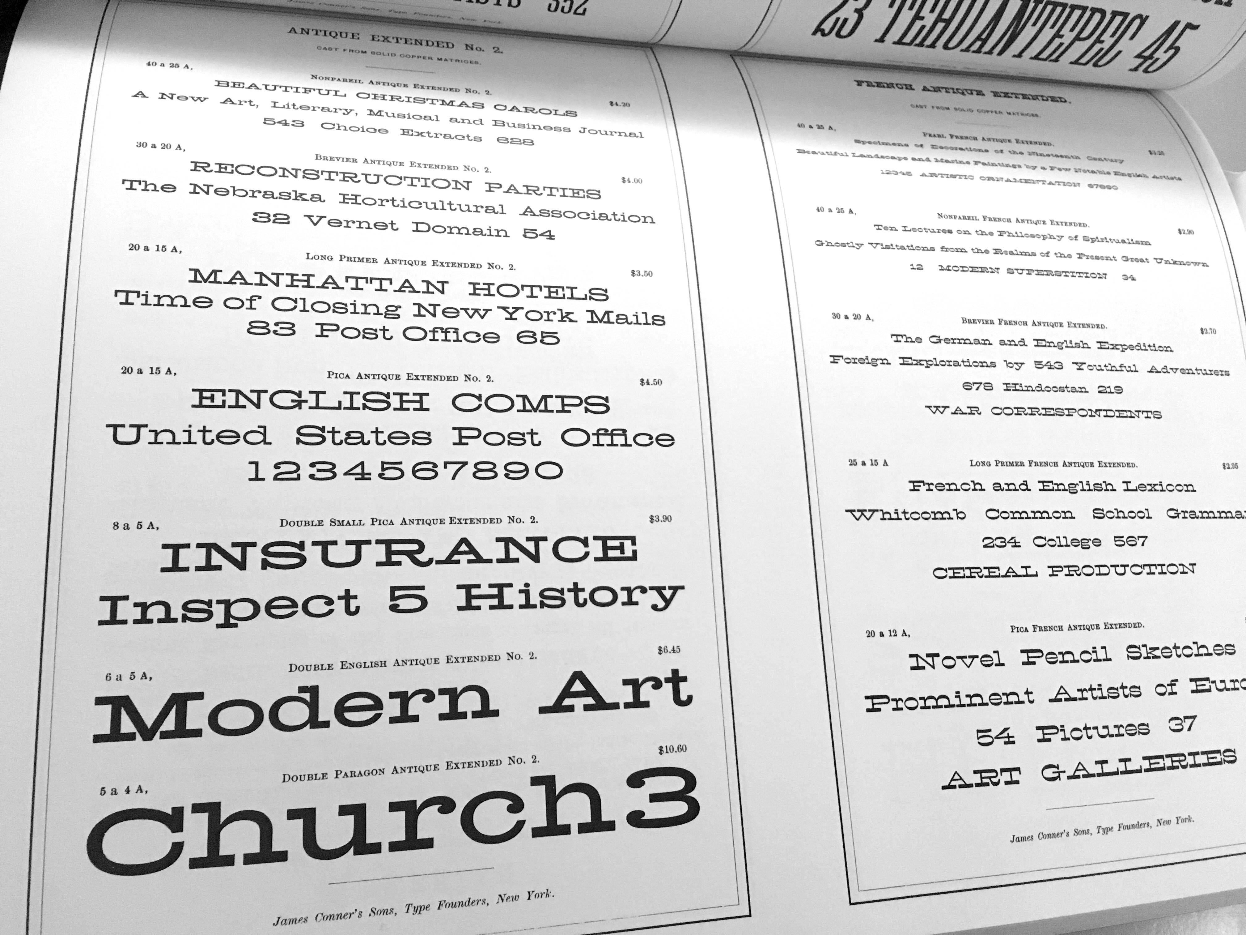
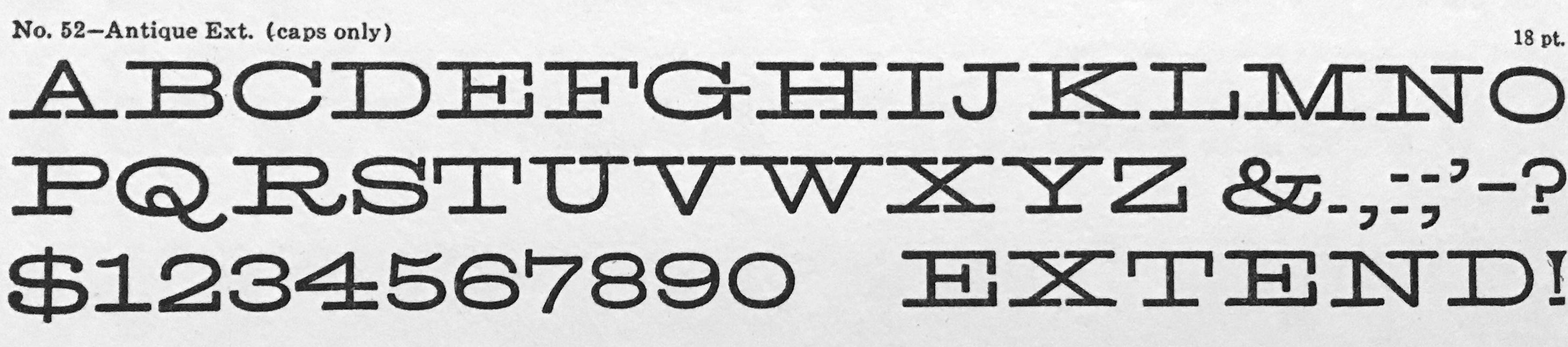
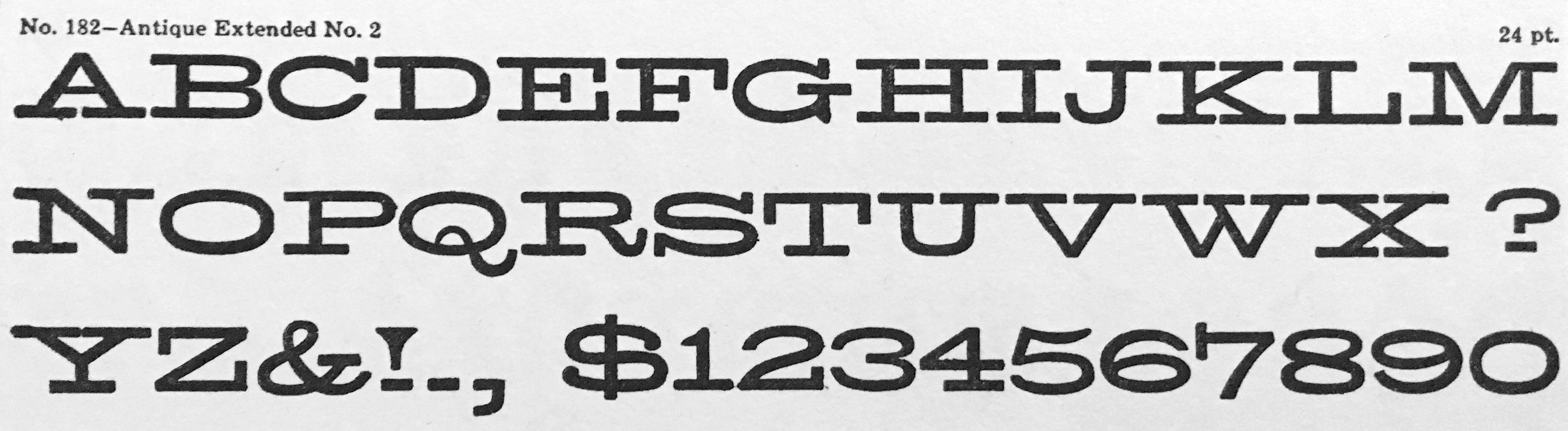
Antique Extended No. 2 from the James Conner’s Sons, NYC, 1888 specimen book
… I could describe it as a rational, unbracketed, wide slab-serif. US letterpress-people would call it an extended Antique (Antique as in slab with unbracketed, square serifs. Clarendon is the style with bracketed, thick serifs.) Germans call it an Egyptienne.
This face was widely available from a great number of type foundries and woodtype manufacturers throughout the 19th century and became popular again in the 1950s and ’60s, especially in the US.
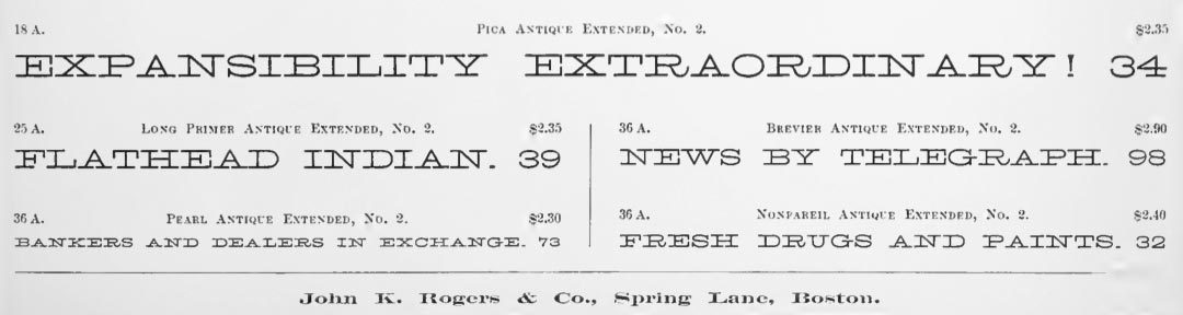
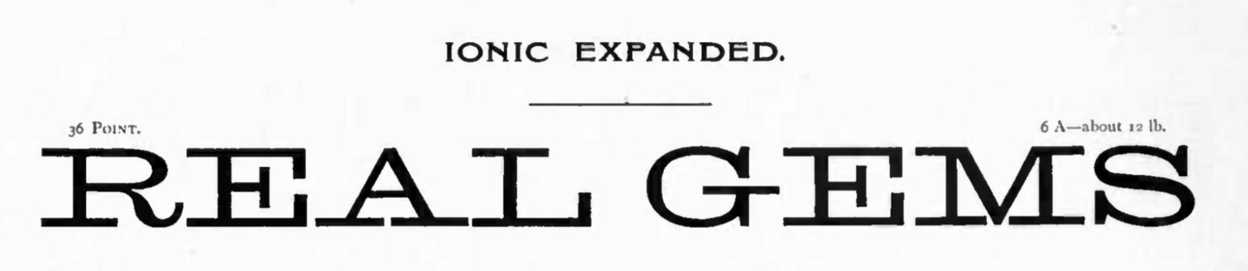
It seems to have started as a monolinear, all-caps design, maybe at the Boston Type Foundry (earliest example I have found so far, images above from the 1860 catalog), sometimes differing in weight and other details like terminal treatment (see below). Miller & Richard’s Ionic Expanded (further below) for instance has some more stroke contrast and a peculiar swelling in the tail of R .
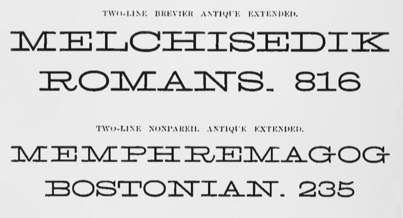
From Phillipp’s Old-Fashioned Type Book
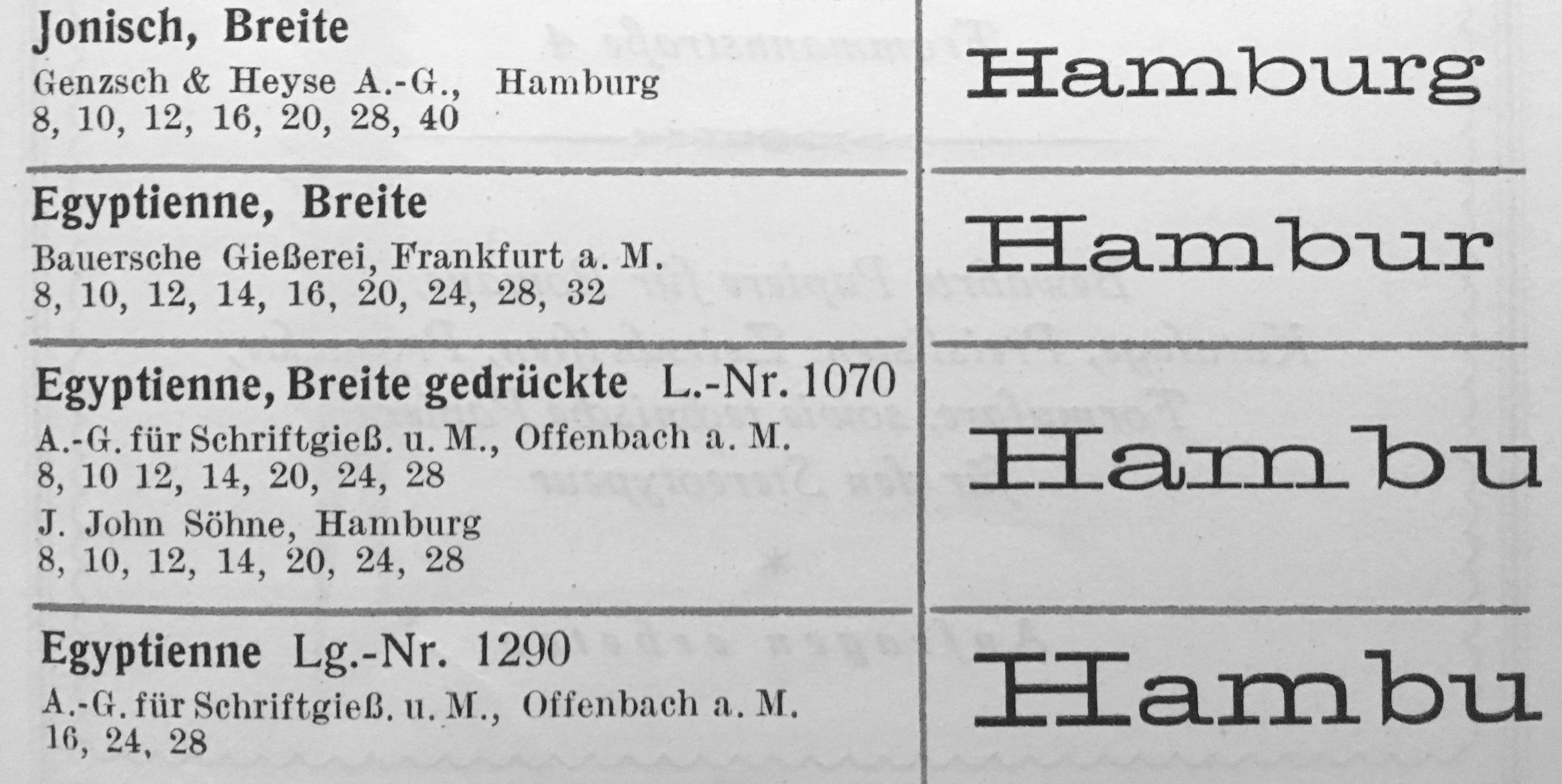
As for German type founders, it was available from Genzsch & Heyse under the name Breite Jonisch since at least before 1895 (date from Reichardt) as well as Flinsch and Bauer who later sold it in the US under the name Hellenic Wide. (The Egyptiennes from Bauer, AG für Schriftgießerei and John have – again – slightly different details though, at least judging from the 16–20 pt sizes shown in the Seemann specimen book, below.)
Antique Extended closely reminds me of BioRhyme Expanded, an open source font. I’m sure its creators used it as a reference