A couple of days ago I publicly “sighed” at a client of mine who doesn’t want me to use italic or bold in a book we are working on. The client is king, so I started to typeset the book solely using Meran light …
I was overwhelmed by the response and hilarious tips my friends started to throw at me in the following hours. Here is the best of:
Benjamin Dahl mit SmallCaps auszeichnen?
Niels Heidenreich Condensed?
Jesse Ragan Serif/sans superfamily!
Jan Yanone Gerner Sperren!
Frank Grießhammer … and use underlining to emphasize.
Nina Stössinger Wow :) How bout 2 fonts, like serif & sans? Or can you get by with no Auszeichnungen at all?
André Mora or +2 points, that always does the trick!
Niels Heidenreich Different colours? ;) Like in the Neverending Story!
Jesse Ragan Get crazy: +/- point size. Make the whole book look like one of those obnoxious tag clouds.
Erik Spiekermann here’s always colour, like taking a regular weight and making it 70% black, looks like light.
Indra That’s what I did for the headlines, emphasize with white space but index et al will be fun.
Nina Stössinger You have smallcaps right? And there’s always the condensed styles. Sounds like a fun challenge actually. I’m curious already :-)
Indra No small caps until now, and no condensed, but we’ll see. I’ll keep you posted :)
Nina Stössinger nothing wrong with buying some new fonts either. ;)
Stephen Coles 2 typefaces!
Niels Heidenreich Turn text upside down, or flip it horizontally. Use cyrillic or greek glyphs
Tiffany Wardle de Sousa That is strange. Strange! No italics or bold to use an emphasis in an entire book?
Jesse Ragan What about a typeface with a more subtle Italic, less disruptive?
Yves Peters What about a less conventional combo? Serif/sans?
Severin Wucher Try mixing Rotis Semi Serif with Rotis Sans—and your client _will_ love italics :)
Indra Oh you are awesome! Thanks for all the elaborate tips! (I especially love the upside-down-idea :)
Alas we settled on Meran already, no serif (not liked either) and I didn’t plan on using the condensed but we’ll see. Up to now I only did the cover and intro with distinction and emphasize by size, color (greyscale) and white space. Luckily it’s a photography book, so not that much text, but I’m already looking forward to the index and imprint.
Arjen van Voorst What about sticking to one-size-fits-all? Try with one typeface, no variations in size, shape or weight. Just play with whitespace…
Jesse Ragan Set the whole thing in all caps, using lowercase for emphasis.
Indra Jesse, you’re the man!
Florian Hardwig Size is underrated (as in inline size changes, vertically centered).
Arjen van Voorst If in CAPS use sub- or superscript for <em>
Jesse Ragan Good old-fashined Blackletter with letterspacing for emphasis. (Don’t encourage us, Indra, or we’ll keep going with this irrelevant thread…)
Or, stealing from Arjen, just use <em>unexpanded</em> HTML tags!
Arjen van Voorst <P> But please, <CAPS> only </P>
Yves Peters Jesse, your “all caps, using lowercase for emphasis” had me laughing out loud. I didn’t even bother to try to explain to my wife and kids what it was about. Groan, I am such a geek. :-/
Tiffany Wardle de Sousa Arjen, you forgot to close your tag. </CAPS>
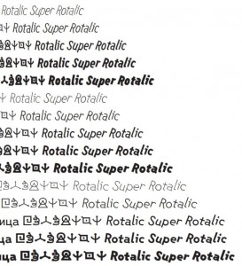
Frank Grießhammer Not mentioned so far: individual letter rotation.
Nick Sherman … also known as “rotalic”.
Florian Hardwig The Ever-useful Rotalic! Or the Rotalic Rückwärts
Rob Keller Did someone say Rotalic?
Frederik Berlaen you mean rotation? it took 7741 glyphs and a big fea file :)
Scott Kellum This is amazing.
Frank Grießhammer How did you manage to do that with the 6500-glyph-limit of @fontlaberrors? ;)
Frederik Berlaen ufo2fdk simple ;-) Done with a 53 line of sweet python (for the outline rotation and writing the features) from any exiting font.
Indra This is most hilarious irrelevant thread ever, I’ll encourage you as empathically as I can.
Arjen van Voorst Tiffany, I’m so very sorry about that. But I understand that our input is no longer nescessary. There is one suggestion I can’t keep to myself: Forget about spacing: All text in lowercase without spaces should do the trick…
Chris Lozos Was it e e cummings who is the client?
Simon Robertson no suggestions, just i feel your pain. i have clients/co-workers here who have similar feelings. some hate serifs, some love them. etc etc. All the best! and I’d love to see how to resolve it when it done, if that possible??
Dan Reynolds Well, your client is German, right? What about a fine Fraktur as a secondary typeface (Eric Gill recommeded that), or maybe just letterspacing the emphasized text? If it is good enough for the Bundesregierung …
Niels Heidenreich Fraktur would be pretty cool… but I guess they wouldn’t find it funny.
Indra My client is a photographer who has a very clear idea of how his book should look like and is actually quasi designing it himself. I’m trying my best within the restrictions of three columns, no serif, no italic, no bold, no fancy whatsoever. So I guess no Fraktur either. But he never said anything against ALLCAPSTEXT, so …
Chris Lozos Looks like he is an Emil Ruder fan. See his book “Typographie”.
Yay! Invigorated by such awesome tips gehe ich frisch ans Werk and will keep you posted on the progress.


Oh, by the way, this is it: http://fontsinuse.com/uses/1157/the-raw-and-the-cooked