A letter I once wrote to Paul Shaw regarding the history of Akzidenz-Grotesk by Berthold.
[…]
Günther Gerhard Lange was convinced that Akzidenz-Grotesk doesn’t have its origin at Berthold but goes back to Ferdinand Theinhardt’s foundry in Berlin. Theinhardt, said Lange, cut one of the first later AG-styles, Royal-Grotesk, in 1880. Those fonts came to Berthold via their acquisition of the Theinhardt foundry in 1908. Berthold combined them with other fonts acquired from other foundries and some of their own to form the Accidenz-Grotesk family (early spelling with double-c).
Thus, AG was not designed as a coherent type family but is a collection of fonts from different sources and foundries Berthold bought over the years. However, supposedly for marketing reasons, they were not so keen on displaying that fact everywhere. They rather stated the typeface being a “house cut” from 1898 in all their material, as also widely found in type publications. Both, Royal as well as Accidenz-Grotesk were sold under their respective names until 1926. Later Royal became AG mager (light), Steinschrift became AG schmal (narrow), Bücher-Grotesk from 1896 became AG schmal fett etc. (see GGL in tm 2, 2003). This “combining” of formerly solitary fonts and the idea of a type family, a series of stylistically connected fonts, may be regarded as Berthold’s biggest contribution to AG and future typeface releases.
According to Eckehard SchumacherGebler though, Theinhardt cannot be the creator of Royal nor AG. ESG researched in Friedrich Bauer’s Chronik der Schriftgießereien as well as in Theinhardt’s own Erinnerungsblätter (journal/diary) from 1899. The Chronik states that Theinhardt, born 1820, sold his foundry to the Mosig brothers and Oskar Mammen in 1885 and stopped working shortly after that. He died in 1906.
There is no Royal or AG to be found in Friedrich Bauer’s chronicle nor in Theinhardt’s specimen of 1905. Only in the edition of 1908/09 an Accidenz-Grotesk is shown. Berthold bought Theinhardt shortly before the specimen was published and obviously added typefaces from their program (this according to a note in Chronik der Schriftgießereien).
However, the Theinhardt specimen of 1905 (or 1895 as Wolfgang Homola states, they obviously worked on it for many years) does show a Breite Grotesque. Maybe a precursor of it all. There has also been a Schmale magere Grotesk, Enge fette Grotesk and Fette Grotesk by Theinhardt. Breite Grotesque looks similar to Halbfette Accidenz-Grotesk in a later specimen (as Andreas Seidel claims) but might stem from a different source altogether.
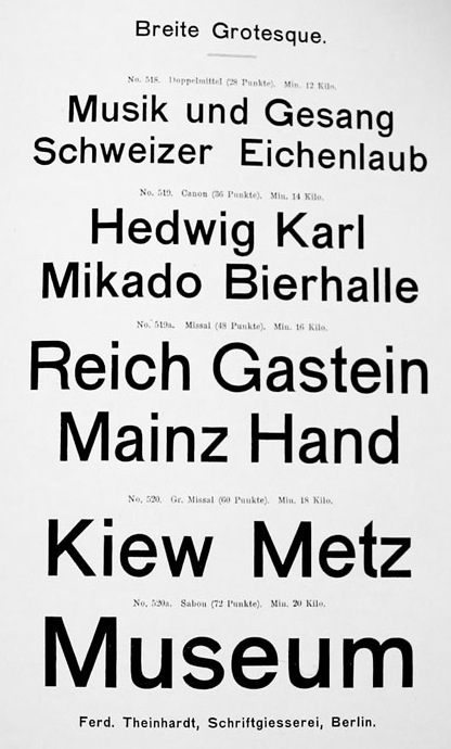
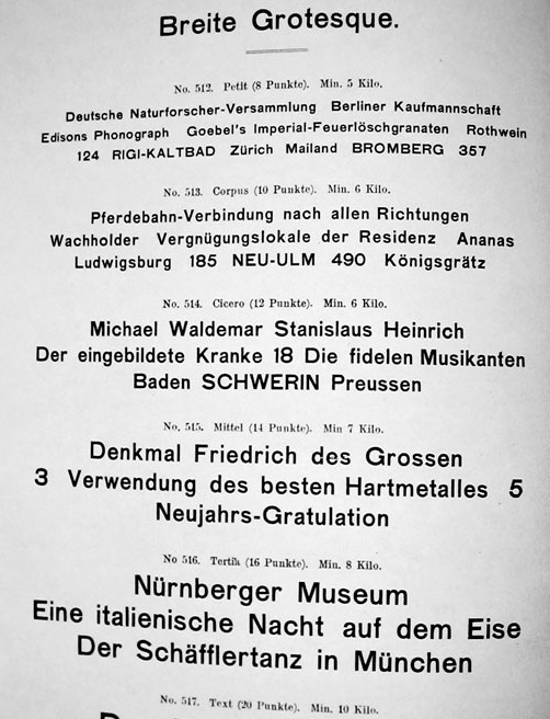
Images by Wolfgang Homola posted on Typophile, now on Luc Devroye’s site
Berthold published this ad below in the Deutscher Buchdrucker in 1899. Thus there must have been an Accidenz-Grotesk at Berthold long before the acquisition of Theinhardt’s foundry in 1908. For a while I suspected those fonts came from Bauer & Co in Stuttgart, which Berthold bought in 1897 (see Schwemer-Scheddin/Klein Types and Typographers), but I didn’t find any in their specimens, alas (apart from a shaded grotesk).

The Seemann Handbuch der Schriftarten from 1926 lists the following as from H. Berthold AG:
Akzidenz Grotesk, 1898
Royal Grotesk, 1902
Akzidenz Grotesk, breit, 1908
Akzidenz Grotesk, halbfett, 1909
Akzidenz Grotesk, fett, 1909
Akzidenz Grotesk, breit mager, 1911
Akzidenz Grotesk, eng, 1912
From the Berthold Chronik, 1921:

Image posted by Spiekermann on Typophile
Still quite muddy, the water, but I hope I could clear up some things a tiny bit.
Read also Part Two of Some notes on AG with things we found since 2012
I’m rather late in finding this thread. I recently bought an unnamed fount of light caps/figs/accents/points in corps 18, which came from a old printer in Sweden. Naturally, I need to put a name to it, and as it looks to me to be the light (Magere) Akzidenz-Grotesk from Berthold, I’d rather list it as the original Royal-Grotesk, which of course it is. I too note that Seemann records it as a Berthold production of 1902. I also see that Jolles lists a small specimen book ‚Royal und Akzidenz-Grotesk‘ which Berthold put out in 1904. All this predating the Theinhardt succession in January 1908. Does anyone know of the whereabouts of a copy of this small specimen booklet? There’s still some deeper research to do here?
Interesting! Feel free to email me a photo of the type, but I don’t doubt that you identified it correctly. There is indeed some more research to do. I can ask SchumacherGebler if he has a copy of the specimen booklet, though since I have a lot of this info overheard from him, he would have mentioned it perhaps. Incidentally I will be at the library of the Gutenberg museum this week where the specimen collection of Hans Reichardt is housed. I’ll keep an eye out.
Hi Indra, many thanks for your instant reply. I have tried to send you shots of the fount, through your email address I have found on your old LinkedIn page, but they have come back as wrongly addressed. Let me have your current details and I’ll resend them. Or let me know how I can post them on this page?
Ha, I have a LinkedIn page? I thought I deleted my account there 3 years ago, scary. My address is on the about page, indra @ kupferschrift
I have sent to that address but they bounce back? Strange. I have indra@kupferschrift.de is this correct?
How weird. Try kupfers @ gmail, will look into the Kupferschrift issue asap.
This is getting weirder. Tells me I have an incorrect address as Kupfers@gmail is this correct?
Indra, have you now received my 3 emails? They are in my sent box. ?
Hi. I came across this thread in my search to solve one of the greatest typographical mysteries of the twentieth century. What is the typeface used on the movie poster for Woody Allen’s 1977 film Annie Hall?
http://originalvintagemovieposters.com/wp-content/uploads/2013/02/Annie-Hall-LB.jpg
It resembles Akzidenz Grotesk, but thinner and a little compressed, which led me to the modern typeface Theinhardt, designed by François Rappo in 2010.
http://www.optimo.ch/typefaces_Theinhardt.html
Which leads me to Ferdinand Theinhardt’s Royal-Grotesk, of which samples are scarce. Here’s a photograph of a early Berthold specimen book.
https://www.flickr.com/photos/n1ke/6920980157/
and so I arrived on this thread, which may have solved the mystery among the seven typeface samples at the end, but are linked to a dead web site! (Don’t go to the old Global Type site, evil now lurks there.)
However, those missing samples are pulled from the Handbuch der Schriftarten from 1926. I couldn’t find that edition, but would a 1924 edition do?
http://www.klingspor-museum.de/HandbuchderSchriftarten/HandbuchderSchriftarten.pdf
At this point, I’m convinced the movie poster designer used Royal-Grotesk and photographically compressed them. This doesn’t seem an impossible claim to me, as the designer demonstrates professional photographic skill in the wonderfully textured photo of Keaton and Allen.
I’m a technologist by trade. I claim minor design cred as I supported print designers in the 1990s. I’m curious what your professional opinion is regarding my conclusion.
Thank you.
Ha, what a fantastic comment! Yes, maybe this is Standard (the name of AG in the US) Light photo-type. I’m not sure though, I only have a very scarce photo-type specimen only showing 8 glyphs (among those 4 caps). The tag line in lowercase looks very close to Helvetica, maybe a mix or also a version of AG. Linotype sold the typeface under the name Basic Commercial. Maybe we find some photo-type specimens of that. I’ll keep an eye out.
This is certainly a tricky face to pin down. It looks to me, very much akin to Standard, which had been re-weighted with slightly redesigned glyphs by several companies during the phototypesetting era. If you look at Headliners‘ (an American franchise active in the 70s) neo-Standard A Weight NA 240 SC (semi-condensed) it looks very similar except for the higher crossbar of A, and possibly the dropped Helvetica-styled centre strokes of M and W, which I can’t check in my limited available reference. The weight is pretty accurate, and the condensing is about right. On this evidence there is a strong starting point in Standard. And, it may well prove interesting to consult Photo-Lettering Inc’s ‚Alphabet Thesaurus‘ in the volumes that they completed throughout the 60s and 70s – thousands of typefaces were redrawn and made available in variant styles and weights. Film posters were nearly always set with condensed type in some form, due to the actors‘ and directors‘ importance and heirarchy against the remainder of the typography. Please get back to me if you’d like a scan of that Headliners‘ Standard.
There is a further point to mention. It seems that this poster was reproduced in different formats. The one referenced in your link, I think, is possibly using the original setting (format 27×41), as a second format (28×22) clearly photo-distorts the title and artists names to a wider dimension, leaving the tag line in its original state. The thinning of the horizontal strokes is a well-known aberration which occurs during photo (lateral) expansion. This fact confirms that the artwork needed to cover adaptations in media sizes most probably went through, either a distortion to the direct typesetting, or through a modi-graphic process to distort several in-position elements at the same time? Whichever, clearly proves that the letterforms were tampered with, making it somewhat difficult to identify precisely. See movie poster.com for the comparison of poster sizes.