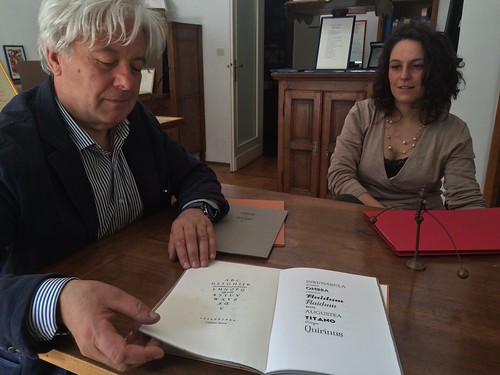
Early June, I spent a week in northern Italy visiting print shops and other interesting sites on a small type field trip around Kerning conference. It was also an exploration of all the different types of trains Tren Italia is deploying these days. I flew to Milan Linate (wise decision), took the bus to the main station (wonderful from the outside, nightmarish to navigate inside), and then a slooow, crowded and hot regional train to Torino. There I met with David Shields, who happend to be stationed in Florence for VCU summer school, and we took another train to Alpignano to visit Tallone Editore, Italy’s last printer/publisher solely working with foundry type and mostly hand-made paper, run by Enrico Tallone and his family. We got an introduction ot the company and their superb products from his lovely English speaking daughters (Enrico doesn’t speak English) before they showed us around the print shop where also some font-ID fun was waiting for me.

The highlight was Enrico showing us his rare woodtype specimen books. Jaw-dropping.
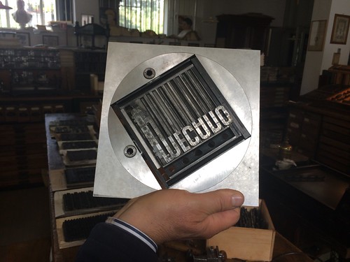
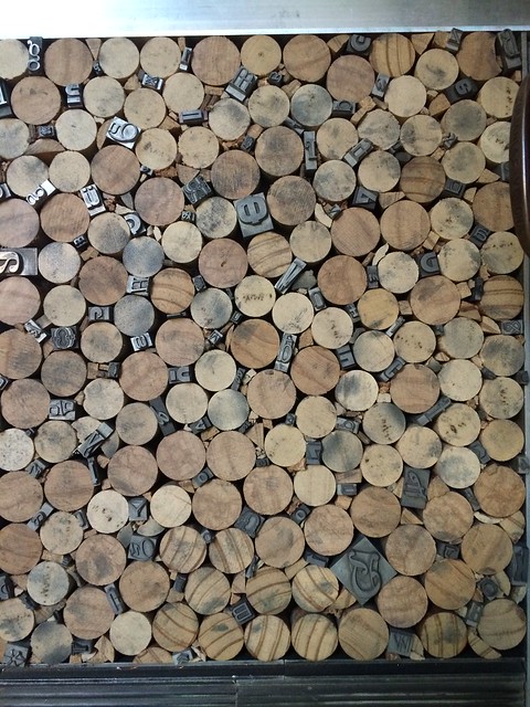
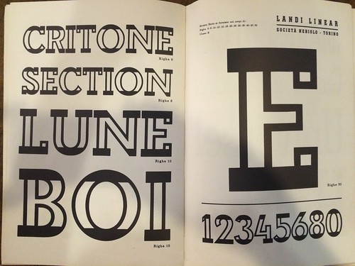
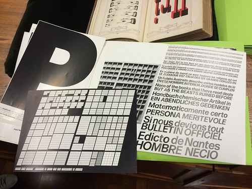
Next stop was Archivio Tipografico in the center of Turin, where we would meet Nick Sherman who couldn’t make it out to Alpignano. Archivio, named after the celebrated corporate magazine of Nebiolo, is a wonderful print shop cooperative, preserving old type, machines, and producing printed matter for diverse clients; also some type ephemera, like a small brochure about the work of Aldo Novarese. This page, for instance, is showing some of Novarese’s typefaces and the corresponding printing forme with sorts stuck between wine corks:
David had to go back to Florence but Nick and I stayed in Turin, checking out the pizza at piazza Giambattista Bodoni. Couldn’t get more topical.

After exploring more of Turin’s sights we took the train to Bologna, the pretty comfortable, superfast one this time. I even bought four tickets by accident, two for adults, two for kids, which we learned while chatting with a kind fellow passenger about fonts.
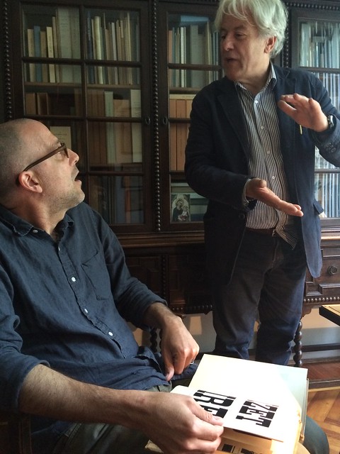
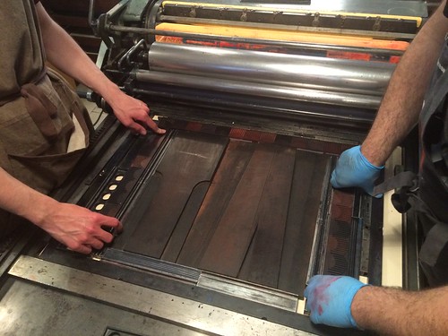
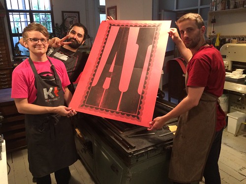
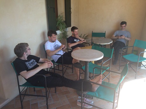
So good to be back in Bologna at our friend’s shop, Anonima Impressori! Team Baguette, Jean-Baptiste Levèe and Loïc Sander, joined us, too, reviving our visit from 2014 when we also went there on our way to Kerning conference. This time though, Nick determined we should print something, and why not with the largest type they had? These über-letters are cut in half or even quarters and assembled on the press and were larger than the largest press they had, so we had to print in two runs, first bottom, then top half.

After a lovely night out eating and drinking Bolognese delicacies, we drove to Faenza, a charming “normal” Italian town between Bologna and Rimini where the conference would take place. Most conference goers stayed at Hotel Vittoria (recommended), some of us visited the cemetery (very recommended), or just hung out in the nice courtyard at the hotel. The conference venue is a historic theatre/cinema, a fantastic setting with an adjecent cosy courtyard where we would hang out between talk and snack on more Italian delicacies, or peek into the small historic print shop that is also part of the ensemble. This year, I was invited to give a talk on choosing typefaces, alongside a great line-up with, among others, Laura Worthington, Tobias Frere-Jones, Bruno Maag, and Nicholas Felton. Many type friends come from quite far away to Faenza to enjoy the friendly layed-back atmosphere — and you should totally, too, next year!
Tradition has it that we would visit Tipoteca Italiana in Cornuda after Kerning, where we thus drove on Saturday morning. Since our last visit, Tipoteca greatly expanded and stepped up its game, although it was already the greatest and neatest and well-kept type museum I’ve ever been to (see my report from 2014 in the 365typo book). Opposite of the main building now opened a newly built house with lecture hall, seminar rooms, and a superb restaurant where we met Tipoteca maestro Sandro Berra, joined in by Team Geek, Nina Stössinger and Tobias Frere-Jones. Although we made it relatively singlemindedly through the vast exhibition to have more time at the library, we didn’t even get to the room with the woodtype storage in time before we were totally “fuso”. Obviously, not even two visits are enough.


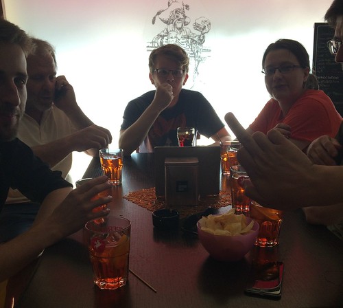
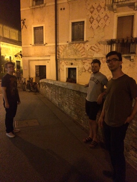
After-type drinks. The firsts of many aperol spritzes that day. We spent the evening in near-by Treviso, surprise-joined by Claudio Rocha, heading home after some ice-cream and 35+ salade de fruits. The band:
The Bolzonello Lawn Conference the following morning was more meta this time than last year’s edition, nevertheless a staple in our busy event schedule by now. Pre conf internetting:
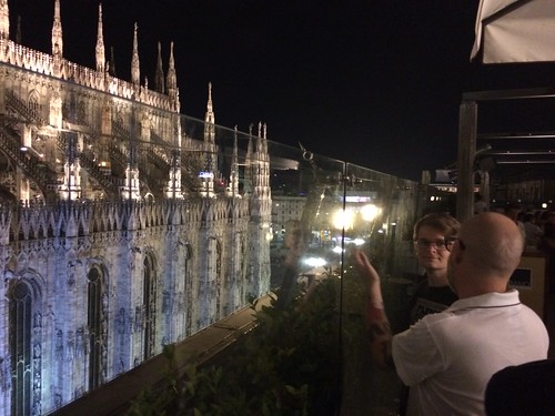
We hit the road towards Veneziaaa (Team Baguette) and Paduaaa (Team Malade) respectively, heavily packed with poster rolls and book bags. After hanging out for three sad hours at Padua train station due to overbooked trains, we had the privilege to experience yet another fine product of Tren Italia rocking us towards our final destination, Milano. There, we explored the modernist Milan subway signage system (sporting a typeface I mistakenly identified as Forma), and met The Dan Rhatigan & friends for food and drinks with a view. And after another last day exporing type, lettering, architecture and Italian delicacies, I flew home, exhausted but endlessly inspired and ready to learn ever more about Italian type over the summer. To be continued.
Most fascinating read !!!