Students and font licenses

Below, a comment from a Typedrawers discussion from last year that sparked my list of educational discounts for fonts. Recently, a friend who will take a new teaching position in the fall, asked my advice about classroom licenses and purchasing font collections, so perhaps this note is of help to more people here, too. 


I teach undergraduate and graduate students and I am very sure all of them but maybe the very beginners have/horde collections of (free) fonts I don’t want to know how and where they got them from. But I am totally to blame for that, too, at least in parts. Because I want them to practise choosing (the right) typefaces as much as possible, and to look beyond the tellerrand of fonts that come with the OS or Adobe applications. (These are actually almost banned by me). We have quite a big collection of classic typefaces (Font Folio and URW) and some hand full of newer typefaces, but I also want them to learn how to research what type foundries and offerings are out there, what fonts cost, how they can find the right typeface for their design (not one for the whole group), and also how to test these typefaces and make mockups without having the font files. Some developed really impressive skills in photoshopping MyFonts gifs and hacking FontShops rendering engine for their copy.

I like your idea [Silas Dilworth’s in the orginal message] of assigning a collection of fonts, and especially the class-room-multi-user idea (if I understood it correctly). But at the end of the day it all boils down to art schools without tuition fee, like in Germany, don’t have the funds to buy font licenses on a regular basis. The problem is not so much to get a license for 1–5 computers but to estimate and oversee bulk licenses, and come up with the budget for it. The students are usually using their own laptops in school. We for instance don’t have any school workstations or computer pools anymore where I would install the fonts. How many seats do I have to get with a changing number of students between 4 and 30? Are the foundries OK with the students installing them on their private computes, not the school machines? We don’t have a bookstore and our school is very small. Nobody wants to do the extra admin work, even I am not keen on that although I would do everything I possibly can to mediate in this matter.

Of course, students buy paper, computers, pencils and books for school, too, but only rarely are they willing to pay for font licenses for school assignments (some older students are starting to, though, my graduands did for their own final projects for instance). They want to try out the fonts before they buy, and I can understand that. It is only reasonably experienced designers who can judge a typeface by its specimen and imaging how it will behave in their real life environment, in their given language, before buying the cat in the bag. Stephen started this thread of foundry discounts on here, that is very helpful and I passed this on to the students. But honestly – they are not really helped with 10% off, they’d need at least 50% off to convince them. And then you have the problem again of what happens when they graduate. Are they to keep the license forever they paid at a student rate? Webfonts with trial licenses are at an advantage here, and I guess that all font-serving technologies could implement a testing-deal for matriculated students quite easily. Less so the small independent foundries I especially want the students to get to know of.

The best I seem to can do at the moment is emphasize and repeat every single day that it may be OK to show me this design idea with this font in class, but whenever they do something for the outside world or get paid for a design, they absolutely have to have their own license for the fonts they use. And I tell them how I obtained my collection of typefaces: by whenever I was asked to do something for a friend, family member or NGO for free (which was plenty), I said I would agree to go without payment but they have to pay for the font license. That always worked (and now I have quite a collection of script fonts :/ ).
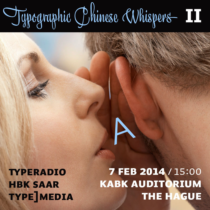
Typographic Chinese Whispers

Our HBKsaar project together with Typeradio and the t]m class of 2014 at KABK The Hague. Presentation next week Friday, February 7, 15:00. Hallo bitte kommen!

“Flyer” by Donald Beekman


End of Saarbatical

I think I had never been as stressed out as last July (or maybe in the HBK-FHD-Helvetica summer of 2007). Apologies to everyone who saw me at Typecon Milwaukee. Summer semester of 2012 felt like triple workload juggling several guests teachers, extra projects, and admin work, next to my own stuff and engagements I thought I could do on the side. Last week of July, the week before semester break, I spontaneously filed the solicitation for a sabbatical in winter term. I got the note that it went through when I was already out of the country, right off from school, to speak at this wonderful conference in the US.

What did I plan to do (and what did I actually end up doing)? I proposed two big projects: 1. to write a book about choosing typefaces, and 2. to start a universal database of analog and digital fonts. Don’t laugh.

Well, I got half way through the book, determined content and structure, started to compile illustrations, made specimens, wrote text – in English, which didn’t make it particularily light handed for me, especially with increasing slackness and doubts. Skiving off writing I even already designed the whole thing, including cover which is what I usually tend to do last. It’s not my first attempt to write this book but the forth and at times I thought I should really give it up for good now. Usually after some resting time, I gather new hope, set up a new plan, with new ideas, and a new structure until I get down again by a new other book release or distraction. Just like in January. Some weeks ago I had a good long talk with Dan Reynolds about the concept after which I changed a lot again, kicked out the specimen part and other redundant things. I will finish it one day. And be it only for myself.

The type database is an independent project I conceived with Nick Sherman. We had some really good busy few weeks at the beginning of my months off, felt almost ready to announce a first version we set up with the help of developers Chris Lewis and Lars Schwarz. It doesn’t work as well as we envision it yet, and it’s clear there is so much more work ahead of us, adding data and images but more importantly fine tuning the whole system, structure, back-end, editing process … at some point all the non-sabbaticalists on the team got more pressing things on their table and we stopped working on it. I continued to put data in a spreadsheet offline and tinkered with the design a bit, but still nothing to show you. We will “finish” it one day. And be it only for ourselves.

The idea was also to travel much less, which I did. But, boy it made me lazy. Once I put down my backpack, it’s obviously much harder to get up again than just staying in the flow with your bag packed, ready for whatnot detour. Similarly with work. I didn’t really get so much more done than during semesters in school, where I was often thinking, »das macht den Braten jetzt auch nicht mehr fett«. Okay, probably less stressed out, but most of the extra time I spent procrastinating and querying the things I had done.

But my months out of school weren’t completely for the birds even if I didn’t achieve everything I had hoped for my proposed projects. I at least finished a new edition of Tipp Tipps, a small booklet with German composition rules for typography and word processing, which I’m currently preparing for printing. After Typecon Milwaukee, I gave talks at Bijzondere Collecties Amsterdam about technological shifts in typeface design, about my views on responsive typography at Webfontday in Munich, attended the conference of European printing museums in Lyon, and spoke at FontShop’s TypoDays about choosing and combining typefaces. I read up on everything you want to know about type on screen, researched more about the history of some typefaces, wrote a lot about fonts, looked at tons of specimens and other books you never get around to read, took over books from friends like my good friend Max Bollwage, and catalogued them. (I have many doubles meanwhile, thinking about offering them for sale somehow.)

Also, I was not completely absent from the HBK campus. I still advised three (btw excellent) graduating students in their diploma work, and had to attend the monthly faculty meetings. I also continued to consult for two companies, in 5 on-site meetings and approximately 573,928 emails.

Tomorrow summer semester is starting at HBKsaar. I can’t wait. I missed the chaotic crazy art school bunch. Before me lies a busy semester, with interesting projects and fantastic guest teachers – Matthias Kreuzer (Our Polite Society) from Amsterdam teaching exhibition design, Dan Reynolds coming in from Berlin to design typefaces, and Jacob Heftmann all the way from New York City to update us about the web. I am excited! And I will continue to work on everything I started in the past months. And more.

Sometimes less really is less

So one of the results of my two days web-interlude with the genius Florian Hardwig is a site that looks more basic every day. Not that this wordpress-theme got any simpler or managable, the only thing I’m capable of is removing stuff it seems.

Although I’m not happy with the general design and admin, I feel a great pull to revisit persitantly. To look at IbisRE, my wonderful loan from Webtype. This will continue for at least 29 more days. After that I’ll have to make do with visiting FontBureau’s website every now and then, which uses Ibis for all body copy (apart from the news section) since recently, too. Anymore sites you know of? Send them my way (or, even better, donate an obolus for the annual webtype fee so Ibis and me don’t have to part in the first place).


Typostammtisch am Freitag, 5. Februar

update:

Es war wiedermal ein rauschendes Fest mit Euch. Bilder gibt es in unserer Typostammtisch-Flickr-Gruppe (danke Frank).

fuer_fuenf_tische_reservieren*
Typostammtisch Mosel–Saar–Ruwer am Freitag, den 5. Februar 2010 um 19:30 im Kafé Costbar, Nauwieser Str. 19 in Saarbrücken. Frank Kiosk-Fonts Grießhammer kommt extra und live aus Den Haag. Löchert ihn mit Frage (nach einem Erfrischungsgetränk, er hat einen harten Arbeitstag hinter sich).

((* Danke an Patrick, Visualisierer de luxe, amasius fungus und prima Typ))

Decorum im Kunstgewerbemuseum Berlin

Ab morgen, 1.10.2009, kann man im Berliner Kunstgewerbemuseum am Potsdammer Platz bis zum 22.11. eine gläserne Rezeption auf  traditionelle Glasdekortechniken erleben. 600 Prototypen von 80 Designern sind das Ergebnis eines 3-jährigen Forschungsprojekts des Centre International d’Art Verrier (CIAV) im lothringischen Meisenthal und der Hochschule der Bildenden Künste Saar (HBKsaar) in Saarbrücken. Im Rahmen einer Wanderausstellung werden die Arbeiten nun in Berlin gezeigt. Zu den Entwürfen zählen sowohl solche von namhaften Gestaltern, wie James Irvine oder Werner Aisslinger als auch studentische Arbeiten. Die Tradition der saarländischen und lothringischen Glasverarbeitung reicht bis in das 16. Jahrhundert zurück. Im letzten Drittel des 19. Jahrhunderts wurde in der Glashütte in Meisenthal (Lothringen) eine Vielzahl der Jugendstilgläser von Emile Gallé (1846–1904) produziert.

Carsten Feil