Two tweets from my drafts

What’s the reason for the current thin-skinnedness in type all-around? I think, constant aggressive marketing causing stress and jadedness, and
and sheer Existenzangst. Can’t blame anyone for being sensitive. Might need more fundamental changes than just shutting up in public though.

Alphabettes

Unbelievable that it’s only been two months (Sept 10) since we launched Alphabettes.org, our new blog on all things type-related, and only one month more since we gathered together as Alphabettes, a loose group of women in type, typography, and the lettering arts. It’s been quite a summer (and we’ve been making quite some waves) but finally having a good place to post what’s on my mind regarding type and our industry — quick, informal, diverse, occasionally super-specialized (where can you write about matrix production in metal type days these days?) and, above all, with awesome new friends — is easily one of the best things that happened to me this year.

To many more quarters, ’bettes! 🍹


Max Bollwage’s caricatures of type people

Today, my friend Max Bollwage turns 88. I was lucky to get to know this grand Gebrauchsgrafiker and illustrator from Stuttgart at a DIN-classification meeting in 1998 (perhaps the best thing that came out of this meeting) and we stayed in touch ever since. He can look back on a full career and life, designing a broad range of things, from small hand-lettered book-covers to complex design systems such as working on the corporate design of Sparkasse. For years, mainly at type conferences and other gatherings, Max keenly observed and then sketched his colleagues with a quick hand. Erik van Blokland recently found a stash of fun portraits on a back-up drive with ATypI Antwerp things from 1993. Can you guess who is who?

image

image

image

More images in Erik’s album on Flickr

Happy birthday, Max!

Type excursion through Italy

Early June, I spent a week in northern Italy visiting print shops and other interesting sites on a small type field trip around Kerning conference. It was also an exploration of all the different types of trains Tren Italia is deploying these days. I flew to Milan Linate (wise decision), took the bus to the main station (wonderful from the outside, nightmarish to navigate inside), and then a slooow, crowded and hot regional train to Torino. There I met with David Shields, who happend to be stationed in Florence for VCU summer school, and we took another train to Alpignano to visit Tallone Editore, Italy’s last printer/publisher solely working with foundry type and mostly hand-made paper, run by Enrico Tallone and his family. We got an introduction ot the company and their superb products from his lovely English speaking daughters (Enrico doesn’t speak English) before they showed us around the print shop where also some font-ID fun was waiting for me.

Enrico and one of his daughters

At the Tallone print shop

Nebiolo modular type and locomotives

The highlight was Enrico showing us his rare woodtype specimen books. Jaw-dropping.

David Shields speechless

Untitled

Next stop was Archivio Tipografico in the center of Turin, where we would meet Nick Sherman who couldn’t make it out to Alpignano. Archivio, named after the celebrated corporate magazine of Nebiolo, is a wonderful print shop cooperative, preserving old type, machines, and producing printed matter for diverse clients; also some type ephemera, like a small brochure about the work of Aldo Novarese. This page, for instance, is showing some of Novarese’s typefaces and the corresponding printing forme with sorts stuck between wine corks:

Letters by Aldo Novarese as printed by Archivio Tipografico

Forme with rotated letters at Archivio Tipografico

David had to go back to Florence but Nick and I stayed in Turin, checking out the pizza at piazza Giambattista Bodoni. Couldn’t get more topical.

Alla Lettra at piazza Giambattista Bodini  Torino

After exploring more of Turin’s sights we took the train to Bologna, the pretty comfortable, superfast one this time. I even bought four tickets by accident, two for adults, two for kids, which we learned while chatting with a kind fellow passenger about fonts.

So good to be back in Bologna at our friend’s shop, Anonima Impressori! Team Baguette, Jean-Baptiste Levèe and Loïc Sander, joined us, too, reviving our visit from 2014 when we also went there on our way to Kerning conference. This time though, Nick determined we should print something, and why not with the largest type they had? These über-letters are cut in half or even quarters and assembled on the press and were larger than the largest press they had, so we had to print in two runs, first bottom, then top half.

The largest type at Anonima Impressori is cut in half

Untitled

Done!

After a lovely night out eating and drinking Bolognese delicacies, we drove to Faenza, a charming “normal” Italian town between Bologna and Rimini where the conference would take place. Most conference goers stayed at Hotel Vittoria (recommended), some of us visited the cemetery (very recommended), or just hung out in the nice courtyard at the hotel. The conference venue is a historic theatre/cinema, a fantastic setting with an adjecent cosy courtyard where we would hang out between talk and snack on more Italian delicacies, or peek into the small historic print shop that is also part of the ensemble. This year, I was invited to give a talk on choosing typefaces, alongside a great line-up with, among others, Laura Worthington, Tobias Frere-Jones, Bruno Maag, and Nicholas Felton. Many type friends come from quite far away to Faenza to enjoy the friendly layed-back atmosphere — and you should totally, too, next year!

Tradition has it that we would visit Tipoteca Italiana in Cornuda after Kerning, where we thus drove on Saturday morning. Since our last visit, Tipoteca greatly expanded and stepped up its game, although it was already the greatest and neatest and well-kept type museum I’ve ever been to (see my report from 2014 in the 365typo book). Opposite of the main building now opened a newly built house with lecture hall, seminar rooms, and a superb restaurant where we met Tipoteca maestro Sandro Berra, joined in by Team Geek, Nina Stössinger and Tobias Frere-Jones. Although we made it relatively singlemindedly through the vast exhibition to have more time at the library, we didn’t even get to the room with the woodtype storage in time before we were totally “fuso”. Obviously, not even two visits are enough.

Untitled

Metropol flyer

Untitled

Forma

Untitled

After-type drinks. The firsts of many aperol spritzes that day. We spent the evening in near-by Treviso, surprise-joined by Claudio Rocha, heading home after some ice-cream and 35+ salade de fruits. The band:

New Indie Rock Band

The Bolzonello Lawn Conference the following morning was more meta this time than last year’s edition, nevertheless a staple in our busy event schedule by now. Pre conf internetting:

Untitled

We hit the road towards Veneziaaa (Team Baguette) and Paduaaa (Team Malade) respectively, heavily packed with poster rolls and book bags. After hanging out for three sad hours at Padua train station due to overbooked trains, we had the privilege to experience yet another fine product of Tren Italia rocking us towards our final destination, Milano. There, we explored the modernist Milan subway signage system (sporting a typeface I mistakenly identified as Forma), and met The Dan Rhatigan & friends for food and drinks with a view. And after another last day exporing type, lettering, architecture and Italian delicacies, I flew home, exhausted but endlessly inspired and ready to learn ever more about Italian type over the summer. To be continued.

Untitled

Untitled

Flipped, droopy, “sign-painter” quotes

I want to share some Sunday afternoon armchair research. As you (Americans) probably know from signs or hand writing, some typefaces have quotes that – when used for English – look flipped, instead of “rotated”, usually of straight or tapered form. Germans don’t like those because we use your opening mark as our closing mark and then they point into the wrong direction (see the red quote below). This is an on-going complaint about Verdana and others, most recently the new Apple OS fonts (which have since been changed). Image by Frank Rausch on Twitter:

San Francisco quotes

When people ask me where this comes from and why, I usually say, it’s a sign painters tradition and because it often looks better in English, but I would love to know a better explanation.

I asked on the Sign Painter Support Group Facebook page and hoped to get an answer from John Downer. He pointed me to a letter he wrote for Emigre Magazine in one of the last two issues of 1996. With this helpful index I found them in issue No. 39 and 40. I asked on Twitter if anyone still had those Emigre mags and within minutes super helpful friends replied and Pieter van Rosmalen sent me photos of the issues’ letter sections:


Letter/question to the editor in Emigre 39

 
Downer’s reply in issue No. 40

I also asked Cyrus Highsmith as I once contacted him about the flipped quotes in Relay and if he could make a “rotated” version for setting German. He provided an interesting other answer:
“In some designs, flipping the quotes is necessary to distinguish the left and right quotes from each other. For example, if the wedged-shaped quotes in SF UI were rotated instead of flipped the left double quote and right double quote would be basically identical. And that would look weird in English. Taz just barely avoids this because of the tapering.”

Matthew Carter just seemed to like them better for Verdana. (Upon request, he changed the quotes in Verdana Pro though).

And Mac McGrew interestingly calls the straight ones uniquotes:

 
While we luckily don’t live with the constrained character-set of 265 glyphs anymore, this discussion might continue as there are so many different ways how to use the standard quotation marks in different languages. Some fonts now implement a {locl} feature, but getting it to work in different apps is still tricky (I remember long email exchanges with Kent regarding this) and it only works if the language for a text/document is set correctly. I propose keeping the rotated form the default and perhaps use the cool U+201F DOUBLE HIGH-REVERSED-9 QUOTATION MARK (‟) for the flipped design more.

Proposal:

Let’s have an all-female-speakers conference next year.
TypeCon?
ATypI?
TypoBerlin?
I’d have many ideas.

Discuss.

Equality in our industry

“I don’t want nobody to give me nothing. Open up the door, I’ll get it myself.” — This line from James Brown’s still timely song is what I have to think of every time I read another piece on gender and race inequality that stresses minorities and problems more than it offers suggestions for improvements. I don’t want no special treatment, I want equal treatment. I don’t want a job, an award, a speaking engagement, feature, or interview request because of a quota for alleged minorities, but because someone thinks I do good work, have expertise in a field, or can contribute someting valuable, regardless of my sex.

I’m not sure it really helps to constantly complain about women not being on stage enough at conferences, or not getting a certain award. It promotes the feeling that women who do get invited are only asked because of that. It may just take a little bit more time until the fantastic recent graduates rise and get the next life-time achivement award. In the meantime, see what you can do to support them. And if anyone reading this needs tips, names, contacts of people to invite, talk to, or hire, I’m more than happy to point you to some great colleagues.

What can you do to support women, people of color, or just anyone in general:

• Educate them. Suggest and pave the way to technically oriented programs, too. While the same education is theoretically available to all, not everyone can afford to follow an expensive program (thumbs up for Germany!). Set up scholarships, offer internships and apprenticeships (and pay them).

• Offer them (flexible) jobs. Many design programs report that they have around 70% girls in their classes, but only about half of them are later working in the field, lets alone in a leading role. Offer part-time positions and flexibility in working remotely. In many countries it is not easy to find affordable child day-care (boo Germany!).

• Offer them an environment they want to work in. No bullying, no bro culture/talk, team building over booze. Be understanding about different cultural backgrounds, socialization, and different constitutions. Be patient if not everyone is exhibiting the consistent and smooth mood and behaviour that would be desirable at all times. (Trust me, you don’t want to go through this hormon stuff every four weeks.)

• Encourage them. Recognize them and show appreciation for their work and effort. Unfortunately, because of many reasons discussed elsewhere, some women tend to have less confidence when it comes to applying for a challenging position, taking on new tasks, getting into technical areas, speaking in public, or just speaking up in general. Especially if they have had bad experiences before (which I can unfortunately assure you they have). Ask their opinion, include them, point them to opportunities and openings, offer your genuine support and help.


Why not make a series of blog posts about great people in our industry that are not that visible in general? Jill Pichotta or Andreas Frohloff heading font production at foundries, tech geniuses like Inka Strotmann and Jens Kutilek, staff designers like Sandra Winter, Sara Soskolne or Robin Nicholas, or Petra Weitz or Joyce Ketterer running a type foundry.


Typography on the Web

I’m pretty content. Almost all the things we got accustomed to in everyday (printed) typography are now also possible on the web — and more — if you only know and care enough about it. I don’t mourn poorly produced paperbacks when I can read a casual story on screen (and then delete it), nor do I miss huge format newspapers that pile up in my wastepaper and were always too large to read on trains anyway.

Of course, not everything we see and read on screens is fine typography, but that’s how it was in the early days of DTP, too — people using a medium and software who aren’t experts in the field yet — and how it still is for the majority of “offscreen” typography. Think sales flyers, cereal packaging or patient information. What we gained with modern web technology is the ability to have the layout (and even fonts) automatically react to outside conditions like screen format, device capabilities, user preferences, or even reading distance. Design is no longer about tailoring invariable content to one specific embodiment; the web forces us to think about typography in terms of parameters and to get clear about content versus form.

Typography hits us on two different levels: by the look of it, telling us if this is something we may like or should be interested in, and by the necessity to read it. If we have to read this time table, contract or assembling instruction we will do so regardless of its looks. We may find it more or less comfortable to read but our brains are incredibly capable of deciphering the most cryptic glyphs in context. If you want to attract designer or improve everyone’s reading experience in general, here are a few things to keep in mind, in any medium:

☞ Make sure the rendering of the typeface you chose is excellent in the size you chose, well spaced and of even color. Set font-smoothing options to “subpixel-antialiased” or “auto” for small text on light background for better legibility; “font-smoothing: antialiased” (full-pixel greyscale antialiasing) looks good in sizes above 60px.

☞ If you don’t have good control over hyphenation, don’t justify texts, especially not in narrow columns. Hyphenation on the web is still tricky and algorithms for anything but English poor. Java Script hyphenation is an option.

☞ Make use of the font’s built-in kerning. Switch on kerning (and other features like ligatures) via “font-feature settings” or “optimize-legibility” (read up on the quirks of the latter option).

☞ Beware of faux-bold and faux-italic. Don’t use the styling functions/tags if you don’t have the respective font available on the site. Check how you call the fonts in your font-loading CSS, either as a merged family (via “bold” or “italic”) or individually by its full name.

☞ Text doesn’t have to be large to be readable, dare to use sizes smaller than 24px, but check the rendering across all browsers and platforms if the type is smaller than 16px. Keep the apparent size (large or small x-height) of the font in mind.

Line-length (and other measures) should scale with your screen size, but set an appropriate max-width. You can use media queries to switch font styles relative to line-length, or landscape vs. portrait screen orientation. Short lines look and read well in a narrower, economic typeface, longer lines in a wider font.

☞ Adjust line-height and margins in relation to line-length. Text on small screens in short lines need only a little bit of leading and padding and are more comfortable to read when set quite compact (= less scrolling). Longer lines need larger line-height (120% of the font-size and more).

Size is relative. The closer we hold a text to our face, the smaller the nominal font-size, line-height and margins can be. (Check universal measures like arc minutes: size in relation to reading distance).

☞ Try size-specific variants of a type series for different text types and sizes, e.g. a family’s text styles for body copy and display styles or narrow variants for headlines. Multiple widths of a family can be used to accommodate longer and shorter headlines for instance.

☞ And lastly, mind ortho-typography sandtraps like „“ ’ — and –, especially in large headlines and pull-quotes. Correct quotes and dashes are easy to use on the web (make sure you spec UTF-8 encoding). These kind of things stand out saliently and contribute to the still prevailing skepticism whether good typography on the web is possible at all. It is.


Deutscher Gießzettel für Antiqua

bei Lieferung nach Minima, von 48p aufwärts:

aaaaaaaaaaaaaaaaááààââääääbbbbbbbbccccççddddddddddddddddeeeeeee
eeeeeeeeeeeeeeeeeeeeeeeeeeeeeeeeeeeeeeeeeeeééèèêêëëffffffffgggggggggg
hhhhhhhhiiiiiiiiiiiiiiiiiiiiiiiiííììîîïïjjjjkkkkkkllllllllllllmmmmmmmmnnn
nnnnnnnnnnnnnnnnnnnnnnnnnnnnnooooooooooooóóòòôôööööppppppq
qrrrrrrrrrrrrrrrrrrrrrrrrssssssssssssssssssttttttttttttttttttuuuuuuuuuu
uuúúùùûûüüüüüüvvvvwwwwwwxxyyzzzzzzßßfififlflffff&&……..,,,,,,,,-
– – – – -::::;;!!??(())[[]]’’**»»««„„““111122223344555566778899990000A
AAAAAAABBBBBBBBCCCCCCDDDDDDDDEEEEEEEEEEEEEEEEFFFFFFFFGGG
GGGGGHHHHHHHHIIIIIIIIIIIIJJJJKKKKKKKKLLLLLLLLMMMMMMMMNNNN
NNNNNNNNOOOOOOOOPPPPPPQQRRRRRRRRRRSSSSSSSSSSTTTTTTTTUU
UUUUVVVVVVVVWWWWWWXXXXYYZZZZZZÄÄÄÄÖÖÖÖÜÜÜÜÜܸ¸´´`
`˝˝¨¨

Nach TGL 2967 (DDR Industrienorm). Weil ich das gerade brauchte. Vielleicht hilft es ja noch jemandem.

I had never loved Helvetica

I had never loved Helvetica. Despite of being an omnipresent typeface, I really noticed and used her first in the form of the bland system font on a Mac Classic for my very first piece of typesetting as a design student. Although I can’t blame my unrefined typography solely on the crude font, I avoided her ever since. Besides that, it was the early 1990’s when humanist sans-serifs were the type to use and Meta had taken over as “the Helvetica of the nineties” (quote not by Robin Kinross as often stated). A time when it was the order of the day to “hate” Helvetica. Some colleagues never got over this.

I practiced a policy of peaceful indifference and our paths never crossed again. Until in 2007 when I was asked to research the history and development of Helvetica for a book and exhibition project on the occasion of the typeface’s 50th birthday. It was a timid approximation at first, but the more I learned about the genesis of the family, the background, the people and techniques involved, and above all saw the original drawings, proofs and corrections, there was a certain fondness growing inside of me. Meanwhile I find myself coming to Helvetica’s defense every once in a while, because she wasn’t meant to be as bland and unrefined as most of us digital natives got to know her. In fact, Neue Haas-Grotesk, as the foundry type version of Helvetica was called upon release in 1957, is a rather beautiful and soulful design.

Although being credited mostly to Max Miedinger alone, the development of the original Neue Haas-Grotesk in the mid 1950s owes just as much to Eduard Hoffmann, then president of the Haas typefoundry in Münchenstein near Basel. By the mid 1950s he recognized a decrease in sales and appreciation for the sans-serif typefaces in their program: Französische Grotesk and Normal Grotesk. Both designs, originally from 1890 and 1909 respectively, looked rather dated in the eyes of the leading Swiss typographers who preferred the more rigorous Akzidenz-Grotesk by Berthold instead. Hoffmann had planned to issue a new sans-serif since 1950 but hesitated facing the expenses. Now with the conspicuous rise of the “Swiss Typography” and the “International Style” the time had come.

Hoffmann commissioned graphic designer Max Miedinger, a former salesmen at Haas, to develop the new sans-serif which should be based on Haas’s reworking of Normal-Grotesk from 1954. Through his dialogue with customers, Miedinger had a good insight into the market’s demands and what makes a successful typeface. Work began in early fall of 1956 with the medium weight (Stempel’s official translation of Halbfett was Medium whereas other places may refer to it as the bold style). The new design was aimed to be presented at the Graphic 57 trade expo in June the following year. From very early on – even before the actual development began – Hoffmann consulted with prominent Swiss graphic designers and the weighty advertising departments of Basel’s chemical companies Geigy and Ciba. It was clear to him that the success of a new grotesk would largely depend on winning over the influential designers, because that meant the large printing offices would most certainly purchase the new typeface.

Over the following months a sedulous exchange of correspondence, drawings, and proofs between Miedinger and Hoffmann took place. Hoffmann elaborately documented the whole development process in a notebook. The new design was continually compared to samples of the competitor Akzidenz-Grotesk as well as Haas’s “old” grotesks. Its most unique new features were the consistently horizontal terminals, the large x-height, and the extremely narrow sidebearings. Never before were designers able to set type this tight. These features result in the typical dense, vigorous color of Neue Haas-Grotesk. The two men didn’t always agree. Many details were discussed over weeks and modifications would continue until late autumn. Miedinger in particular was not satisfied with the capital R and considered forms with a more diagonal leg than the vertical “Schelter R” tail that we now recognize as “typical Helvetica”. Also, the characteristic “a” with its drop-shaped bowl got its final form only after the inaugural presentation at the trade show.

The response to the new typeface was positive throughout and Neue Haas-Grotesk became an immediate success. Miedinger promptly took up work on additional weights. However, the competitors didn’t sleep either. Also in 1957, Adrian Frutiger’s Univers was issued by Deberny & Peignot and the German Bauer foundry published their Folio, both for hand-composition. For machine composition, the Monotype system was prevalent in Switzerland and with it Monotype Grotesque.

Meanwhile the rivalry among the different Swiss design schools and influential protagonists of the Swiss Typography in Basel and Zürich was is full swing and grew into a rivalry of the new typefaces Neue Haas-Grotesk and Univers. Competing for the favour of the influential designers, Haas countered Emil Ruder’s bias for Univers in Basel by commissioning leading Zürich designers like Josef Müller-Brockmann for work. The success of Neue Haas-Grotesk has to be thanked to effective marketing from day one. Articles, ads and supplements were placed in all relevant magazines, and extensive specimens designed by Hans Neuburg and Josef Müller-Brockmann. Most notably Haas issued a costly binder called “Satzklebebuch” with dummy texts in all styles and sizes, making it very convenient for typographers to lay-out pages. But Hoffmann knew that for truly challenging the competition, it was important to make Neue Haas-Grotesk available for machine composition.

In June 1959 Hoffmann took up negotiations with D. Stempel AG in Frankfurt, Germany, who held 51% of Haas’s shares. Besides producing foundry type, Stempel also manufactured the matrices for Linotype composing machines. The Germans were skeptical. Only five years earlier, in 1954, had they adapted Haas’s Normal-Grotesk for the Linotype which did not sell very well. Also the taste for sans-serif typefaces was considerably different across the border in Germany at that time. With a list of 62 potentially interested Swiss printers, Hoffmann was able to win Stempel over. The name “Neue Haas-Grotesk” however was deemed not suitable for an international market. Heinz Eul, sales manager at Stempel, suggested “Helvetia”, Latin for “Switzerland” but Hoffmann was not convinced, especially since a sewing machines manufacturer and an insurance company already carried that name. Instead he suggested “Helvetica” — the Swiss.

In the beginning only the Linotype version, issued in 1960, was called Helvetica. The type for hand composition was continued to be sold under its old name for several years (later at Stempel as “Helvetica A”). This made sense because the design had to be altered significantly to meet the requirements of the Linotype system. The Linotype machine casts one line of type at a time from a row of individual matrices which are assembled automatically by typing the text on a keyboard. One matrix holds two forms of the same character, usually either regular and italic, or regular and bold. As such, both forms on a matrix have to be exactly the same width. This “duplexing” inevitably leads to compromises: italics often appear to be too wide, bold styles on the other hand too narrow. Kerns – parts of a letter that extend onto the following sort – were not possible, which resulted in the typical narrow f’s in Linotype fonts.

In the case of Neue Haas-Grotesk the size of each glyph on the body had to be slightly reduced to accommodate uppercase accents. The italic was completely redrawn by Stempel, as Haas’s version was regarded “not good enough”. The Medium was made slightly bolder, and the spacing of all styles was adjusted, making the Regular “lighter in flow” and the Medium more dense. It was not a premiss that the two typefaces had to be fully compatible since they were usually not used together at the same size. Hoffmann had no qualms about the changes as long as the overall design and proportions were maintained.

The immediate success of Neue Haas-Grotesk and Helvetica put pressure on both Haas and Stempel to issue additional weights and styles as quickly as possible. Styles of older typefaces were hastily tweaked and renamed “Helvetica” to meet the demand for a larger family, leading to many inconsistencies in design and proportions between the various fonts. The bold expanded style of Normal-Grotesk for instance was cast more tightly and adopted as “Helvetica Bold Expanded”. Similarly, Commercial-Grotesk — a sans derived from an Egyptian called Superba by cutting off the serifs — was respaced and adopted as Helvetica Medium Condensed, Bold Condensed and Compact (two years later, in 1966, revised by Matthew Carter and Hans Jürg Hunziker as Helvetica Compressed). Only the italic weights were fully original drawings. This stands in great contrast to Univers, which was planned as a systematic family right from the outset.

From the late 1960s on, further development of Helvetica was entirely taken over by Stempel in Frankfurt. They reworked Haas’s ad-hoc-additions of condensed and expanded styles, and added a Light and Light Italic. Hoffmann was right. The availability for the Linotype and the international distribution contributed enormously to Helvetica’s success, especially in the United States where the Linotype was the prevalent composing machine. Albeit not very systematic at first, the family grew into a large, versatile series of various widths. It was available in sizes as small as 5 pt, cast from extra hard alloy, up to the striking, large Poster styles — my personal favourite — in wood, aluminum or plastic. There were also several alternate characters available, most notably a capital ‘R’ with diagonal leg. Upon customer request Stempel provided a third form of ‘R’, in the so called “Futura-form”, an ‘A’ with round top (uh!), a single story ‘a’ or a ‘y’ with a straight descender.

Because of its wide spread, Helvetica was always among the first typefaces transferred into a new technology. However, almost all changes came with sacrifices to the original design, for instance the switch from metal to photo-typesetting in the late 1960s. For metal type, separate matrices were created to cast each size of a typeface. This allowed the design to be adjusted for the different sizes, optimizing spacing, proportions, and weight as needed. Photo-typesetting on the other hand enabled the infinite scaling of just one master design. To preserve at least some of the adjustments traditionally made for different sizes, foundries provided up to four sets of masters to be used for different size ranges. Another problem was the undesirable rounding of sharp edges in the photographic process. To work against this, the letter forms were drawn with exaggeratedly pointed corners and notches. Also, the width and spacing of all characters had to be reworked. While Linotype hot-metal machines justify the lines by means of mechanically expanding wedges — the “space bands” — phototype systems, as well as the Monotype machine, have to calculate the line-length and wordspaces from the width of the characters. Because computing unlimited spacing variations was not possible back then, the width of all characters had to follow a rather coarse 18-unit system (later 54 units). This again implied that all styles had to be redrawn.

When Helvetica was adapted as one of the first typefaces for digital typesetting — initially as bitmap fonts in the 1970s, later as outline fonts included in the first version of PostScript — many of the design limitations from analog systems were carried over to the digital realm. The version of Helvetica that comes with Macintosh’s operating systems today still retains the 18-unit width system from the phototype era. Many of the curves lack finesse and the italic was created by automatically slanting the roman. The adjustments for different size ranges were given up for a one-size-fits-all master drawing and spacing. In 1982 Linotype set out to revise and systematize the hodgepodge of fonts Helvetica had become over the years. Adopting the numeric naming system from the former competitor Univers, styles and weights were coordinated and complemented. The height of all capitals and lowercases were aligned throughout the family. Yet the wish for regularization and cohesiveness led to new compromises: condensed and expanded styles required squarer forms in the normal widths, again sacrificing some of the personality of the rounder original.

In 2004 designer Christian Schwartz was commissioned by a British newspaper to digitize Neue Haas-Grotesk. He calls it a “restoration”. With “as much fidelity to the original shapes and spacing as possible”, he carefully redrew the typeface to match Miedinger’s original forms. The series is comprised of two families: a display version retaining the characteristically tight spacing of the original’s larger sizes, and a text version which is slightly sturdier and more loosely spaced for smaller sizes. Furthermore, he incorporated the alternative glyphs for “a”, the straight-legged R and the original ç, as well as additional numerals and other amenities, but the essence of Neue Haas-Grotesk was preserved throughout.

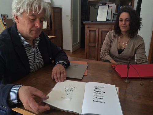
Alfred Hoffmann, son of Eduard Hoffmann and former CEO of the Haas foundry, witnessed the development of Neue Haas-Grotesk and Helvetica for over 50 years. Upon seeing proofs of Schwartz’s new Neue Haas-Grotesk he was delighted: “There can be no greater present for the founding fathers. Almost better than the original”, he said.

I agree.


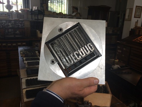
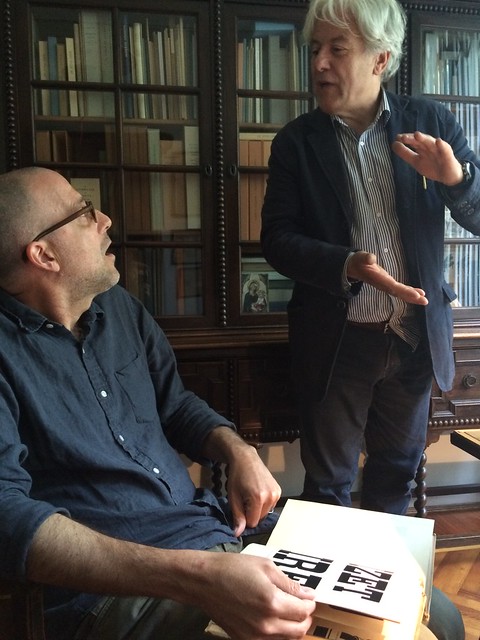
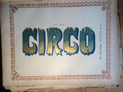
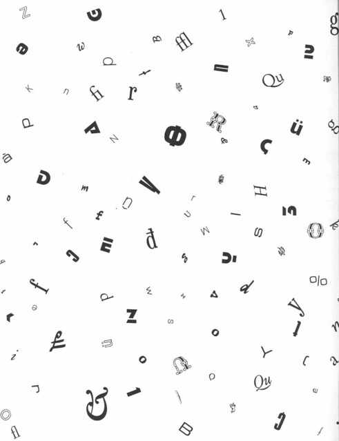
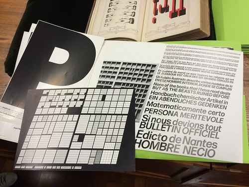
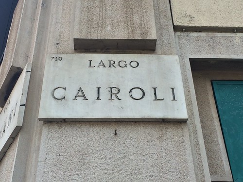
A selection of related images in my Flickr stream.