Schriftenfest Dresden 2019

Eckehart SchumacherGebler ist dabei, wieder ein exzellentes Programm zusammenzustellen. Bisher zugesagt haben Dan Reynolds, Eckehart SchumacherGebler selbst und, um, ich :)
Insgesamt werden es wohl so fünf bis sechs Vorträge sein und andere verwandte Aktivitäten. Alle, die irgendwie schriftgeschichtlich interessiert sind müssen da kommen!

Bis dahin, hier die Informationen von letztem Jahr. Der Ort, an dem die neuen wahrscheinlich auch wieder erscheinen werden: schriftenfest.de

On the topic of female speakers at conferences (again, sorry)

In the past two years, a LOT has changed for the better and the more diverse in the design community (talking about my turf – communication design, typography, type – but most of my points below are applicable more broadly). I have not forgotten why we founded Alphabettes and while bro culture, mansplaining and the general tendency to regard non-male-non-white people not as highly did not go away entirely, discussions, awareness and action have improved in most European and American countries.

Nevertheless, I was reminded today by the random example of two Russian conferences and a related discussion thread that that’s not universally the case across the globe. One of the conferences had no female speakers, and the other only one among a line-up of 13. But where the conference took place is actually not important. It only gives me the opportunity to talk about some of the most common excuses we hear when bringing up poor diversity:

Women are afraid to talk in public

That may be true for some if your industry and region doesn’t yet have an established body of female speakers that could serve as role models and advisors to those freaked out by the thought. But there are also many who are not afraid. Rather than shrugging and blaming those who declined, why not change something about your event structure and add more differently sized speaking slots? A 15 or 20 minute talk doesn’t sound as horrifying as a 45 or 60 minute one, a smaller crowd not as scary as a 1000-people hall. Or start with even shorter Pecha-Kucha-style talks. Most would probably agree to a short, more informal presentation or a smaller audience and it’s a good way to give new people a chance to get some experience. Everyone can survive seven minutes on stage! Or add a discussion round on the topic you want to cover and do it interview-style – much less scary compared to standing on a stage by yourself. (But please make the topic something else than “women in/on xxx”.) Encouragement from you and giving someone a chance will go a long way, plus it can snowball into more people feeling encouraged and less afraid.

Most of the women we asked declined

or more specifically today:

Most women declined because they had (vacation) plans with family

To the latter I can only reply: when did you ask? Did you plan your event sufficiently ahead of time when not most people already made their holiday plans? Maybe a conference in August is going to always be tricky in that regard? You all know it’s much easier for dudes to take off to a conference and leave their family at home than for the ladies. Whether you regard this as fair is up to you, but you could try to accommodate the fact by giving women enough time to plan ahead, or maybe even offering some help. Would they be allowed to bring their kid? (Adobe MAX for instance does not allow children on the venue, not even on the hallway or courtyard!) Did you ever consider organizing child care at your conference? Maybe the demand wasn’t there up to now because women with kids were never able to attend because they didn’t have child care. (This should also be communicated way ahead of time and not only last minute.)

More broadly: If people decline your invitation, did you make it attractive enough to come speak at your event? Are you paying a speakers fee, or only travel and lodging? How many nights, just one? Direct flights or only the absolute cheapest ticket? Ground transportation to/from station/port? Private hotel room or hostel dorm? I can’t blame anyone not ready to put up with anything just to speak at an event for free, sinking hours into preparations and sacrificing billable work hours/days.

If you are a call-for-papers event and you see that significantly fewer women apply, reach out to them directly or post the call on respective fora and encourage them to submit something. Offer advice on how to write a convincing conference proposal. Blind selection may also help because none of us is free of unconscious bias and preferring friends and people we know over strangers.

We’re not going by gender but by who is best for a given topic

I used to say this, too, and still would. But I know so many fantastic women in my field now that they automatically make up a healthy quota – if not the majority – of people who come to my mind for a given topic. It all depends on who / how many you know, who you are looking (up) to, what you are reading, what bubble you follow on Twitter. If all your friends and idols are guys, you can only choose “the best” from that pool of what you know, but man, you are missing OUT!

Admittedly, it’s hard to get a broader, more encompassing overview in an instance, but that’s what all the resources and the friendly communities out there are for. They can recommend someone and pass on contacts. Personal recommendations from conference and/or industry veterans may be more useful than just going by databases. Our Alphabettes contact form is always open!

There are no women who can talk on this topic

That’s mostly the same dilemma: if you don’t know many different people in a field, not many women may come to your mind 1, 2, 3. Some really technical or specialized areas may indeed not have as many qualified women in it (yet), but that should be a reason for us to encourage and promote any female interested in the field. Get more creative than just defaulting to the ever same guys. Maybe the topic can be reframed a little? Maybe a team of two can talk about it? Maybe a workshops on the topic could give more people the chance to enter the field?

Organizers not having a good overview over the industry and the old “but we need a big name to sell tickets” are also how the ever same “rock stars” are invited to events which brings me to …

I’m writing this all out of selfish reasons. I gave 14 talks in 13 different cities last year (all while having a full-time teaching job and a freelance business). I’m trying to cut down on this but not because I’m tired of the idea of conferences or travel but because I am tired of seeing and hearing the ever same people, including me. Although June is one of the most busy months for me, I’ll still try to attend Typographics in NYC again because they are making an effort to bring new faces on stage (and for several years with a 50/50 female/male ratio, still unmatched by others).

It’s also a lot of work and energy we put into community work while neglecting our own projects, discussing with conference organizers and the Twitterati, suggesting people, building resources, sending around CFPs, pushing the up-and-coming to talk and write, advising on the involved how-to’s, and just generally keeping an eye on you guys out there. Could you maybe all help us with this a little, please? Everyone should ask who else is invited when they get an invitation to a conference and I wish men would stop being complicit in the game: we should decline to speak at events if they don’t have a minimum of 30% female participants (or just more from the whole pool of diverse non-Kaukasian humans in general).

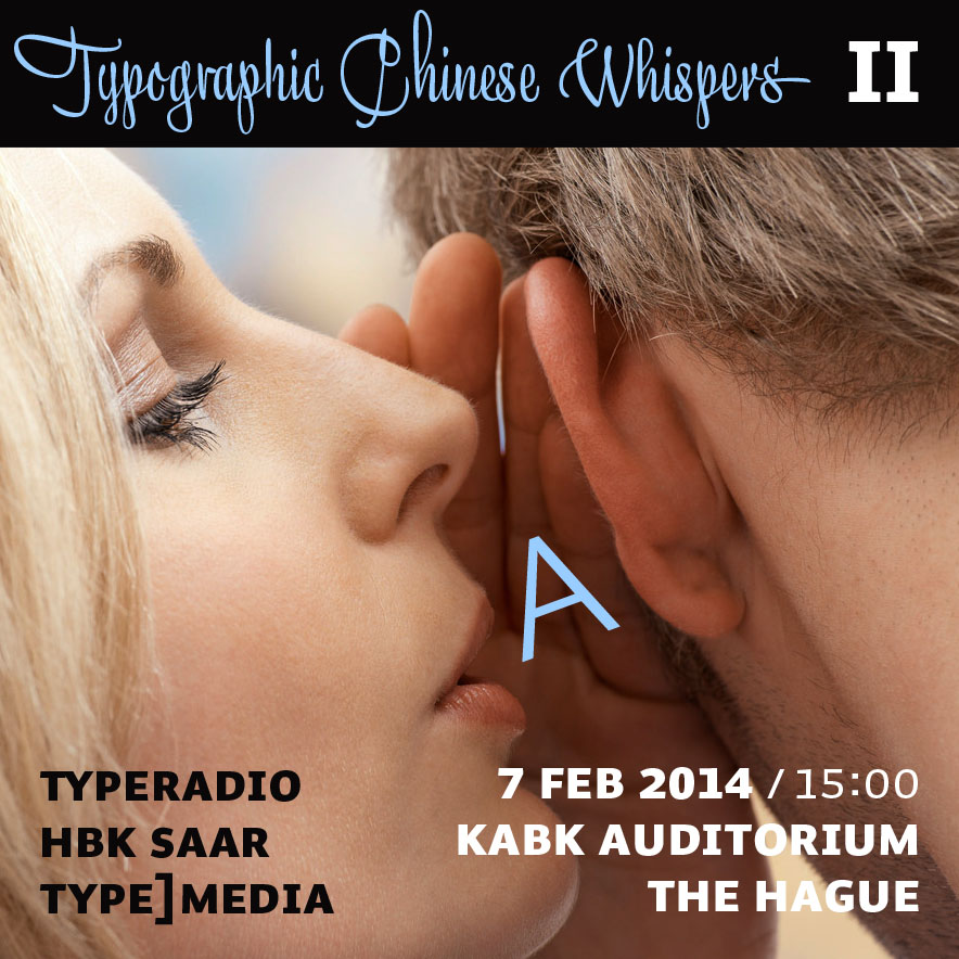
Typographic Chinese Whispers

Our HBKsaar project together with Typeradio and the t]m class of 2014 at KABK The Hague. Presentation next week Friday, February 7, 15:00. Hallo bitte kommen!

“Flyer” by Donald Beekman


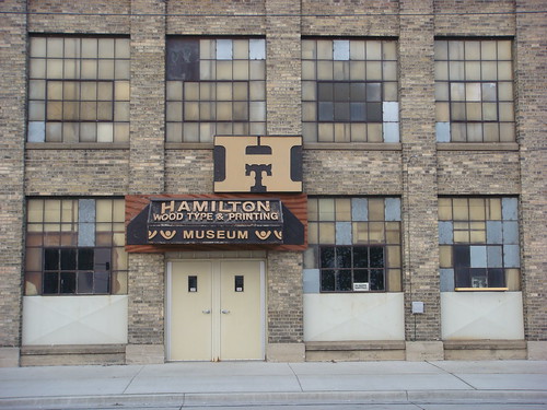
The Hamilton Woodtype Museum is the coolest place in type world!

Hamilton Wood Type & Printing Museum

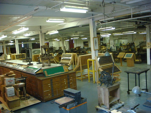
However, they are being forced to move out of the old Hamilton factory building that houses them and have not funds enough to do so. A minimum of $250,000 is needed to pack up the 30,000 sq. feet of printing history and move to a new home yet to be found. Please consider helping them by making a donation. If you’re working in the creative field get a membership for yourself and your co-workers, or suggest to your employer to give memberships this year for christmas. You can also contact the museum director Jim Moran for further information: Jim.Moran@woodtype.org

Donate via their official PayPal button above or this form. There is also an official press release.

Watching
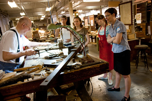
Photo above by Lester Public Library from our TypeCon field trip this summer. All other photos and the video tour by Nick Sherman, one of the wonderful activists for Hamilton and board member of the museum.

Hamilton Wood Type & Printing Museum

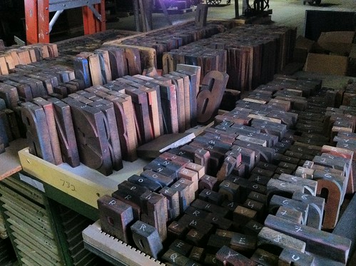
The stacks

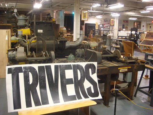
T’rivers, ’Scansin

More on flickr.

Notes from Lyon

Posted via email from Starbucks, the only working wifi in town.

James Mosley is the best!

“There has been a lot of rubbish written about type history.”

“I’m thinking of Updike who thought he knew everything about type, but in fact he didn’t know type at all.”

“One hero is Harry Carter. And then a young chap called Mike Parker came along.”

More

ATypI Konferenz Leipzig 2000

Dies ist die Transkription einer Kopie eines Schulhefts, in das ich für Max Bollwage die ATypI Konferenz in Leipzig protokollierte und welches ich ihm nach Abschluss zusendete. (Lesezeit ca. 11 Minuten)


Freitag, 21. September 2000

9:45
Da bin ich also mit meinem Klapproller im alten Konsumgebäude, abgefahren rustikal, mit Shuttelbus vom Museum aus zu erreichen. Begrüßung von Mr. Batty, der ATypI-Chefin, Erik, dem Spiekermann und zu guter Letzt begrüßt auch SchumacherGebler die Hörerschaft bevor der Lederjackenträger Weidemann die Bühne betritt. Bisher no Inhalt, bad coffee und bereits leichter Kopfschmerz von rechts wegen des frühen Aufstehens.

More

Font-Shopping Continues

In case someone actually still wants to buy fonts this year I better hurry up with my report. Alright, what more did I buy?

.

Okay Type:
They (Jackson and his cat) have some really super fonts in the making, but only Alright Sans is ready for licensing yet. I had kept track of this interesting amalgam of a sans for quite some time already as it gets mentioned almost every day on typophile. Not purely humanist in style and proportions it combines open forms with the regularities of a classic grotesque and daring slanted a’s and g’s as alts in the italic. Makes me think of good ol’ Syntax and the Ideal Italic again.
Due to my (meanwhile) mission to get as many different families as possible, I just boughts five single weights at MyFonts because one can only get the whole family on Okay Type’s website. (Why?)

Exljbris:
Now while I was there I did what probably everybody does at MyFonts from time to time—getting a couple of free fonts. Not many of them are suitable for professional design work, but in my opinion the typefaces by Jos Buivenga are. I got some complementary styles to the free version of Calluna, a versatile text face (and since Christmas joined by a sans to become a super-family) plus the flamboyant conceptional experiment that is Geotica—a high-contrast Didone only built up of geometric elements. The different fills, swashes and ornaments make it an exciting display venture.

.

The Asset:
All those typefaces hopefully complement the ones I got earlier this year:

Eames Century Gothic* Modern: I just had to order immediately, it simply is the impersonation of Erik van Blokland. One can dive deep into the individual shapes for days, the display styles make instant logos (beware, not allowed in basic license), the ornaments and numeral fonts are a playful plus. So enjoyable.

Hard to avoid the typefoundry Bold Monday this year, especially Nitty, which is surprisingly comfortable to type text in and Panno by Pieter van Rosmalen. I started out with the friendly priced sampler and got the full family of Paul van der Laan’s humanist sans Flex later.


Half way through my shopping spree Commercial Type, or rather Christian Schwartz announced the release of Neue Haas Grotesk to be near. Halleluja! Ever since working on the Helvetica Forever project I wished for that to happen. (We actually wanted to type-set the book in this newly digitized version back in 2007, but somehow either it wasn’t ready by that time or they didn’t manage to sort out the legal issues, so we ended up with Neue Helvetica.) I have no idea whether I’d ever use neue Neue Haas Grotesk, it’s just so tempting to get and be it only to show the world how Helvetica was meant to look like. But—maybe later.

Because all of a sudden the tide was turning: the notice of some unexpected debits abrupty shrunk my font-budget by almost 50% (now ~1500 €). But there was still so much left in my FontShop, A2 and MyFonts Carts :/
So these, among others, are typefaces I unfortunately had to skip (I should make a shortlist of nearly-bought fonts at some point):

Freight Micro, Text and Display I’m in love with this extensive super family by Joshua Darden/Garage Fonts for quite some time now. Especially the Micro (Italic) styles have great display qualities, too, although originally designed for extra small text.

Hercules, a quirky Modern/Scotch by František Štorm and also his
Farao, a playful take on the Clarendon genre. I like most of his typefaces although you realise some similarities after a while (the a’s e.g. are typical), but that is the case with other great type designers, too, like Gerard Unger or Fred Smeijers (his g’s and ß’s).

Lavigne got postponed as well, a dulcet text face by Ramiro Espinoza with great ampersand and complementing display styles for even more lavish demeanor.

Relato by Eduardo Manso attracted me with its distinct cursive. The rather low-contrast makes it a designated book face suitable for long-distance reading.

Iowan Old Style by John Downer, a calm, no-fuss text typeface, quite atypical for him actually.

Grot 10 from newly formed foundry A2. I especially like the true italics, which are still rather unusual for an “old-style” grotesque. There have been a lot of these kind of revivals popping up lately, like Plan by Typotheque, Fakt from Ourtype, Embarcadero by Mark van Bronkhorst or the recently expanded Founders Grotesque from Klim, to mention a few. Type expert Stephen Coles even names 2010 the year of the Helvetica replacements.

On that note, let me put you off until the third and final installment with some more shopping-occurrences, my final receipt and conclusion.

Font Shopping (Part I)

Last week I found myself faced with the rare and luxurious task to spend quite some money, quickly, and on something typography related.
I guess I’m not alone with this end-of-year-business-expence problem, so instead of a list with cool things in type 2010 I want to share my shopping experiences here.

As kind of a warm-up I ordered a couple of books and studio-material — easy — followed by some software, but I figured investing in fonts would be a lot less age sensitive and a more sustainable way to spend the remaining rest of this non-recurring source of capital. But what to pick?
I have a good overview and dialog with German and neighbouring European foundries, the classic Adobe Font Folio and ancient URW collection but what was kind of missing were the more independent anglo-american contributions of the past years.

so

So I started my stroll — at Font Bureau. I love them for their varied collection of part vernacular, part sophisticated typefaces, a lot with display styles available, and webfonts of course (but better avoid the “wacky” section).
My cart filled quickly, felt a bit like the old game »Ich packe meinen Koffer und nehme mit …«:

Amplitude: Because I fell in love with the triangular opening at the base of the a. A big fat wide compressed family presumably suitable for almost everything. Not too gruff, yet not too friendly (I got a bit tired of all those numerous humanist sans recently).

Farnham Text + Display: The a again, it won me over ever since I first saw it. I’m into baroque, Baskerville-ish typefaces for quite a while now and Farnham is a very amicable interpretation of the theme. I buy my daily Frankfurter Rundschau just because of this.

Giza: Yeah! Who can resist Nine Five? Now to find the right occasion to use and not only look at it.

Ibis Text + Display: “Very small and very big” are probably the best applications for Ibis. It resembles the feel of Zapf’s Melior and other squarish, almost-slab-seriffed 1950s typefaces I like a lot. Didn’t use it up to now, but Ibis does an amazing job as a webfont, especially on windows. Bold italic!

Meno: An irresistable cursive, like a bacchanal exaggeration of Galliard. Probably tricky to typeset but I definitely want to take the challenge and spend some time with her one day.

Miller Text + Display: Hard to go wrong with Miller, one of my all-time favourites. A versatile workhorse for tons of text with crispy, sexy display styles. Yum!

Prensa: As an admirer of Dwiggins one simply has to love Prensa (and Delicato and Enigma). Edgy, hardheaded, yet very legible and with great display qualities, too. Once again: bold italic!

Skilt Gothic: A better replica, derived from 1920s Danish signage lettering, this new release is a good alternative to DIN or when you want to say “industrial and undesigned”. Cool g and y, both one- and two-storey a’s and lots of other OT goodies (yeah, still rare but finally pro/premium OpenType arrived at Font Bureau, too).

Titling Gothic: Incredible, huge Grotesque families are FB’s specialty, so choosing a sans and picking styles from their ample palette was extra hard. I went for Titling Gothic because it somehow stands in the middle between the eccentric Bureau Grot and the more sane Benton Sans and Franklin. I would have liked Boomer Sans, too, but that sounded difficult to license.

Trilby: Well, what to do with Trilby, posters probably. It’s just so damn cool.

Whitman: I have to admit, it’s not my favourite but it seemed an expedient investment. Maybe it’s the a (again, they are my acid test), or that it is so perfectly balanced, but Whitman is a good alternative for Joanna, often described as a difficult diva. Or Scala.

Zocalo Text + Display: It definitely is the a! Freakish italics, cantilevered serifs in the caps, very readable in text, quirky at display sizes, simply a joy to look at.
so

I didn’t select all those typefaces at once. But after putting like 10 fonts in the cart I noticed a significant drop in price, even though I didn’t get the full families but only individual weights. From 40$ in the beginning the price per font decreased to 35, 30 and finally 25$ only. That’s awesome! And dangerous.
From then on I was lost. I forced myself to take a break, shopped at some other manufacturers and wholesalers and decided to fill my parked FB-cart with as many fonts as possible at the end of my trip.

so

Stop 2: Hoefler & Frere-Jones
They make very good, downright perfect typefaces, no doubt. I like them, really. But somehow everybody loves HFJ and regard them as the authority in quality fonts — it doesn’t make me want to use their typefaces so much anymore. Everybody else is using them already.

so

Stop 3: Process Type
Right on time the nasty* guys at Process Type announced a 25%-off christmas sale. Not easy to keep me from buying something with a wallet so loosely in my pocket. I got Locator, a versatile, uncluttered Sans with cool Q, J and l (a bit like in Neuzeit) and freaky Maple because I couldn’t resist the g and e, r and a are so cheerful in bigger sizes.

so

Intermezzo:
As mentioned earlier I mainly roamed through the collection of the smaller independent foundries and I have to admit “evil”* MyFonts came in really handy during my expedition. I’d rather spend my money directly on the foundry’s site but it can get quite tedious to look up all of them individually, creating an account, providing payment info etc. So I lazily filled my cart at this central market place. Besides MyFonts’ search, mark, save, rate, tag and easy-use test-facilities are just super practical (plus some foundries don’t even sell their fonts on their sites).

While browsing some “new-and-noteables” I went astray and came across an ancient all-time-favourite of mine — and simply melted away confronted with its light italic: Bitstream’s Schadow by Georg Trump, one of my favourite designers anyway. Look at the g!

so

End of day 1. To be continued with some okay type, more hands-on shopping experiences, my in- and out-takes, reciept and conclusion.

so
Die tollsten Schriften des Jahres* (Teil 2)

* und andere (persönliche) typografische Ereignisse

Das weitere Frühjahr stand im Zeichen der TypoBerlin, die alles in allem großartig war und die ich zum ersten Mal als Moderator erlebte, u.a. durfte ich z.B. Mitja Miklavcic ansagen, dessen FF Tisa zwar schon letztes Jahr erschienen ist, die ich aber trotzdem sehr gerne mag.

Fontshop Deutschland veröffentlichte zeitgleich eine eigene Schrift von Erik Spiekermann + friends (also keinen FontFont von FSI, sondern einen Fontshop-Font) mit einem interessanten Marketingkonzept: die Axel kostete vier Wochen lang nur 9,90 Euro (danach 79,00).
Sie ist sehr sehr schmal, für die Verwendung in excel-Tabellen ausgelegt und dennoch gut lesbar. Mein bester ehemaliger Student Frank Grießhammer, damals noch bei FSI in der Lehre, hat eine Büro-Soap dazu gedreht.

axel_soap_tabelle
Axel (Bild Fontblog)

Ich weiss nicht warum, aber ich hab’s irgendwie nicht geschafft, sie zu kaufen. Zwar finde ich das Konzept und die Schrift gut, aber ich arbeite fast gar nicht mit spreadsheets und wenn nur mit google docs. Es würde mich aber interessieren, ob Fontshop durch mehr Verkäufe zu einem günstigeren Preis nicht auf den gleichen Schnitt gekommen sind. Sollten Schriften günstiger werden?

Ebenfalls auf der TypoBerlin wurde die neue Website von Fontshop Deutschland vorgestellt – leider kein so großer Wurf in meinen Augen, wirkt immer noch irgendwie Beta. Da könnte sich Fontshop Deutschland ein, zwei Scheiben von der amerikanischen Website abschneiden. Die ist super und erfindet alle paar Monate ein neues nützliches feature wie die fontlists und staff-picks, über die ich schon so manche vergessene Alternative gefunden habe, tolle Schriftmuster, gute Navigation und einen lesenswerten newsletter/blog haben sie auch.

Die Typo veränderte ziemlich viel. Ich knickte ein und meldete mich bei twitter an, was die internationale Kommunikations und Vernetzung irre beschleunigte und die Post-Typo-Insomnia noch verstärkte. Aufgrund von akutem „typographic conference withdrawl“ riefen Leidensgenosse Dan Reynolds und ich den type meet-ups calendar ins Leben und wir reisten auf Typostammtische quer durch die Republik. Die Ankündigung setzte Dan aus seiner preisgekrönten Reading-Abschluss-Schrift Malabar. Die möchte ich gerne mal für eine Zeitung verwenden.

type-meet-ups-page-header

Leider sind nicht alle Linotype-Neuerscheinungen so erfreulich, wie die Malabar oder z.B. die ITC Chino von Hannes van Döhren und Livius Dietzel. Dort schießen die »Next«, »New«, »Nova« »Better« und »Really« Schriften schneller aus dem Boden, als man die Pilze essen kann, besonders geärgert habe ich mich dieses Jahr aber über die Aeonis von Erik Faulhaber. Ich kann diese Dax-Verschnitte einfach nicht. mehr. sehen!

aeonis

Vor wenigen Tagen wurde die Helvetica Arabic von Linotype veröffentlicht. Mich erinnert sie in der Anmutung mit ihren runden Punkten, winkligen Strichenden und weichen Kurven eher an Frutiger. Aber ich verstehe nicht viel von arabischer Typografie (nur von Helvetica).