Rabatte und Schrift-Trends

Eine Passage aus Sven Fuchs’ MA Arbeit, die mich nachdenklich gemacht hat:

IMG_7255

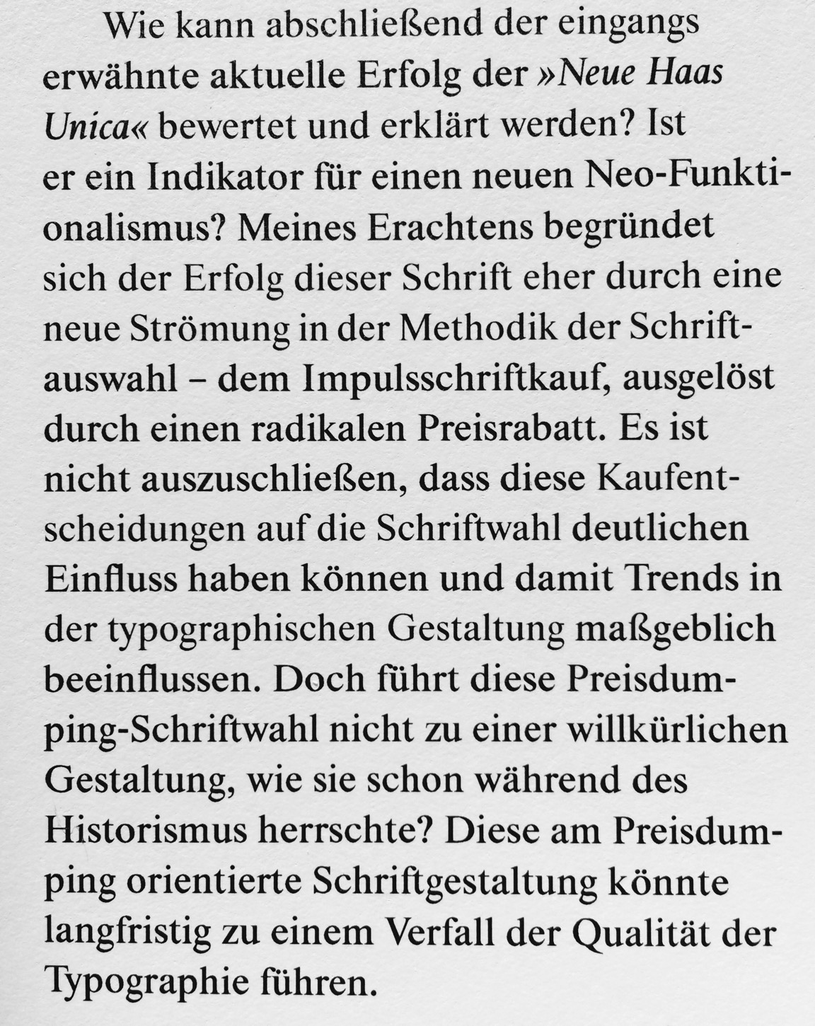
Können Preise und Rabatte typografische Trends beeinflussen und »schlechtere Typografie« zur Folge haben? (Schlechter im Sinne von weniger idealer, beliebiger Schriftwahl.) Sehen wir so unglaublich viel Open Sans auf all diesen Webseiten, klein und groß, weil sie die passendste Schrift für diese Seiten ist oder einfach nur weil sie so unschlagbar billig ist? Prägt diese extrem häufige Verwendung einer bestimmten Schrift Trends im landläufigen Webdesign?

Über diese und ähnliche Dinge grüble und diskutiere ich bereits seit längerem, vor allem im Bezug auf »Schriften mieten« vs. »Schriften für die Ewigkeit lizenzieren«, und »Katalog-Abos« vs. »Einzellizenzen«. Wenn ich mir einen Vorrat von unbeschränkt lizenzierten Schriften auf Halde lege, werde ich für eine Aufgabe eher nur Schriften aus diesem Bestand auswählen und nicht aus dem großen Fundus aller Schriften dieser Welt. Meine Auswahl wird also immer eingeschränkt und evt. nicht ideal sein, aber meine Schrift-Investitionen sollten sich ja auch amortisieren. Muss ich aber für jede Anwendung die Schriften neu lizenzieren und darf sie nicht unendlich lange nutzen, wie es z.B. bei vielen Webfonts oder gemieteten Desktop-Schriften der Fall ist, dann entscheide ich mich evt. immer neu und passend für eine individuelle Schrift aus dem Gesamtpool des Angebots, und nicht unbedingt für eine, die ich in der Vergangenheit schon mal verwendet hatte. Lizenzieren auf Zeit, bzw. Schrift-Miet-Services wie Fontstand sind also theoretisch gut für die typografische Vielfalt und letztendlich die gestalterische Qualität unserer Arbeiten, im Gegensatz zum unbefristeten Lizenzieren, welches die Wieder- und Wiederverwendung der immer gleichen Schriften befördert.

Und weiter: wenn ich noch nichts vorab lizenziert habe und alle Schriften ungefähr ähnlich teuer sind, werde ich wahrscheinlich diejenigen aussuchen, die ich am passendsten finde – aber auch die, für die es überzeugende Schriftmuster und Information gibt, die am einfachsten zu lizenzieren ist, oder wo ich guten Kundenservice bekomme. Ein extrem niedriger Preis jedoch ist ein so überragend starkes Kaufargument für viele Leute, dass es das klassische Marketing verzerrt oder gar aushebeln kann. Schriftmarketing, das unsere Kaufentscheidung beeinflusst (bzw. beeinflussen will) und die Idee von Schriften als Verkaufsargument für Technik/Geräte gab es schon lange, fast immer. (Adobe, zum Beispiel, möchte uns mit Typekit und ihren Schriften am Ende des Tages auch nur ein Creative Cloud Abo schmackhaft machen.) Nur im Handsatz, nach der Standardisierung von Maßen, und nun mit digitalen Schriften konnten wir frei entscheidend Schriften von verschiedenen Herstellern nutzen und kombinieren. Hoffentlich auch weiterhin. Bis irgendwann bestimmte Schriften oder Services nur noch mit bestimmten Programmen oder Betriebssystemen funktionieren werden. Bis vielleicht Schriften von »Drittanbietern« zum Beispiel nicht mehr in Microsoft Office Programmen funktionieren …

Fonts In Use turned five!?

Can’t believe we launched Fonts In Use five years ago today. What started as a humble blog with not even a handful of writers developed into an enormous, divers resource with countless contributors.

One of my favourite posts still is the one about type at the Bauhaus that I wrote in the very early days (actually, reposted from this site [oh dear, kaputt image links]) although it is very brief and I would write it very very differently today. It is a favourite because of the discussion that followed and that, back then, it still seemed OK to post something short and not super elaborate and eloquent. Put a proposition out there and let the ensuing discussion take over, then subsequently expand and clarify on the points that people find interesting or debatable. But no one is commenting on the internet like this today. The standards for good blog post became so high (deep topic, solid research, excellent imagery, engaging layout and presentation, detailed references …) that they discourage me to even write/attempt one. I recently decided that I don’t want this to be the case on my own blog any longer though. (As you probably noticed, confusedly babbling here more again.)

Here’s to more interesting discussions on the internet in coming years, and especially many more about fonts in use and Fonts In Use.

Two tweets from my drafts

What’s the reason for the current thin-skinnedness in type all-around? I think, constant aggressive marketing causing stress and jadedness, and
and sheer Existenzangst. Can’t blame anyone for being sensitive. Might need more fundamental changes than just shutting up in public though.

Alphabettes

Unbelievable that it’s only been two months (Sept 10) since we launched Alphabettes.org, our new blog on all things type-related, and only one month more since we gathered together as Alphabettes, a loose group of women in type, typography, and the lettering arts. It’s been quite a summer (and we’ve been making quite some waves) but finally having a good place to post what’s on my mind regarding type and our industry — quick, informal, diverse, occasionally super-specialized (where can you write about matrix production in metal type days these days?) and, above all, with awesome new friends — is easily one of the best things that happened to me this year.

To many more quarters, ’bettes! 🍹


Max Bollwage’s caricatures of type people

Today, my friend Max Bollwage turns 88. I was lucky to get to know this grand Gebrauchsgrafiker and illustrator from Stuttgart at a DIN-classification meeting in 1998 (perhaps the best thing that came out of this meeting) and we stayed in touch ever since. He can look back on a full career and life, designing a broad range of things, from small hand-lettered book-covers to complex design systems such as working on the corporate design of Sparkasse. For years, mainly at type conferences and other gatherings, Max keenly observed and then sketched his colleagues with a quick hand. Erik van Blokland recently found a stash of fun portraits on a back-up drive with ATypI Antwerp things from 1993. Can you guess who is who?

image

image

image

More images in Erik’s album on Flickr

Happy birthday, Max!

Type excursion through Italy

Early June, I spent a week in northern Italy visiting print shops and other interesting sites on a small type field trip around Kerning conference. It was also an exploration of all the different types of trains Tren Italia is deploying these days. I flew to Milan Linate (wise decision), took the bus to the main station (wonderful from the outside, nightmarish to navigate inside), and then a slooow, crowded and hot regional train to Torino. There I met with David Shields, who happend to be stationed in Florence for VCU summer school, and we took another train to Alpignano to visit Tallone Editore, Italy’s last printer/publisher solely working with foundry type and mostly hand-made paper, run by Enrico Tallone and his family. We got an introduction ot the company and their superb products from his lovely English speaking daughters (Enrico doesn’t speak English) before they showed us around the print shop where also some font-ID fun was waiting for me.

Enrico and one of his daughters

At the Tallone print shop

Nebiolo modular type and locomotives

The highlight was Enrico showing us his rare woodtype specimen books. Jaw-dropping.

David Shields speechless

Untitled

Next stop was Archivio Tipografico in the center of Turin, where we would meet Nick Sherman who couldn’t make it out to Alpignano. Archivio, named after the celebrated corporate magazine of Nebiolo, is a wonderful print shop cooperative, preserving old type, machines, and producing printed matter for diverse clients; also some type ephemera, like a small brochure about the work of Aldo Novarese. This page, for instance, is showing some of Novarese’s typefaces and the corresponding printing forme with sorts stuck between wine corks:

Letters by Aldo Novarese as printed by Archivio Tipografico

Forme with rotated letters at Archivio Tipografico

David had to go back to Florence but Nick and I stayed in Turin, checking out the pizza at piazza Giambattista Bodoni. Couldn’t get more topical.

Alla Lettra at piazza Giambattista Bodini  Torino

After exploring more of Turin’s sights we took the train to Bologna, the pretty comfortable, superfast one this time. I even bought four tickets by accident, two for adults, two for kids, which we learned while chatting with a kind fellow passenger about fonts.

So good to be back in Bologna at our friend’s shop, Anonima Impressori! Team Baguette, Jean-Baptiste Levèe and Loïc Sander, joined us, too, reviving our visit from 2014 when we also went there on our way to Kerning conference. This time though, Nick determined we should print something, and why not with the largest type they had? These über-letters are cut in half or even quarters and assembled on the press and were larger than the largest press they had, so we had to print in two runs, first bottom, then top half.

The largest type at Anonima Impressori is cut in half

Untitled

Done!

After a lovely night out eating and drinking Bolognese delicacies, we drove to Faenza, a charming “normal” Italian town between Bologna and Rimini where the conference would take place. Most conference goers stayed at Hotel Vittoria (recommended), some of us visited the cemetery (very recommended), or just hung out in the nice courtyard at the hotel. The conference venue is a historic theatre/cinema, a fantastic setting with an adjecent cosy courtyard where we would hang out between talk and snack on more Italian delicacies, or peek into the small historic print shop that is also part of the ensemble. This year, I was invited to give a talk on choosing typefaces, alongside a great line-up with, among others, Laura Worthington, Tobias Frere-Jones, Bruno Maag, and Nicholas Felton. Many type friends come from quite far away to Faenza to enjoy the friendly layed-back atmosphere — and you should totally, too, next year!

Tradition has it that we would visit Tipoteca Italiana in Cornuda after Kerning, where we thus drove on Saturday morning. Since our last visit, Tipoteca greatly expanded and stepped up its game, although it was already the greatest and neatest and well-kept type museum I’ve ever been to (see my report from 2014 in the 365typo book). Opposite of the main building now opened a newly built house with lecture hall, seminar rooms, and a superb restaurant where we met Tipoteca maestro Sandro Berra, joined in by Team Geek, Nina Stössinger and Tobias Frere-Jones. Although we made it relatively singlemindedly through the vast exhibition to have more time at the library, we didn’t even get to the room with the woodtype storage in time before we were totally “fuso”. Obviously, not even two visits are enough.

Untitled

Metropol flyer

Untitled

Forma

Untitled

After-type drinks. The firsts of many aperol spritzes that day. We spent the evening in near-by Treviso, surprise-joined by Claudio Rocha, heading home after some ice-cream and 35+ salade de fruits. The band:

New Indie Rock Band

The Bolzonello Lawn Conference the following morning was more meta this time than last year’s edition, nevertheless a staple in our busy event schedule by now. Pre conf internetting:

Untitled

We hit the road towards Veneziaaa (Team Baguette) and Paduaaa (Team Malade) respectively, heavily packed with poster rolls and book bags. After hanging out for three sad hours at Padua train station due to overbooked trains, we had the privilege to experience yet another fine product of Tren Italia rocking us towards our final destination, Milano. There, we explored the modernist Milan subway signage system (sporting a typeface I mistakenly identified as Forma), and met The Dan Rhatigan & friends for food and drinks with a view. And after another last day exporing type, lettering, architecture and Italian delicacies, I flew home, exhausted but endlessly inspired and ready to learn ever more about Italian type over the summer. To be continued.

Untitled

Untitled

Flipped, droopy, “sign-painter” quotes

I want to share some Sunday afternoon armchair research. As you (Americans) probably know from signs or hand writing, some typefaces have quotes that – when used for English – look flipped, instead of “rotated”, usually of straight or tapered form. Germans don’t like those because we use your opening mark as our closing mark and then they point into the wrong direction (see the red quote below). This is an on-going complaint about Verdana and others, most recently the new Apple OS fonts (which have since been changed). Image by Frank Rausch on Twitter:

San Francisco quotes

When people ask me where this comes from and why, I usually say, it’s a sign painters tradition and because it often looks better in English, but I would love to know a better explanation.

I asked on the Sign Painter Support Group Facebook page and hoped to get an answer from John Downer. He pointed me to a letter he wrote for Emigre Magazine in one of the last two issues of 1996. With this helpful index I found them in issue No. 39 and 40. I asked on Twitter if anyone still had those Emigre mags and within minutes super helpful friends replied and Pieter van Rosmalen sent me photos of the issues’ letter sections:


Letter/question to the editor in Emigre 39

 
Downer’s reply in issue No. 40

I also asked Cyrus Highsmith as I once contacted him about the flipped quotes in Relay and if he could make a “rotated” version for setting German. He provided an interesting other answer:
“In some designs, flipping the quotes is necessary to distinguish the left and right quotes from each other. For example, if the wedged-shaped quotes in SF UI were rotated instead of flipped the left double quote and right double quote would be basically identical. And that would look weird in English. Taz just barely avoids this because of the tapering.”

Matthew Carter just seemed to like them better for Verdana. (Upon request, he changed the quotes in Verdana Pro though).

And Mac McGrew interestingly calls the straight ones uniquotes:

 
While we luckily don’t live with the constrained character-set of 265 glyphs anymore, this discussion might continue as there are so many different ways how to use the standard quotation marks in different languages. Some fonts now implement a {locl} feature, but getting it to work in different apps is still tricky (I remember long email exchanges with Kent regarding this) and it only works if the language for a text/document is set correctly. I propose keeping the rotated form the default and perhaps use the cool U+201F DOUBLE HIGH-REVERSED-9 QUOTATION MARK (‟) for the flipped design more.

The unforseen merits of girls’ school?

This is an excerpt of an email I sent Amy Papaelias a while ago on the topic of (few) women in design. So you know where I’m coming from.

 
[…]
Throughout all of my youth and adult life, I rarely to never considered that anything that happened or didn’t happen in my life has anything to do with my gender. I went to an all-girls (catholic) high-school. Naturally and unquestioned, we did everything there – science, sports, mathematics, programming (even if only super old-school Basic), cooking, building stuff … it never occurred to me that girls cannot or should not do anything they want. I actually wanted to study chemistry when I finished school. We had male teachers who were wimps and some who were hunks, we had teaching nuns and tough business lady types. If there was a conflict or bullying, we could be certain it was because of who knows what but not because we were girls. With this (maybe super naïve) mindset I went on to study and on to work. I still think it is a good basic attitude, paired with speaking up whenever you see issues or feel treated unfairly, but of course it comes with tons of mine fields I walked through and will proudly walk through in the future.

My advice for female designers: Don’t just do publication/book design and illustration, please. There are so many interesting fields in design besides these classically female dominated departments. Document your work, be an active part in the community, write and publish your thoughts and opinions (have opinions!), talk at conferences even if it’s scary (it is).

My advice for you others: educate and encourage girls, offer them flexible, equal jobs and an environment they want to work in. Be understanding about irrational fears, doubts and weird behavior. Ask their opinions, include them and just generally take them seriously and not only if they adopt male-manners.


Thank you Frau Uffelmann, who pushed through against my parents that I would coincidentally attend this school, Marienschule Fulda.


Proposal:

Let’s have an all-female-speakers conference next year.
TypeCon?
ATypI?
TypoBerlin?
I’d have many ideas.

Discuss.

Female speakers at conferences

Yesterday, this discussion took place again on Twitter. I hear this complaint all the time, and sometimes complain myself, too. However, I also organized conferences and events in the past and know how hard it is to get more female speakers on board if you still want to cover the topics you find important to cover. We gotta be proactive if we want more women to speak, all of us. I proposed many talks via calls for papers / presentations, because I want to participate in the community, in the discussion and in research. Don’t wait around for other people to cordially invite you. Sometimes these proposals get accepted, sometimes they don’t, but I don’t automatically suspect misogyny or a scheme behind it when I get turned down.

Many times when I spoke at events where I was the only, or one of the very few women, I couldn’t help but wonder if I was only invited because they needed some (more) girls on stage. Because, you know, complaints. This is not the feeling you want to have. You want to think, they invite you or accept your proposal because they think what you could contribute is interesting and fitting.

Instead of only looking at the diversity on stage, we should take a closer look at the boards and teams that are organizing events, the councils and committees that are shaping organizations. And don’t say “they should”, be an active part in your community and offer yourself as a candidate.