Multi-axes type families

There is an occasional confusion with extensive type families and the involved terminology. Basically a type family – a set of fonts with common design characteristic and features – can have multiple

· weights (Light, Regular, Medium, Bold, Black etc.)
· widths (Narrow, Compressed, Condensed, Normal, Wide etc.)
· related designs (Sans, Serif, Slab, Mix, Mono, Semi, Pi etc.)
· size-specific variants aka optical sizes (Text, Display, Agate/Micro, Headline, Banner etc.)
· grades (One, Two, Three, A, B, C etc.), and probably more.

Series / Super-Families

One common question is what to call an extensive type family that is comprised out of more than one “family”, for instance a matching serif and sans. Some call this a super-family, others a series, like ATF and Photolettering traditionally did. I like series better because it is a very flexible term and can umbrella (herby proposing this to be a verb) many different styles that are connected in their design, be it by weight, width or shape.

Size-Specific Designs / Optical Sizes

Also frequently mixed up are optical sizes and grades. Optical sizes refer to the adjustment of a typeface’s design for a certain range of sizes or application. (I’m not really happy with the term and mostly call these size specific designs.) In metal type, each size of a typeface was tailored to the requirements of that specific size. Characters intended for small sizes were kept wider, with open apertures and more loosely spaced. They have a large x-hight, lower stroke contrast and more sturdy serifs for instance. Type for display sizes on the other hand is tighter, more narrow and more detailed in design. Nick Sherman illustrates the range of adaption very well in his A List Apart article.

These adjustments got lost during phototype and, until recently, had only been rarely available for digital type. Fortunately, there is a growing selection of families offered in different sets of fonts for different applications, e.g. text and display variants, sometimes also called Banner or Headline. The latter might indicate that the design is especially narrow and space saving, i.e. optimized for newspaper applications. Agate means that the fonts are suited for very small sizes, traditionally ca. 6pt, used in newspaper tables and listings. Skyline is a name used for a very condensed tall style. (More on optical sizes in Tim Ahrens’ book.)

Grades

Grades are variants of one style of a family – for instance the regular text weight – in slightly different weight nuances to adapt to varying output conditions, e.g. different printing presses, paper stock, climate, or screen resolution. Quite unlike optical sizes or a normal range of weights, the unique feature of grades is that the spacing and kerning is identical for all fonts in a set, so there is no reflow of the layout when you change the grade. By using the appropriate grades, the intended weight of the font will look consistent everywhere, as they compensate for type getting “fatter” in the printing process (dot-gain) or text appearing lighter on coated stock or high-res screens. (Adaptions beyond the offering of fixed grades used to be possible with Multiple Master typefaces, and are currently discussed again in connection with advanced hinting techniques.)


Below I started a list of typefaces available in different optical sizes and grades, for print and screen. This is not meant as an exhausting list, rather to note some down for myself, but I’ll try to keep it updated and add to it, so feel free to point me to more typefaces in the comments. (Web indicates that some styles are available as webfonts).


Typefaces Available in Grades (number of grades)

Benton Modern Text (4); Font Bureau [web on request]

Bureau Roman (5); Font Bureau

Chronicle Text (4); H&FJ

Greta Text (3); Typotheque

Magma (2); Stone Type Foundry

Mercury Text (4); H&FJ

Miller Daily (4); Font Bureau

Munc (2); Stone Type Foundry

Poynter Agate (4); Font Bureau

Poynter Oldstyle Text (4); Font Bureau

Quiosco (4); Font Bureau

Renard (3); TEFF

Tabac (4); Suitcase [web]

Tempera (3), Tempera Biblio (3); Typonine [web]

Tuff (2); Stone Type Foundry

Zócalo Text (4); Font Bureau


Typefaces Available in Size-Specific Variants / Optical Sizes 

Arno; Adobe

Axiom; Typemanufactur Georg Salden [web]

Arnhem, Arnhem Fine, Arnhem Display; Ourtype [web]

Benton Modern Text (grades), Benton Modern Display; Font Bureau [web]

Brioni Text, Brioni; Typotheque [web]

California Text, California, California Display; Font Bureau

Chaparral; Adobe

Chronicle Text (grades), Chronicle Deck, Chronicle Display; H&FJ [web]

Cronos; Adobe

Escrow Text, Escrow; Font Bureau [web]

Fedra Sans, Fedra Sans Display 1 & 2; Typotheque [web]

Fedra Serif A & B, Fedra Serif Display; Typotheque [web]

Garamond Premier; Adobe

Glosa, Glosa Text, Glosa Headline, Glosa Display; DS Type [web]

Greta Text (grades), Greta Display, Greta Grande; Typotheque [web]

Guardian Egyptian TextGuardian Egyptian Headline; Commercial Type [web]

Guardian Sans AgateGuardian Sans Headline; Commercial Type [web]

Harriet Text, Harriet Display; Okay Type [web]

Hoefler Text, Hoefler Titling (more independent design); H&FJ

Ibis REIbis TextIbis Display; Font Bureau [web]

Info Text, Info Display; FontFont [web]

Irma TextIrma; Typotheque [web]

Jenson; Adobe

Jules Big, Jules Colossal, Jules Epic; DS Type

Kepler; Adobe

Klavika, Klavika Display; Process Type Foundry [web]

Locator, Locator Display; Process Type Foundry [web]

Lyon Text, Lyon Display; Commercial Type [web]

Marlene, Marlene High, Marlene Display; Typonine [web]

Mercury Text (grades), Mercury Display; H&FJ

Miller Daily (grades), Miller, Miller Headline, Miller Banner; Font Bureau [web]

Minion; Adobe

Myriad; Adobe

Neue Haas Grotesk Text, Neue Haas Grotesk Display, Linotype [web]

Poynter Serif REPoynter Oldstyle Text (grades), Poynter Oldstyle Display; Font Bureau [web]

Poynter Gothic TextPoynter Agate (grades); Font Bureau

PrensaPrensa Display; Font Bureau [web]

Publico Text, Publico Headline, Publico Banner; Commercial Type [web]

Transit Text, Transit Front, Transit Back; FontFont

Turnip RE, Turnip; Font Bureau [web]

Utopia; Adobe

Warnock; Adobe

WhitmanWhitman Display; Font Bureau [web]

Zócalo Text (grades), Zócalo Display, Zócalo Banner; Font Bureau [web]

Ooof, no one ever say again that there aren’t any families with optical sizes. Way more than I thought and am able to add here right now. I’ll try to update the list later. Until then, see also this
list on typophile,
list on Fontshop,

list on Tim’s blog.


Typefaces Optimized for Small Sizes on Screen (< 14 px)

Aften Screen, Antenna RE, Antenna Serif RE, Apres RE, Basic GothicBenton Modern REBenton Sans RE, Custer RE, Deja Rip, Dispatch Mono, Droid Sans, Droid Serif, Georgia ProGiza REFedra Mono ScreenFedra Sans ScreenFedra Serif ScreenIbis RE, Irma ScreenNitti, Open SansPT Sans, PT SerifPoynter Serif, Riga Screen, Scout RESource SansTurnip RE, Verdana Pro.


Some notes on the history of Akzidenz-Grotesk

A letter I once wrote to Paul Shaw regarding the history of Akzidenz-Grotesk by Berthold.

[…]
Günther Gerhard Lange was convinced that Akzidenz-Grotesk doesn’t have its origin at Berthold but goes back to Ferdinand Theinhardt’s foundry in Berlin. Theinhardt, said Lange, cut one of the first later AG-styles, Royal-Grotesk, in 1880. Those fonts came to Berthold via their acquisition of the Theinhardt foundry in 1908. Berthold combined them with other fonts acquired from other foundries and some of their own to form the Accidenz-Grotesk family (early spelling with double-c).

Thus, AG was not designed as a coherent type family but is a collection of fonts from different sources and foundries Berthold bought over the years. However, supposedly for marketing reasons, they were not so keen on displaying that fact everywhere. They rather stated the typeface being a “house cut” from 1898 in all their material, as also widely found in type publications. Both, Royal as well as Accidenz-Grotesk were sold under their respective names until 1926. Later Royal became AG mager (light), Steinschrift became AG schmal (narrow), Bücher-Grotesk from 1896 became AG schmal fett etc. (see GGL in tm 2, 2003). This “combining” of formerly solitary fonts and the idea of a type family, a series of stylistically connected fonts, may be regarded as Berthold’s biggest contribution to AG and future typeface releases.

According to Eckehard SchumacherGebler though, Theinhardt cannot be the creator of Royal nor AG. ESG researched in Friedrich Bauer’s Chronik der Schriftgießereien as well as in Theinhardt’s own Erinnerungsblätter (journal/diary) from 1899. The Chronik states that Theinhardt, born 1820, sold his foundry to the Mosig brothers and Oskar Mammen in 1885 and stopped working shortly after that. He died in 1906.

There is no Royal or AG to be found in Friedrich Bauer’s chronicle nor in Theinhardt’s specimen of 1905. Only in the edition of 1908/09 an Accidenz-Grotesk is shown. Berthold bought Theinhardt shortly before the specimen was published and obviously added typefaces from their program (this according to a note in Chronik der Schriftgießereien).

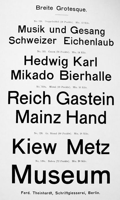
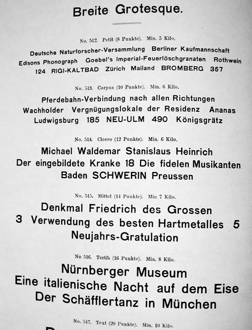
However, the Theinhardt specimen of 1905 (or 1895 as Wolfgang Homola states, they obviously worked on it for many years) does show a Breite Grotesque. Maybe a precursor of it all. There has also been a Schmale magere Grotesk, Enge fette Grotesk and Fette Grotesk by Theinhardt. Breite Grotesque looks similar to Halbfette Accidenz-Grotesk in a later specimen (as Andreas Seidel claims) but might stem from a different source altogether.


Images by Wolfgang Homola posted on Typophile, now on Luc Devroye’s site

Berthold published this ad below in the Deutscher Buchdrucker in 1899. Thus there must have been an Accidenz-Grotesk at Berthold long before the acquisition of Theinhardt’s foundry in 1908. For a while I suspected those fonts came from Bauer & Co in Stuttgart, which Berthold bought in 1897 (see Schwemer-Scheddin/Klein Types and Typographers), but I didn’t find any in their specimens, alas (apart from a shaded grotesk).

The Seemann Handbuch der Schriftarten from 1926 lists the following as from H. Berthold AG:
Akzidenz Grotesk, 1898
Royal Grotesk, 1902
Akzidenz Grotesk, breit, 1908
Akzidenz Grotesk, halbfett, 1909
Akzidenz Grotesk, fett, 1909
Akzidenz Grotesk, breit mager, 1911
Akzidenz Grotesk, eng, 1912
 

From the Berthold Chronik, 1921:


Image posted by Spiekermann on Typophile

Still quite muddy, the water, but I hope I could clear up some things a tiny bit.

 
Read also Part Two of Some notes on AG with things we found since 2012
 

Type classifications are useful, but the common ones are not

This is an article I wrote for the publication accompanying the conference Research in Graphic Design at the Academy of Fine Arts Kattowice where I gave a talk on the subject in January 2012. Please excuse the lack of illustrations. I will try to add some later, but usually those are empty promises as you can see in other posts on this site. Reading time ca. 16 minutes


It is a recurring phenomenon that we tend to sort what comes in large amounts, to be able to grasp it, for quicker reference, and to find it again more easily. Once organized you don’t have to look at everything all the time but only consult the parts of your current interest. The vast world of type is a prime case. Grouping typefaces also breaks down the process of identifying them into a less challenging task.

Any categorization covers three aspects: 1. sorting into groups (this is what scholars and historians do, also type manufacturers), 2. referencing (educating) and 3. “taking out” or finding (this is what the user usually does). The aspect of finding a typeface though is crucial to many more people, every day, than the act of classifying them. You sort your CDs once and then only look at the respective shelf when you want to listen to Jazz for example. This is why I think a (more) useful classification is one that helps the user to find and select typefaces and which is structured accordingly.


What happened?

More

sans serif

Not one word with a single s.
Two words.
No hyphen.
Without (sans) serifs (serif).
French and Dutch—a natural linguistic combination. Like wine and milk.

Paul Shaw


Fonts and intellectual property

“Finally, a personal opinion, from a person who has designed typefaces that have been successful in the market – you don’t need my typeface to do your design – my typeface adds value to your design, and so if you want to use it because it’s nice/pretty/might sell more stuff, you should understand that my intellectual rights to that property entitle me to some reward. There are many typefaces in the public domain that will convey language just fine. There is a reasonable premium for creativity. The price of a font today is a small acknowledgement of the value the design brings.” — Cynthia Batty


Zur Erinnerung: Der erste Spiekermann’sche Lehrsatz

»Gibt es bei zwei mit geringem Abstand nacheinander folgenden Zeilen auch nur jeweils eine Ober- und Unterlänge, so treffen diese beiden in 99 Prozent aller Fälle aufeinander.«

[Inoffizielle englische Übersetzung in etwa:]

“If there is only one descender and one ascender in two successive lines with little or no leading, there is a 99 percent chance that they clash.”


Font Shopping 2011

Instead of yet another best-of list (who can challenge the epic Typographica-reviews anyway) I want to share what typefaces I actually licensed last year, from where and why and whether I used them up to now.


Additional styles of Alright Sans, Jackson Cavanaugh, Okay Type (MyFonts.com): To complement previously licensed styles and because I wanted to see it pop up on the MyFonts live-sale-map.

Amplitude Italic, Christian Schwartz, Font Bureau (email/contact Font Bureau): To complement previously licensed roman styles for the book Tanzdekade, see below.

Brioni Text, Nikola Djurek, Typotheque (typotheque.com): Because I like it and regard it versatile and a good fit one day.

Elena, Nicole Dotin, Process Type Foundry (processtypefoundry.com): Because I like it and wanted to support Nicole’s long-term efforts.

Equity, Matthew Butterick, MB Type (equityfont.com): Because I like it and find it suitable for future text heavy documents and because I beta-tested it.

Klimax, Ondrej Jób, Typotheque (typotheque.com): It’s just so cool.

Plan Grotesque, Nikola Djurek, Typotheque (typotheque.com): One of, if not the best among all those grotesques popping up everywhere lately, extensive and probably an all-around multi-talent.

Vendetta, John Downer, Emigre (Emigre.com): For our Christmas cards at school and because I always wanted it anyway.

Zamenhof, Castle Type, Castle Type (myfonts.com): I don’t know, it was on sale.

Furthermore I downloaded some free fonts and trial licenses. From Exljbris: Geotica 2012. From FontFont: FF Basic Gothic Regular, FF Sero Medium. From MyFonts: Mimix, Sintesi and Sintesi SemiSans, Cala Light, Corda Light, Erato Light, Lido STF, Novel Sans Demo, Pona Display Demo, Supria Sans Regular and Italic. From OurType: Eva Semibold and Italic, Fayon Semibold and Italic, and six styles from the Meran family. From Type Together: Bree Serif.

The (sad) statistic of usage 2011
Amplitude book, italic, bold italic and wide bold were put to use in the book Tanzdekade about The Donlon Dance Company. I set the photography book The Raw and The Cooked by Peter Bialobrzeski solely in Meran light (remember this fun discussion?). Vendetta medium and italic was featured on the holiday greetings of my school. I wrote one quote and one invoice in Elena and set most of my school notices in Alright Sans. I used none of the others and none of the free or trial-fonts.

Resolution for 2012: Use more type more.


ATypI Konferenz Leipzig 2000

Dies ist die Transkription einer Kopie eines Schulhefts, in das ich für Max Bollwage die ATypI Konferenz in Leipzig protokollierte und welches ich ihm nach Abschluss zusendete. (Lesezeit ca. 11 Minuten)


Freitag, 21. September 2000

9:45
Da bin ich also mit meinem Klapproller im alten Konsumgebäude, abgefahren rustikal, mit Shuttelbus vom Museum aus zu erreichen. Begrüßung von Mr. Batty, der ATypI-Chefin, Erik, dem Spiekermann und zu guter Letzt begrüßt auch SchumacherGebler die Hörerschaft bevor der Lederjackenträger Weidemann die Bühne betritt. Bisher no Inhalt, bad coffee und bereits leichter Kopfschmerz von rechts wegen des frühen Aufstehens.

More

Life wasn’t easy in phototype days

While I more or less have a notion of how metal type and measurement works, I’m at a loss reading through specimen and instructions from film-setting days. Yes, I know there have been A, B, C and sometimes D masters to cover different ranges of size (instead of having only one scaled to all sizes), but this sounds complicated:


Specimen for Helvetica Compressed by Mergenthaler Linotype


Monotype Newsletter 92 on the occasion of Helvetica being licensed for Monotype’s hot-metal and photo composition machines, 1972