Font-Shopping Continues

In case someone actually still wants to buy fonts this year I better hurry up with my report. Alright, what more did I buy?

.

Okay Type:
They (Jackson and his cat) have some really super fonts in the making, but only Alright Sans is ready for licensing yet. I had kept track of this interesting amalgam of a sans for quite some time already as it gets mentioned almost every day on typophile. Not purely humanist in style and proportions it combines open forms with the regularities of a classic grotesque and daring slanted a’s and g’s as alts in the italic. Makes me think of good ol’ Syntax and the Ideal Italic again.
Due to my (meanwhile) mission to get as many different families as possible, I just boughts five single weights at MyFonts because one can only get the whole family on Okay Type’s website. (Why?)

Exljbris:
Now while I was there I did what probably everybody does at MyFonts from time to time—getting a couple of free fonts. Not many of them are suitable for professional design work, but in my opinion the typefaces by Jos Buivenga are. I got some complementary styles to the free version of Calluna, a versatile text face (and since Christmas joined by a sans to become a super-family) plus the flamboyant conceptional experiment that is Geotica—a high-contrast Didone only built up of geometric elements. The different fills, swashes and ornaments make it an exciting display venture.

.

The Asset:
All those typefaces hopefully complement the ones I got earlier this year:

Eames Century Gothic* Modern: I just had to order immediately, it simply is the impersonation of Erik van Blokland. One can dive deep into the individual shapes for days, the display styles make instant logos (beware, not allowed in basic license), the ornaments and numeral fonts are a playful plus. So enjoyable.

Hard to avoid the typefoundry Bold Monday this year, especially Nitty, which is surprisingly comfortable to type text in and Panno by Pieter van Rosmalen. I started out with the friendly priced sampler and got the full family of Paul van der Laan’s humanist sans Flex later.


Half way through my shopping spree Commercial Type, or rather Christian Schwartz announced the release of Neue Haas Grotesk to be near. Halleluja! Ever since working on the Helvetica Forever project I wished for that to happen. (We actually wanted to type-set the book in this newly digitized version back in 2007, but somehow either it wasn’t ready by that time or they didn’t manage to sort out the legal issues, so we ended up with Neue Helvetica.) I have no idea whether I’d ever use neue Neue Haas Grotesk, it’s just so tempting to get and be it only to show the world how Helvetica was meant to look like. But—maybe later.

Because all of a sudden the tide was turning: the notice of some unexpected debits abrupty shrunk my font-budget by almost 50% (now ~1500 €). But there was still so much left in my FontShop, A2 and MyFonts Carts :/
So these, among others, are typefaces I unfortunately had to skip (I should make a shortlist of nearly-bought fonts at some point):

Freight Micro, Text and Display I’m in love with this extensive super family by Joshua Darden/Garage Fonts for quite some time now. Especially the Micro (Italic) styles have great display qualities, too, although originally designed for extra small text.

Hercules, a quirky Modern/Scotch by František Štorm and also his
Farao, a playful take on the Clarendon genre. I like most of his typefaces although you realise some similarities after a while (the a’s e.g. are typical), but that is the case with other great type designers, too, like Gerard Unger or Fred Smeijers (his g’s and ß’s).

Lavigne got postponed as well, a dulcet text face by Ramiro Espinoza with great ampersand and complementing display styles for even more lavish demeanor.

Relato by Eduardo Manso attracted me with its distinct cursive. The rather low-contrast makes it a designated book face suitable for long-distance reading.

Iowan Old Style by John Downer, a calm, no-fuss text typeface, quite atypical for him actually.

Grot 10 from newly formed foundry A2. I especially like the true italics, which are still rather unusual for an “old-style” grotesque. There have been a lot of these kind of revivals popping up lately, like Plan by Typotheque, Fakt from Ourtype, Embarcadero by Mark van Bronkhorst or the recently expanded Founders Grotesque from Klim, to mention a few. Type expert Stephen Coles even names 2010 the year of the Helvetica replacements.

On that note, let me put you off until the third and final installment with some more shopping-occurrences, my final receipt and conclusion.
Font Shopping (Part I)

Last week I found myself faced with the rare and luxurious task to spend quite some money, quickly, and on something typography related.
I guess I’m not alone with this end-of-year-business-expence problem, so instead of a list with cool things in type 2010 I want to share my shopping experiences here.

As kind of a warm-up I ordered a couple of books and studio-material — easy — followed by some software, but I figured investing in fonts would be a lot less age sensitive and a more sustainable way to spend the remaining rest of this non-recurring source of capital. But what to pick?
I have a good overview and dialog with German and neighbouring European foundries, the classic Adobe Font Folio and ancient URW collection but what was kind of missing were the more independent anglo-american contributions of the past years.

so

So I started my stroll — at Font Bureau. I love them for their varied collection of part vernacular, part sophisticated typefaces, a lot with display styles available, and webfonts of course (but better avoid the “wacky” section).
My cart filled quickly, felt a bit like the old game »Ich packe meinen Koffer und nehme mit …«:

Amplitude: Because I fell in love with the triangular opening at the base of the a. A big fat wide compressed family presumably suitable for almost everything. Not too gruff, yet not too friendly (I got a bit tired of all those numerous humanist sans recently).

Farnham Text + Display: The a again, it won me over ever since I first saw it. I’m into baroque, Baskerville-ish typefaces for quite a while now and Farnham is a very amicable interpretation of the theme. I buy my daily Frankfurter Rundschau just because of this.

Giza: Yeah! Who can resist Nine Five? Now to find the right occasion to use and not only look at it.

Ibis Text + Display: “Very small and very big” are probably the best applications for Ibis. It resembles the feel of Zapf’s Melior and other squarish, almost-slab-seriffed 1950s typefaces I like a lot. Didn’t use it up to now, but Ibis does an amazing job as a webfont, especially on windows. Bold italic!

Meno: An irresistable cursive, like a bacchanal exaggeration of Galliard. Probably tricky to typeset but I definitely want to take the challenge and spend some time with her one day.

Miller Text + Display: Hard to go wrong with Miller, one of my all-time favourites. A versatile workhorse for tons of text with crispy, sexy display styles. Yum!

Prensa: As an admirer of Dwiggins one simply has to love Prensa (and Delicato and Enigma). Edgy, hardheaded, yet very legible and with great display qualities, too. Once again: bold italic!

Skilt Gothic: A better replica, derived from 1920s Danish signage lettering, this new release is a good alternative to DIN or when you want to say “industrial and undesigned”. Cool g and y, both one- and two-storey a’s and lots of other OT goodies (yeah, still rare but finally pro/premium OpenType arrived at Font Bureau, too).

Titling Gothic: Incredible, huge Grotesque families are FB’s specialty, so choosing a sans and picking styles from their ample palette was extra hard. I went for Titling Gothic because it somehow stands in the middle between the eccentric Bureau Grot and the more sane Benton Sans and Franklin. I would have liked Boomer Sans, too, but that sounded difficult to license.

Trilby: Well, what to do with Trilby, posters probably. It’s just so damn cool.

Whitman: I have to admit, it’s not my favourite but it seemed an expedient investment. Maybe it’s the a (again, they are my acid test), or that it is so perfectly balanced, but Whitman is a good alternative for Joanna, often described as a difficult diva. Or Scala.

Zocalo Text + Display: It definitely is the a! Freakish italics, cantilevered serifs in the caps, very readable in text, quirky at display sizes, simply a joy to look at.
so

I didn’t select all those typefaces at once. But after putting like 10 fonts in the cart I noticed a significant drop in price, even though I didn’t get the full families but only individual weights. From 40$ in the beginning the price per font decreased to 35, 30 and finally 25$ only. That’s awesome! And dangerous.
From then on I was lost. I forced myself to take a break, shopped at some other manufacturers and wholesalers and decided to fill my parked FB-cart with as many fonts as possible at the end of my trip.

so

Stop 2: Hoefler & Frere-Jones
They make very good, downright perfect typefaces, no doubt. I like them, really. But somehow everybody loves HFJ and regard them as the authority in quality fonts — it doesn’t make me want to use their typefaces so much anymore. Everybody else is using them already.

so

Stop 3: Process Type
Right on time the nasty* guys at Process Type announced a 25%-off christmas sale. Not easy to keep me from buying something with a wallet so loosely in my pocket. I got Locator, a versatile, uncluttered Sans with cool Q, J and l (a bit like in Neuzeit) and freaky Maple because I couldn’t resist the g and e, r and a are so cheerful in bigger sizes.

so

Intermezzo:
As mentioned earlier I mainly roamed through the collection of the smaller independent foundries and I have to admit “evil”* MyFonts came in really handy during my expedition. I’d rather spend my money directly on the foundry’s site but it can get quite tedious to look up all of them individually, creating an account, providing payment info etc. So I lazily filled my cart at this central market place. Besides MyFonts’ search, mark, save, rate, tag and easy-use test-facilities are just super practical (plus some foundries don’t even sell their fonts on their sites).

While browsing some “new-and-noteables” I went astray and came across an ancient all-time-favourite of mine — and simply melted away confronted with its light italic: Bitstream’s Schadow by Georg Trump, one of my favourite designers anyway. Look at the g!

so

End of day 1. To be continued with some okay type, more hands-on shopping experiences, my in- and out-takes, reciept and conclusion.

so

Bauhaus, but not in Bauhaus

Certainly Bauhaus and Avantgarde are the most common cases of LTypI (Lacking Typographic Imagination aka choosing a font because of its name for an application of that name).

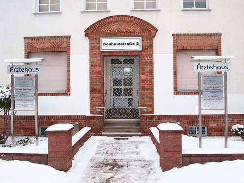
ITC Bauhausstraße 2

It might disappoint you vastly but the initial Bauhaus manifest 1919 and most of their printed matter in early years were set in art-nouveau flavoured seriffed faces, in the case below Ohio by Schriftguss AG/Brüder Butter. Back then one had to content oneself with the fonts a printer had in stock.

Bauhaus Weimar 1919

Later the typefaces chosen better complied with the ideas of the New Typography:
a clear, modern, industrial atmosphere achieved with anonymously designed, rather dark Grotesque faces — stripped of all unneccessary decorative elements.
A font often used f.e. was Breite Halbfette Grotesk by Schelter & Giesecke, recently revived as FF Bau by Christian Schwartz. Others were Ideal-Grotesk and Venus, recycled in Monotype Grotesque.

Grotesk breit hfett Grotesk breit mager vor 1900

above: Breite Halbfette Grotesk by Schelter & Gieseke ca. 1895
below: Venus by Bauer, 1907 and Ideal-Grotesk by Klinkhardt, 1908 

Venus hfett 1907Ideal-Grotesk Seemann

But the typographic ideas of the Bauhaus, above all Herbert Bayer and Joost Schmidt, went further. The radical constructivist designs we now immediately connect with “Bauhaus” however were only carried out in drafts, drawings and lettering, never in a typeface.
Paul Renners Futura was clearly inspired by the concepts of the Bauhaus (see alternative letters) but came out not earlier than 1928. Then however it was accepted as the “type of our time”.

futura1927

The typeface ITC Bauhaus is a design from 1975 by Ed Benguiat and Victor Caruso inspired by the ideas of Bayer, Schmidt et al, but it is not a revival of any Bauhaus design.

So, what typefaces should we choose to be more imaginative?

Typefaces like the ones used by the Bauhaus: for example
FF Bau, VenusMonotype GrotesqueBasic CommercialGothic 726ARS Region

Geometric, contructivist typefaces based on the design ideas of the Bauhaus:
AlbersBayer UniversalJoostErbarFuturaDessauNeuzeitNobelSuper and more Futura alternatives like Avenir, Faricy, Superla, Twentieth Century.

Also check out this Bauhaus-fontlist at FontShop.


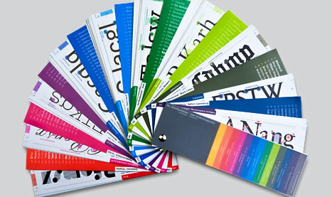
Ein Schriftfächer-Klassifikations-Musterbuch

Ende letzten Jahres wurde ein neuer Schriftfächer von seinen Autoren auf typografie.info vorgestellt. Thomas Kunz hat nun dankenswerterweise eine Liste der vorgestellten Schriften veröffentlich.

facher

So viele verschiedene Gruppen sehen in bunt toll aus. Aber die Einteilung finde ich nicht in allen Punkten toll, die ersten beiden Bezeichnungen eher unglücklich gewählt. »Schriften vor Gutenberg« sind natürlich zeitgenössische Interpretationen wie z.B. Carolina, Duc de Berry uws. Aber warum dann nicht auch Ondine? Diese steckt bei den Breitfeder-Schriften.

Anstatt des Begriffs »gotisierende Schriften« fände ich »gebrochene Schriften« weniger missverständlich, vor allem, da sich so bizarr klingende Unterkategorien wie gotisierende Renaissance-Schriften und gotisierende gotische Schriften ergeben.

Auch bei den einfacher benannten Gruppen würde ich einiges anders zuordnen, More

Die tollsten Schriften des Jahres* (Teil 3)

* und andere typografische Ereignisse

Ich musste noch ein bisschen warten mit dem dritten Teil, sonst wäre die Serie nicht komplett. Aber der Reihe nach.

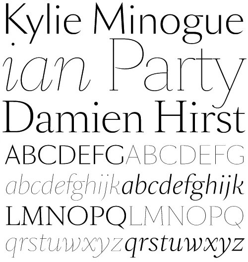
Mein Impulskauf des Jahres war die SangBleu von B & P. Die elegante Sippe (Sans und Serif) beruht auf einer anderen Schrift von Ian Party, die ich ebenfalls sehr mag, der Romain. Da sie ursprünglich für das Magazin gleichen Namens gestaltet wurde, gibt es auch sehr leichte und extrem schmale Display-Schnitte, die sich nur für ganz groß eignen. Die Serifenlose ist eine gute Alternative zur abgenudelten Optima (hallo Kosmetikhersteller!). Ich habe sie jedoch noch nirgendswo einsetzten können, irgendwie passt sie immer nicht recht, die Diva.

Sangbleu

Zwei neue Schrift-Info-Websiten gingen online. Erstens Typedia, ein ehrenwertes wiki-Projekt von Jason Santa Maria, in das alle Nutzer gemeinschaftlich Informationen und Muster zu Schriften einstellen. Es hat jedoch etwas gedauert, bis ich mich auf der Seite zurecht gefunden habe. Besonders die sehr seltsame Schriftklassifikation irritierte mich (inzwischen etwas verbessert), war aber eine gute Anregung, die anglo-amerikanischen Begriffe und Schubladen eingehender zu studieren. Auf der Seite tummeln sich zwar vor allem tausende Spaß-Schriften und freefonts und weniger ernstzunehmende Klassiker, trotzdem editiere ich ständig zwischendurch Einträge, vor allem “good deeds” – Vorsicht, ein Zeitkiller.

Myfonts hat nun einen deutschen Ableger, der mit Interviews und Hintergrundberichten locken möchte. Jan Middendorp, bereits Editor des englischen Newsletter, hat weitere Größen der deutschen Schriftszene ins Boot geholt, u.a. einen der besten, den wir auf dem Gebiet der Hand-/Schriften und Fonterkennung haben: Florian Hardwig.

Eines der größten Themen des Jahres war sicherlich die Diskussion um webfonts. Darüber habe ich ja schon in meinem typekit-Experiment berichtet und es finden sich Beiträge auf nahezu allen einschlägigen Seiten, z.B. bei Ilovetypography eine gute Zusammenfassung oder die Podiumsdiskussion der TypeCon auf der seit April diesen Jahres neu gestalteten typographica.org-Seite. Dan Reynolds wagte eine Vorhersage für 2010.

Im Herbst heiratet Mrs. Eaves nicht nur ihren Mr. Eaves, sondern es zog gleich noch ein Verwandter mit ein: Mr. Eaves Modern. Ich bin begeistert.

mr+mrs eaves Schriftmuster von FontShop

Für meine zweite echte Schrift-Liebe des Jahres musste ich jedoch bis Dezember warten: FF Yoga Serif + Sans von Xavier Dupré. Sie ist ein gelungenes »Best-of« einiger meiner Lieblingsschriften mit unübersehbarem Einflüssen: Smeijers-Punzen, Majoor-Serifen, Gill-Sans, bisschen Unger … da gibt es viel zu entdecken. Im Moment ist sie in nur zwei Gewichten lieferbar, regular und bold, je mit Kursiven und Kapitälchen. Das finde ich in Zeiten von endloser Interpolation erfrischend, da es mal wieder zu einer klaren typografischen Hierarchie herausfordert. Ich denke jedoch, dass das nicht ewig so bleiben wird, Display-Schnitte zumindest sind bereits in Arbeit.

Die Antiqua ist recht kräftig, dabei luftig zugerichtet und mit üppigem Wortabstand – somit klar auf Lesetext in kleinen Graden ausgerichtet und aufgrund der stabilen Serifen und Proportionen auch gut für Zeitungs- und Magazinsatz geeignet. Für Bücher sowieso. Die außergewöhnlichen Details (z.B. das g-Ohr) kommen dann in großen Größen toll zur Geltung, man kann die Yoga also auch gut für Überschriften und Display Anwendungen einsetzen. Bei beiden, Sans und Serif, würde ich aber die Laufweite etwas verringern und den Wortabstand verkleinern, macht sie knackiger.

Was ein guter Abschluss eines tollen Typo-Jahres!

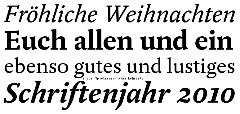
Fröhliche Yoga

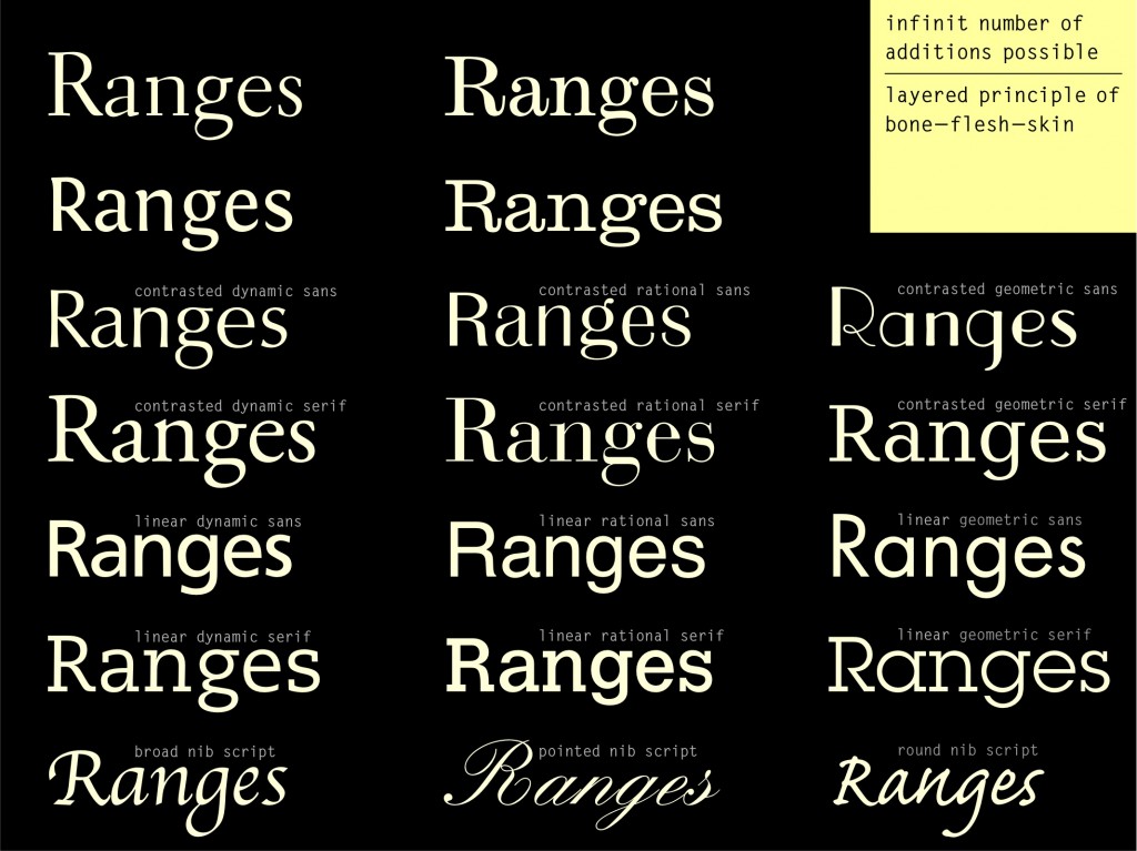
Schriftklassifikation in a nutshell

Meine Einteilung nach Formprinzip habe ich 1998 im DIN-Ausschuss zur Klassifikation der Schriften vorgestellt. Dort lernte ich auch Max Bollwage und Hans Peter Willberg kennen, die später mein Konzept in ihre Büchern übernommen haben.

Hier eine Passage aus meinem Buch Buchstaben kommen selten allein (gekürzt).

Worin unterscheiden sich Schriften?
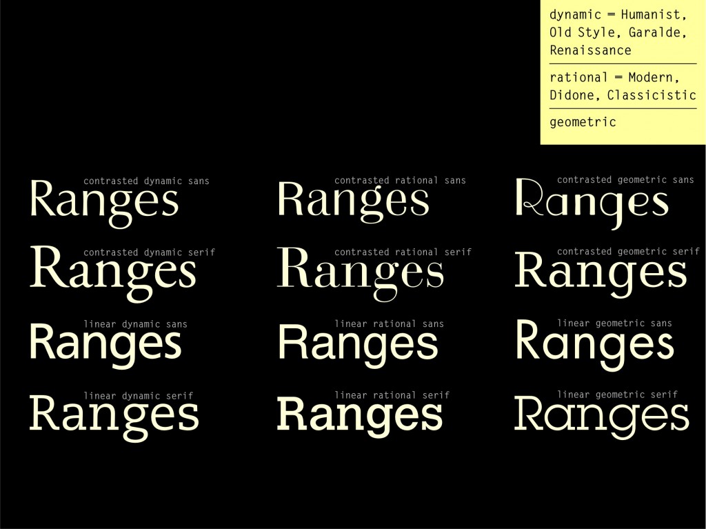
Am augenscheinlichsten kann man zwischen Serifenschriften und Serifenlosen unterscheiden. Das zweite wichtige Merkmal ist ihr Strichkontrast und dessen Verlauf im Buchstaben. Dabei kann man drei verschiedene Grundprinzipien erkennen:
1. von dem Schreiben mit der Breitfeder ausgehend (Renaissance-Charakter, dynamisches Formprinzip, Translation)
2. von der Spitzfeder herrührend (klassizistischer Charakter, statisches Formprinzip, Expansion)
3. von der Redisfeder inspiriert (konstruierter Charakter, geometrisches Formprinzip, kein Strichkontrast)

dynamisches Formprinzip:
schräge Kontrastachse, offene, runde Formen des a, c und e, zweibäuchiges g, schräger Strichansatz, differenzierte organische Form. Versalien orientieren sich in Form und Proportion an der römischen Kapitalis, gerader diagonalen Abstrich bei R.
Diese Merkmale gelten auch bei Verringerung des Kontrasts und dem Verstärken oder Weglassen der Serifen.
typische Vertreter: Garamond, Barmeno, Syntax, Caecilia, Swift

statisches Formprinzip:
gerade Kontrastachse, hoher Strichkontrast, statische, geschlossene Buchstabenformen sichtbar bei R, a, e und s, regelmäßige, ähnliche Formen z.B. bei b, d, q und p. Versalien sind alle ähnlich breit, Abstrich des R geht gerundet nach unten. Diese Merkmale gelten auch für die Serifenbetonten und Groteskschriften ohne Strichkontrast.
typische Vertreter: Bodoni, Britannica, Helvetica, Boton, Clarendon

geometrisches Formprinzip:
kein Strichkontrast, konstruierte Formen, O und andere Buchstaben sind optisch zirkelrund. Versalien folgen den Proportionen der Kapitalis, R mit diagonalem Abstrich.
typische Vertreter: Futura, Memphis, Tekton, Isonorm

Klassifikation nach Formprinzip
Die hauptsächlichen Unterscheidungsmerkmale von Schriften sind also die Serifen, gefolgt vom sichtbaren Strichstärkenunterschied. Nach diesen Ausstattungsmerkmalen kann man alle Schriften waagerecht in Hauptgruppen unterteilt. In der Senkrechten wird nach den drei Formprinzipien unterschieden, ergänzt um eine Gruppe für dekorative und weniger eindeutige Schriftentwürfe.

Möchte man zwei Schriften mischen, ist es in der Regel gefahrlos, Vertreter eines Formprinzips zu kombinieren (z.B. Garamond + Syntax). In der Übersicht nebeneinander stehende Schriften, also unterschiedlichen Formprinzips, harmonieren dagegen meist nicht so gut miteinander (z.B. Frutiger + Helvetica).

Click to enlarge

klass2

Formprinzip oder DIN-Klassifikation?
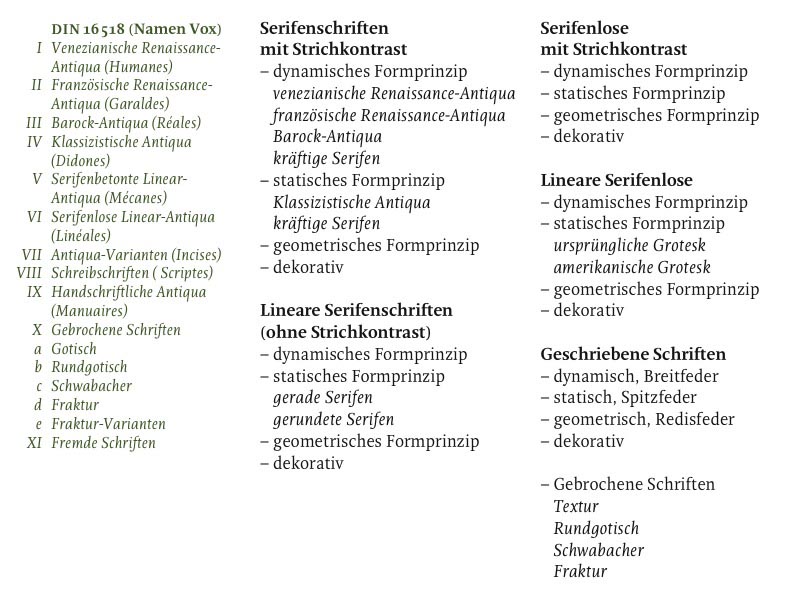
Die Einteilung nach Formprinzip steht im klaren Kontrast zur amtierenden deutschen DIN-Klassifikation 16518 mit ihrer historischen, teils recht groben Einteilung. International findet man noch weitere unterschiedliche Methoden der Klassifikationen und auch jeder Schriftenhersteller strukturiert seine Bibliothek nach eigenen Kriterien. Sehr verbreitet ist die Einteilung von Maximilian Vox, die in den 1960er Jahren Vorbild für die DIN-Klassifikation war. Die Gruppennamen sind für den normalen Anwender jedoch recht schwer nachzuvollziehen.

Die Klassifikation nach Formprinzip lässt sich in der Tiefe um die historisch gewachsenen Untergruppen erweitern. Zum Vergleich links die Einteilung der DIN und Bezeichnung des Vox-Systems.

klassifikation

Noch ein paar Gedanken zur Klassifikation in englisch/some thoughts on classification in english

What typefaces to combine with Helvetica?

Because I was asked this several times in the last months and today this question also appeared on typophile, here are my suggestions (further ideas welcome):

Transitional and Modern Serifs should work quite well with Helvetica, but also Garaldes like Garamond – depends on what kind of atmosphere you aim at. If you are looking for a more human, legible, friendly touch, choose an open typeface from the Garalde subclass like Plantin, Galliard, Swift or Proforma. For more neutrality browse the Transitionals/Baroques like Utopia, Rotation, Farnham. More classy, austere? look in the areas of Modern (bracketed) typefaces. More