Some type genres explained
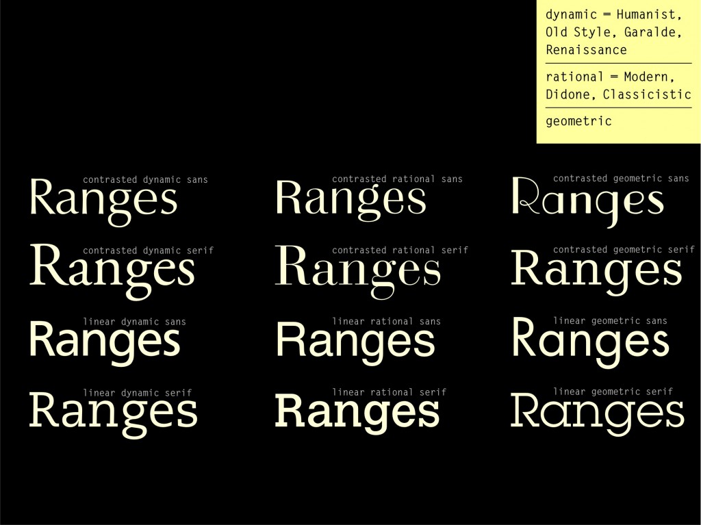
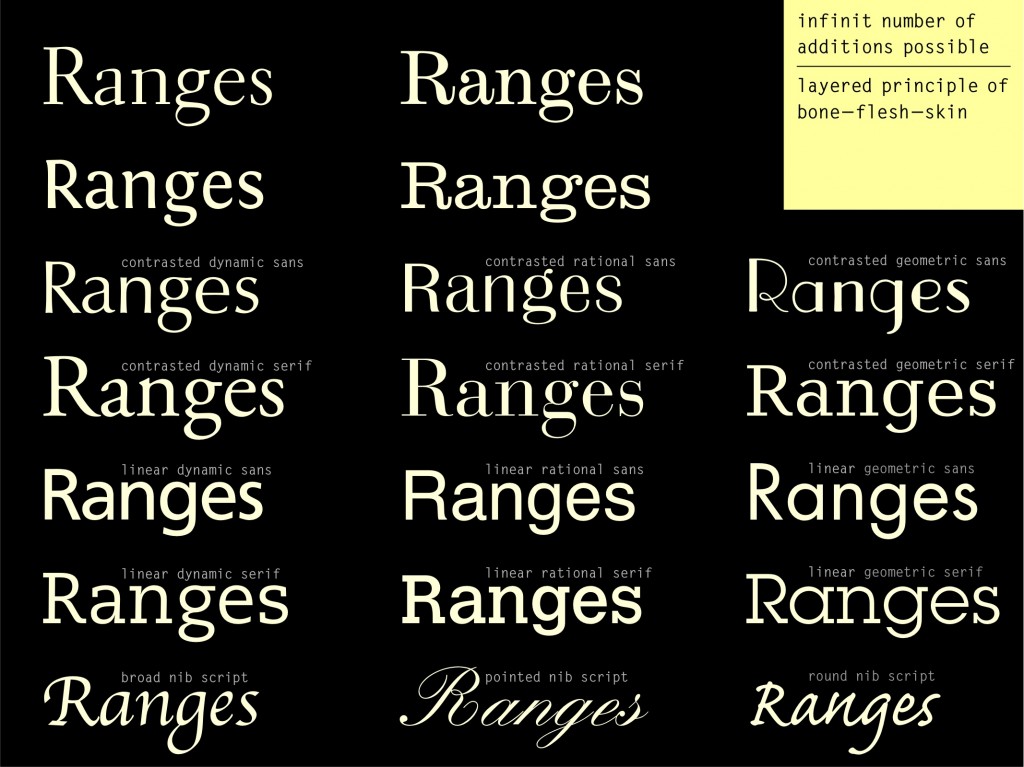
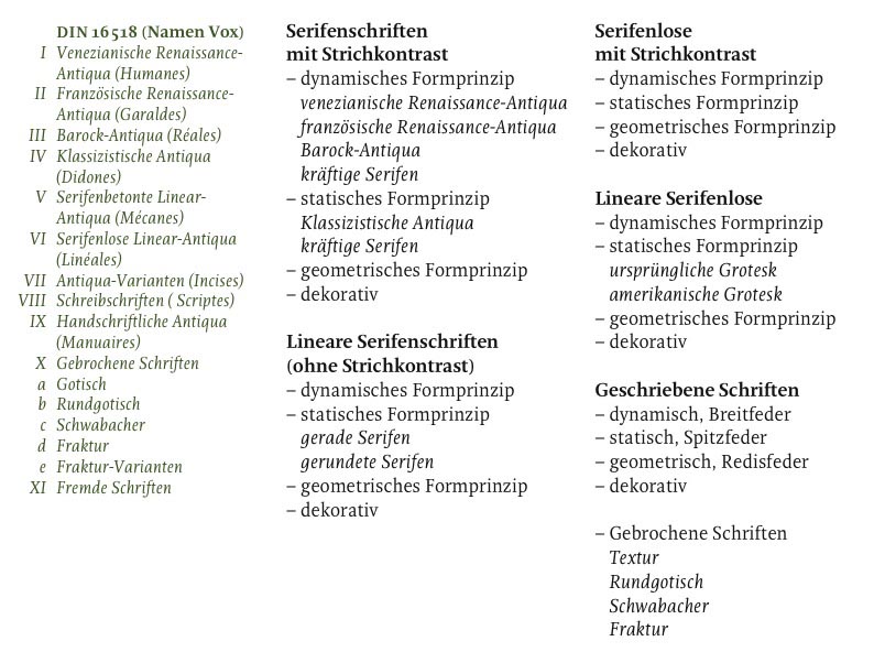
I originally put together this classification for Typedia in early 2012 (before development of a new version of the site was stopped). It was meant to be practical rather than historically waterproof, hopefully not too sophisticated for newbies but with enough groups to aid adding typefaces to the database, and also helping with typeface selection and pairing. Eine Wollmilchsau also, as the Germans say.
1 Serif: humanist, realist, rational, variants, decorative
2 Sans: humanist, grotesque, geometric, variants, decorative
3 Slab: humanist, rational, geometric, variants, decorative
4 Script: Chancery, Roundhand, Handwritten, Decorative
5 Blackletter
6 Pi
1. Serif
1.1 Humanist
The Humanist Serif, also referred to as “Old Style”, is the original form of Roman typefaces developed in the Renaissance period of the 15th century. It can be further divided into the Venetian style, typically with an angled crossbar on the lowercase ‘e’, and the French style, in which the ‘e’ usually has a smaller eye.
Both variants share a gradually modulated, moderate stroke contrast with an oblique stress in the round parts. An axis drawn through the thin parts would be diagonal. The serifs are usually bracketed, sometimes asymmetrical. Top serifs are mostly angular. Apertures are open and character forms are diverse. Capitals follow the proportions of inscriptional Roman letterforms (Capitalis) and are of varied width. The ‘R’ has a diagonal leg, typically relatively long. Italics are similar to the Chancery Script.
The Humanist, or “dynamic” form model is derived from writing with a broad-nib pen held at a consistent angle. This principle is called “translation”. The Vox classification uses the term “Garalde” for this style, derived from the names of the most iconic printers of the 15th century: Claude Garamond and Aldus Manutius. Occasionally, the term “Aldine” is used.
Examples: Jenson, Garamond
1.2 Realist
The Realist Serif, often called “Transitional”, fits somewhere between the Humanist style of the Renaissance and the modern, Rationalist form model of the Neoclassical period. It is also sometimes referred to as “Baroque”.
Its key characteristics are an increased contrast, mostly vertical stress, and more regular letterforms and proportions – a gradual rationalization away from forms that resemble handwriting. In the Realist form model, traces of the broad-nib pen can still be seen, yet the angle of the pen varies. This principle is called “rotation”.
Apertures are slightly reduced, the leg of the ‘R’ is straightened but is still mostly diagonal, serifs are bracketed, and terminals often lachrymal (bulbous tear drops). The capitals are of more consistent width and the x-height is generally larger.
Examples: Caslon, Baskerville
1.3 Rational
The Rational Serif, also called “Modern” or “Neoclassical”, is traditionally characterized by a strong, vertical stroke contrast between thick vertical stems and fine horizontal hairlines. Serifs are horizontal, either thin and abrupt, or bracketed, as in the “Scotch” subcategory.
The letterforms are consistently structured, similar in proportion and details, and often feature ball terminals. Capitals are more narrow and of approximately the same width. Apertures are relatively closed. Italics are similar to the Roundhand script. These characteristics are retained even when the contrast decreases.
The Rational, or “static” form model, with its rather unmodulated contrast, is the result or writing with a pointed pen. The nib spreads in relation to the pressure applied during a downstroke, while other strokes remain thin. This principle is called “expansion”. The Vox Classification uses the term “Didone”, derived from the names of the famous printers Firmin Didot and Giambattista Bodoni
Examples: Bodoni, Scotch Roman
1.4 Variants
This group covers serif typefaces based on early scribal, incised, and inscriptional forms. These include Rustica, Uncial, Gaelic, and other typefaces of indistinct or mixed form models. Typefaces with very small “spur serifs” can also belong here.
Uncial is a Celtic style of calligraphic script with forms created by a broad-nibbed pen at an almost horizontal angle, but sometimes more tilted in later variants. There are no separate upper- and lowercase forms in pure Uncial designs — roman lowercase letters with ascenders and descenders developed from the Uncial and half-Uncial forms of the Middle Ages.
Examples: Albertus, Copperplate, American Uncial
1.5 Decorative
Decorative typefaces are usually too expressive or detailed to be used at small text sizes and are therefore also referred to as “Display”. In terms of appearance, they can be tooled, engraved, shaded, inlined, outlined, ornate, or whimsical. They can be constructed from non-typographical forms (such as objects and shapes) or rendered using non-traditional techniques (scraping, scratching, etc.)
Example: Caslon Open Face [not a great Example :]
2. Sans Serif
2.1 Humanist
The Humanist Sans follows a similar dynamic form model as the Humanist Serif of the Renaissance, with open apertures and letterforms of diverse proportions. The first typefaces in this style appeared in the early 20th century during a calligraphic resurgence to overcome what some saw was an excess of Victorian eclecticism. This movement was spearheaded by Edward Johnston in England and manifested in his design for the London Underground 1916. The typeface by his student Eric Gill from 1928 is regarded as the first popular example of the Humanist Sans style.
The capitals are of varied width, the ‘R’ has a diagonal leg, the ‘O’ is nearly a perfect circle, the ‘g’ is of double-storey form. Italics are often “true italics” of the original cursive form with, for instance, a moderate angle, narrower in width, a single-storey ‘a’ and ‘g’, and sometimes a descending ‘f’.
Examples: Gill Sans, Syntax
2.2 Grotesque
The sans-serif typefaces that first appeared in the catalog of English printers in the early 19th century were derided at the time as “grotesque”. But the style was only new to printing — sans-serif letterforms had already been used in lettering and inscriptions. William Caslon’s caps-only English Egyptian of 1816 is regarded as the earliest sans-serif font. The name has nothing to do with slab-serif type (in the way we use the word “Egyptian” today) — it refers instead to the fashion of the era for anything associated with Egypt. The Vox classification uses the term “Lineal”.
The characteristics of Grotesque typefaces are analogous to the Realist and Rational serif: regular proportions, caps of similar width, relatively static forms based on the oval, and closed apertures in letters like ‘C’, ‘G’, ‘a’, and ‘e’. One can also distinguish between the original, Realist sans serif — often referred to as “Gothic” or “industrial” — and the subsequent Rationalist “Neo-Grotesque” or “Grotesk” of the 20th century, especially popular in continental Europe.
While the Realist Gothic has generally narrower proportions, featuring an ‘R’ with diagonal leg and a two-storey ‘g’, the Rationalist Grotesk is wider, more consistent and even in letter shapes. The leg of the ‘R’ is mostly vertical and the ‘g’ is single-storey. Italics of both Grotesque variants are usually oblique romans with no cursive forms of ‘a’, ‘e’, ‘g’, etc.
Examples: Franklin Gothic, Helvetica
2.3 Geometric
The Geometric Sans developed in the 1920s in Germany in the attempt to find a letterform that better expresses the ideas of the Bauhaus and industrialization than did the “undesigned” vernacular Grotesques. Still, the most radical designs — such as those by Herbert Bayer and Joost Schmidt — were not executed as typefaces at the time.
The character shapes are “constructed” out of (optically corrected) geometric forms with circular round parts and usually very little stroke contrast. The ‘a’ and ‘g’ are usually single-storey, though the double-storey form of ‘a’ is found, too (as in one of the earliest Geometric typefaces by Jakob Erbar). The character width is diverse, with capitals following the proportions of the Roman Capitalis, and an ‘R’ with a diagonal leg. Italics are oblique romans with little more than optical adaptations.
Other typefaces in this category have square forms, based on a rectangle rather than a circle, or built up of other modular elements.
Examples: Futura, Bank Gothic
2.4 Variants
Variants of sans serifs include typefaces with clearly visible stroke contrast or tapered stems, often called “stressed” sans serifs.
Examples: Optima, Britannic
2.5 Decorative
Decorative sans serifs are usually too expressive or detailed to be used at small text sizes and are therefore also referred to as Display typefaces. In terms of appearance, they can be tooled, engraved, shaded, inlined, outlined, ornate, or whimsical. They can be constructed from non-typographical forms such as objects and shapes) or rendered using non-traditional techniques (scraping, scratching, etc.)
Example: Bernhard Fashion
3. Slab Serif
3.1 Humanist
Humanist Slab Serifs, just like their serif and sans-serif relatives, are based on the dynamic, Humanist form model. The stroke contrast is very low and serifs are straight or slightly bracketed. Apertures are generally open and proportions of the letterforms diverse.
The capitals are of varied width, the ‘R’ has a diagonal leg, the ‘g‘ is of double-storey form, and the ‘O’ is mostly a circle. Italics are often moderately slanted “true italics” derived from the original cursive form of ‘e’, single-storey ‘a’ and ‘g’, descending ‘f’, and narrower proportions.
Examples: PMN Caecilia, Chaparral
3.2 Rational
Rational Slab Serifs are characterized by heavy serifs that are almost the same thickness as the main strokes. They can be subdivided into two main groups: those with visible stroke contrast and bracketed serifs, and those with linear strokes and unbracketed, square serifs. Both styles were developed in the early 19th century in the course of a rising demand for eye-catching display and advertising typefaces. They share the Rational form model with closed apertures and consistent, generally broad proportions.
The group with low stroke contrast and bracketed serifs is often called “Clarendon” or “Egizian” after the genre’s most iconic typefaces. The ‘R’ has a vertical, curved tail; terminals of the ‘a’ and ‘g’ are often ball-shaped. The stress axis is vertical.
The linear, square-seriffed variant is called “Egyptian” or “Egyptienne”, probably derived from the widespread fascination for Egypt after Napoleon’s campaign around 1800. Especially in the US, the name “Antique” may be used to distinguish slab serifs from early sans serifs which were previously also called “Egyptian”. The Vox classification refers to all slab serifs as “Mécanes”.
Examples: Clarendon, Serifa
3.3 Geometric
The Geometric Slab Serif, like its sans-serif relative, is based on constructed, often modular geometric forms — either circular, oval, or rectangular. The ‘a’ and ‘g’ are usually of single-storey form. The ‘R’ has a straight, diagonal leg. Unlike most Geometric sans serifs, the characters are usually of consistent width which stresses the mechanical, technical impression. All strokes are of visually equal thickness and serifs are mostly square and unbracketed.
Examples: Memphis, Lubalin Graph
3.4 Decorative
There is a rich and abundant history of decorative and ornamented slab-serif display type designed in the 19th and early 20th century for posters and other jobbing work. These typefaces were especially flourishing in the United States and were usually produced as wood type since large sizes would become too heavy, expensive, and difficult to cast in metal. Unfortunately, the terminology used in the past and present to describe these designs is confusing and almost arbitrary.
The serifs of these display types can either be bracketed or square, furcated, or otherwise ornate. The letters are often shaded, tooled, or decorated with lines, pearls, or spurs. Some typefaces are intended for “chromatic” use, meaning two or more corresponding fonts are designed to be printed on top of each other to allow for multicolor text (eg. Rosewood and Rosewood Fill).
A common variant is the “reverse contrast” slab serif, also called “Italienne” or “French Antique” (without bracketing), and “French Clarendon” or “Aldine” (with bracketing): horizontal strokes and serifs are thicker than the stems. This results in the typical “Western” look where these kinds of typefaces were often used for playbills and posters.
The Tuscan style features furcated (split) or ornate serifs, stroke contrast (normal or reverse), and often a mid-stem decoration, for instance a spur.
The name “Latin” labels typefaces with heavy, triangular serifs.
Examples: Playbill, Thunderbird, Latin
4. Script
4.1 Chancery
The Chancery Script — sometimes also called “Cancellaresca” — is rooted in broad-nib calligraphy of the Renaissance period. It is based on cursive handwriting of the 15th and 16th century developed in Italy, hence the alternative term “italic”. Master calligraphers such as Arrighi, Palatino, and Tagliente published writing manuals to populate the “italic hand”.
The letters are only slightly slanted (or upright) and written with the pen held at a consistent 30°–45° angle. The stroke contrast is modulated and moderate. Letterforms are rather narrow, sometimes angular and sharp edged, similar to the italic styles in Humanist Serifs.
Example: Zapf Chancery
4.2 Roundhand
The Roundhand script is based on pointed-pen calligraphy and connected with the Baroque and Classicist style periods. It was developed in England in the late 17th century and widely popular throughout Europe and North America thereafter, propagated by writing masters like Shelley, Bickham, or Snell. It is also called “Spencerian” or “Copperplate Script”.
The stroke contrast, or rather the thick strokes, are achieved by putting pressure on the pen during a down stroke. All connecting hairlines and upstrokes are thin, and the slant is usually steep. This results in high contrast, narrow, oval forms with round connections and rich flourishing and ornamentation.
Examples: Snell Roundhand, Künstler Script
4.3 Handwritten, Brush
These are casual script styles that don’t closely follow traditional calligraphic models. They can be written with various tools and letterforms can be upright or slanted, connected or loose.
Examples: Caflisch Script, Brush Script
4.4 Decorative
Even more casual than handwritten typefaces, decorative scripts can mimic various lettering styles and techniques. They can be sketched, tooled engraved, shaded, inlined, outlined, ornate, whimsical or rendered using non-traditional techniques (scraping, scratching, constructed with geometric shapes, etc.)
Examples: Allegro, Futura Script
5. Blackletter
In Blackletter typefaces — also referred to as “broken script” or “Gothic” — some or all round parts of the letters are “broken” into straight strokes. This style was gradually developed in Medieval scriptoria so scribes could copy manuscripts faster than in the previously common Carolingian Minuscule hand. While the Humanist Serifs superseded Blackletter in Southern Europe during the Renaissance, the blackletter style — especially Fraktur — continued to be widely used in German speaking countries until the mid-20th century.
There are four subcategories of Blackletter typefaces:
Textura, also Textualis or Old English, is the oldest variant in which all round forms are “broken” into straight strokes. The terminals are triangular and capitals are usually ornamented. This results in a narrow, repetitive texture and a generally dark and densely written page — hence the name Textura. It was also the style of the first typeface cut and cast by Gutenberg in the mid 15th century.
Rotunda is the most round and simple variant and closely related to the Carolingian hand.
Schwabacher features partly straight, partly round forms. The ‘g’ has a unique design with a horizontal top stroke. The ‘o’ resembles a pointy oval.
Fraktur is the latest variant of Blackletter. Letterforms like ‘a’, ‘g’, ‘d’ or ‘o’ are round on one side and straight on the other. Terminals are triangular and ascenders often split. Many characters have unusual forms and are often confused by unfamiliar readers, for instance ‘B’ with ‘V’, ‘N’ with ‘R’, ‘I’ with ‘J’, the long form of ‘s’ with ‘f’, ‘k’ with ‘t’, ‘y’ with ‘h’, or ‘r’ with ‘x’.
Examples: Old English, Fette Fraktur
6. Pi, Dingbats, Ornaments
Non-alphabetic fonts containing symbols, pictures, emoji, shapes, or ornaments, etc.
Examples: Zapf Dingbats, Symbol


