I have long been thinking about ways to better assess the quality of different typefaces. With so many to choose from, students, graphic designers, even laypeople, often have to compare fonts to find the fitting ones for their work. But how should one do that? Leaving mere taste aside, what are some concrete criteria for good quality typefaces?.
The following is a work-in-progress draft. It currently includes points both for users of type as well as designers of typefaces. I may split this up in future versions of this list but it’s also educational for users to see what designers of type have to keep in mind.
Features of “good” fonts
– Good technical quality of the drawing/outlines, e.g. continuous curves, even rounds, no bumps or corners where straights enter curves. Only visible in the outlines: curve and tangent points placed at optimal positions, optimal balance of off-curve points, no superfluous on-curve points
– Even stroke thickness fitting the design of the typeface
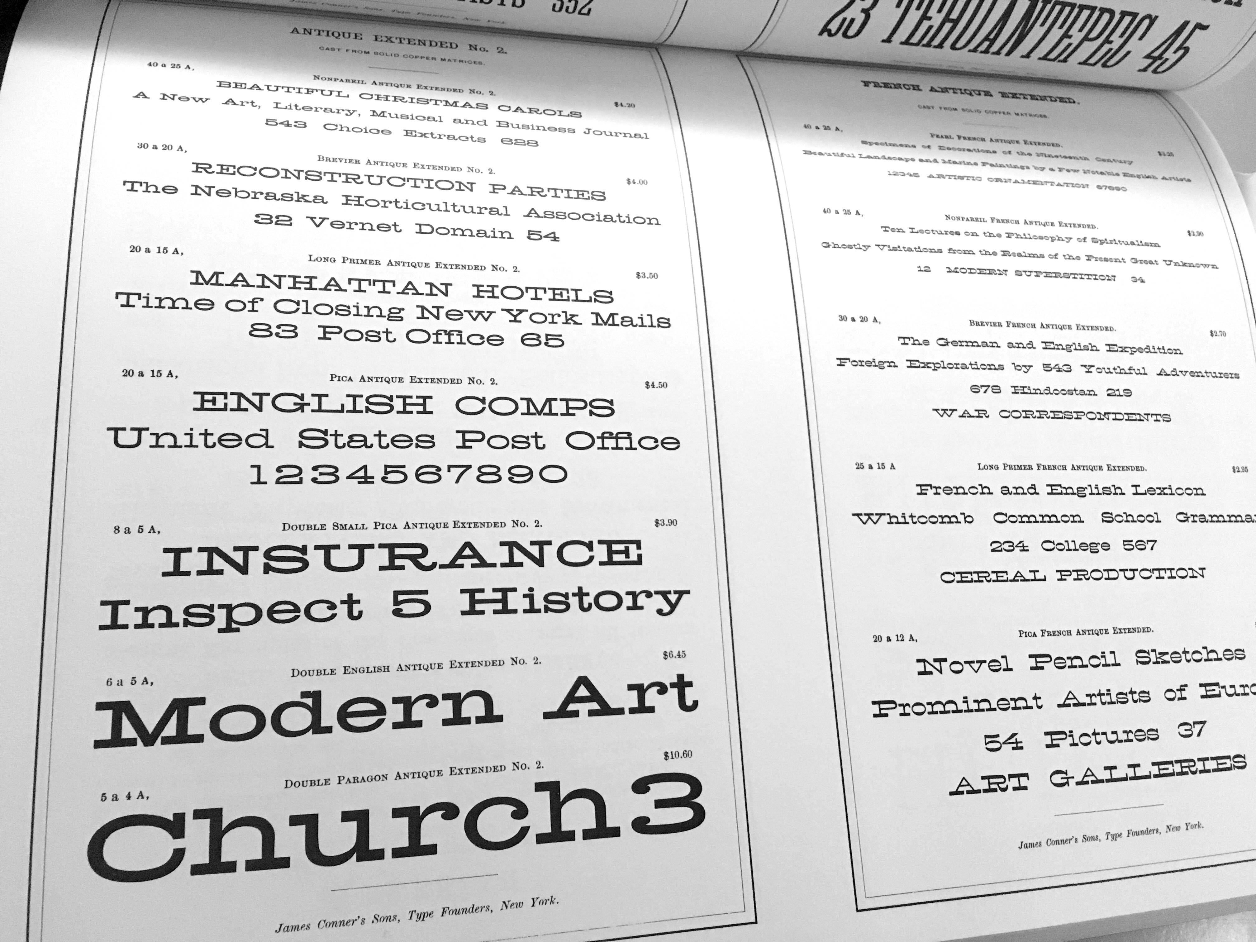
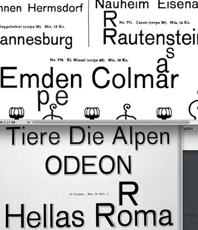
– Related proportions of related characters (n/m/h, b/d/p/q, O/C/G/Q etc.)
– Similar detailing across characters (treatment of related serifs, bowls, extenders)
– Optical compensation, e.g. larger rounds, overshoots, thinning of strokes at joints, optical middle, making verticals thicker etc.
– Harmonious spacing that fits the design, i.e. fitting the size of counters, optically even space between all glyphs, not too tight or too loose (depending on intended size of use)
– Individual spacing adjustment of tricky letter combinations where needed (= kerning). A high number of kerning pairs does not equal high-quality; it may in fact indicate spacing flaws
– Wordspace that fits proportions of the design. Many low-quality free fonts forget to even set the wordspace.
– Completeness of character-set for the task and language at hand, e.g. missing basic accented characters like umlauts, ß or œ/æ
– Fitting design of auxiliary characters like punctuation, numerals, currency symbols etc. (and not just copied over from other fonts)
– Appropriate vertical dimensions, i.e. no clipping, no overlapping extenders when set solid, not too much line spacing
– Functioning OpenType features, if included, that follow the OT-specifications
– Well-designed diacritical characters that meet standards of native speakers, e.g. regarding size and position of accents, appropriate [historical] form of diacritics that fit the design
– Basic, if only automatic, hinting for reasonable rendering on Windows systems
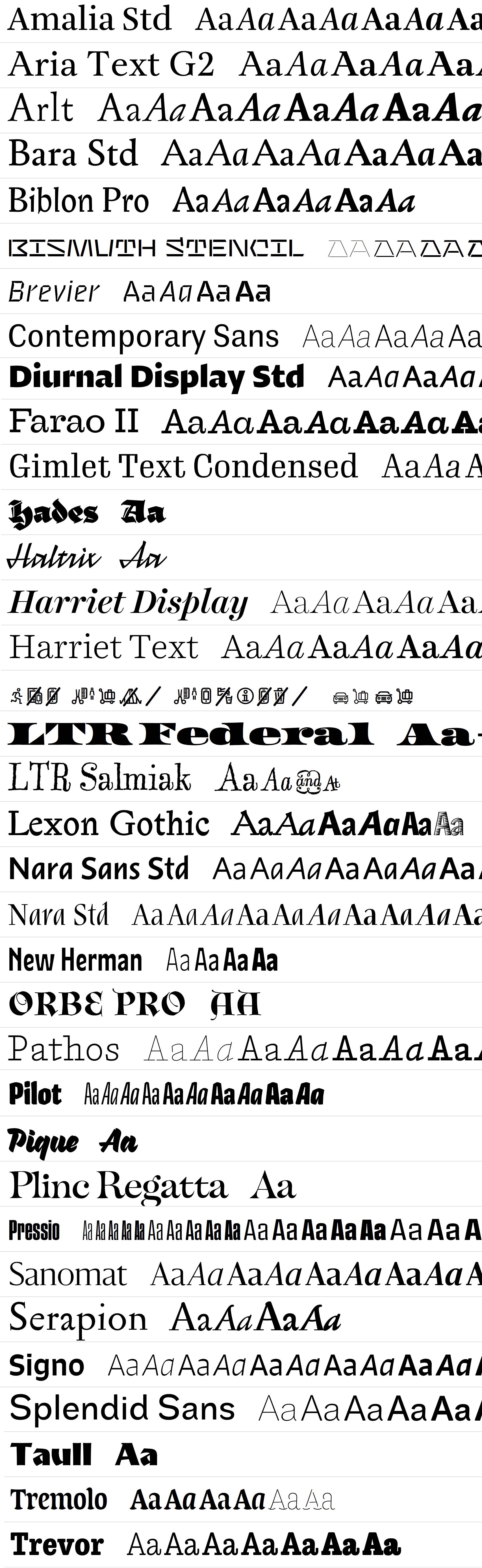
– Related styles that fit together as a family, share design details and proportions. Just one single weight makes a typeface less useful for more complex design
More subjective things to consider:
– Does the typeface meet the design goals of its designer/publisher and does it live up to its marketing claims? For instance, is it suitable for body copy and small sizes, if they say so, or working well in large sizes and headlines as is?
– Is the typeface offered at a suspiciously low price point that could let you assume not that much work has been put into it?
– Does the typeface come from a font sharing website (potentially illegal), a free fonts website, or an otherwise less commercially established outlet?
– Is the design based on outlines by somebody else that were slightly tweaked or stylistic filters have been applied to? Does it carry a name that may indicate closeness to another design?
Criteria that font user can’t assess easily but that type designers should consider:
– Is it a unique design idea that adds something new to the pool of available typefaces?
– Is it a revival of a previously designed/released typeface that was not available digitally, or only in low quality, or incomplete?
– Does the designer have the right to base their work on previously existing forms by someone else, release them, or use a particular name for their typeface?
And then there are, of course, typefaces that are intentionally designed to be weird, wonky, imperfect, distressed, uneven, casual or handmade etc. They are not meant to be evaluated by the same set of technical criteria, but you get the idea.
Regarding taste: “If there were an individual, readily recognized quality or characteristic which the type designer could incorporate in drawings that would make any one type more beautiful, legible, or distinguished than another, it is obvious that only type of that kind would be designed.” — Frederic W. Goudy (via John Savard)
That would be very sad. So experiment away, but still make, and use, typefaces that work well for a given task and are worth the effort.
Some resources:
Underware’s Type Workshop
Briem’s Notes on type design
Microsoft’s Character design standards (how to design certain glyphs)
Bezier Curves and Type Design: A Tutorial
Tal Lemming’s OpenType Cookbook
Diacritics – All you need to design a font with correct accents
The Insect Project – Problems of Diacritic Design for Central European Languages
Context of Diacritics
Cyrillic Type Design: a Critical Context
The relatively easy way to find out the quality of a Cyrillic typeface
Adobe Latin Character Sets
The Raster Tragedy – What is Hinting
Wakamaifondue.com / whatcanmyfontdo.com
FontDrop, to check what is included in a font and how it works
and in a metaphorical sense:
https://blog.lostartpress.com/2018/12/02/deflating-david-pye-50-years-later/
https://blackdogswoodshop.blogspot.com/2018/12/three-things-david-pyes-nature-and-art.html