First read this post from a few years ago. This article here is only about the things we found since. “We” means Dan Reynolds, with who I talked a lot about this topic lately, and me and some other people mentioned in the text.
But to recap in one sentence – there is every reason to believe that Ferdinand Theinhardt has nothing to do with the design of Royal-Grotesk or Akzidenz-Grotesk as they were available at H. Berthold AG, Berlin. Further things that underpin this statement are:
1
A shaded sans called Schattierte Grotesk I found in a Bauer & Co Stuttgart (not the same as the Bauer foundry in Frankfurt) specimen from 1895 that I looked at at UvA’s Special Collections in 2011. It appears to be pretty much AG with drop shadow, which also may mean that there was a version of this sans without shadow somewhere. It would have been quite easy to expand a series by a shaded variant, but coming up with these letterforms just to use them in one specialized display style seems unlikely.
That was what led me to believe some styles of AG, like a light regular weight, may have originated at Bauer & Co. I did not find any in earlier specimens though. I had made a note to double check the date of the specimen because having something like AG in 1895 already would be quite remarkable. It’s always hard to date these books exactly. Then last year, John Lane emailed me that he found a full-page ad for Schattierte Grotesk in an issue of Archiv für Buchgewerbe 33/12 from December 1896 – later but still 11 months before Berthold acquired Bauer & Co, which they did on November 9, 1897 [see Bauer, Chronik der Schriftgießereien]. This dates Schattierte Grotesk to at least 1896, so before any AG action at Berthold. And only three years after Berthold picked up casting typefaces at all, which was in 1893. Before that they only made brass rules.
My very scientific Photoshop analysis of old specimens:
2
An AG showing (one style, 13 sizes) by Bauer & Co and Berthold in Schweizer Graphische Nachrichten from September 1898 that Joep Pohlen found. 1898 is also the date that Berthold had always given, at least since 1921 when their first publication mentioning a date for Accidenz-Grotesk (early spelling with cc) was published. [See image from Berthold chronicle in Part 1]

Sans-serifs were just a small, rather unimportant position among many wild designs that type foundries offered around 1900.


3
Neither Dan nor I could find any documents from the Königliche Akademie der Wissenschaften that were printed in something that looks like Royal-Grotesk – the use case the typeface was allegedly commissioned and made for in 1880. I did not even find a single use of any sans in documents from 1880–1910 that I looked at.
4
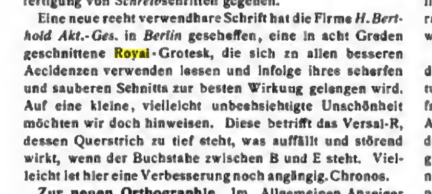
Dan found this mention of Royal-Grotesk in »Schriftprobenschau«, Archiv für Buchgewerbe 40/1, January 1903, S. 19:
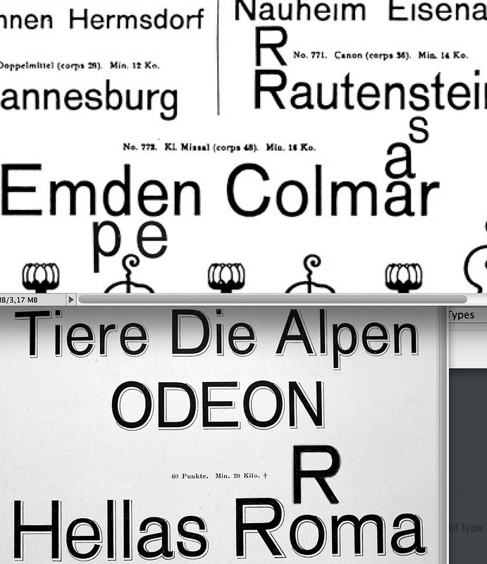
»Eine neue recht verwendbare Schrift hat die Firma H. Berthold Akt.-Ges in Berlin geschaffen, eine in acht Graden geschnittene Royal-Grotesk, die sich zu allen besseren Accidenzen verwenden lassen und infolge ihres scharfen und sauberen Schnitts zur besten Wirkung gelangen wird. Auf eine kleine, vielleicht unbeabsichtigte Unschönheit möchten wir doch hinweisen. Diese betrifft das Versal-R, dessen Querstrich zu tief steht, was auffällt und störend wirkt, wenn der Buchstabe zwischen B und E steht. Vielleicht ist hier eine Verbesserung noch angängig. Chronos.«
So there must have been a Royal-Grotesk available at Berthold in late 1902 or January 1903 – five years before Berthold bought the Theinhardt foundry. But calling it a “new, quite usable typeface” and critique the design doesn’t exactly sound like this font was around since 1880 and used in public documents. Emil Wetzig has 1902 for Royal in Seemann’s Handbuch der Schriftarten, which is not always correct but often a good indicator.
My internet snapshots of said magazine mention from January 1903
Questions still:
– We need to date the Theinhardt foundry specimen — “Hauptprobe. 1892. Gr. 8o (mit mehrfarbigen Titelblättern)” [Jolles] — that was issued sometime between 1890 and 1905. Everyone seems to give a different date for it, or is talking about different editions? Here Henning Krause’s copy and take on the year (he thinks 1890). ESG based his argument on “Neuheiten. Ferd. Theinhardt, Schriftgießerei Berlin-Schöneberg 1. (specimen 8° without title page) without year (ca. 1902)” as his source and remarks that it’s from 1892 but that it did not come into circulation before 1905, according to additional pages in his issue.
– If Berthold only started its type casting business in 1893, did they even employ punchcutters capable of original designs this quickly? Or did they pick up an almost ready series with the acquisition of Bauer. Need to check both companies’ specimen books from before 1897 again.
– No one could ever show any Royal-Grotesk in use from before 1902/3. Where are the Theinhardt-Royal samples when it allegedly was around since 1880? Until someone comes forward with examples or other proof, could we all please stop repeating and regurgitating the Theinhardt story?
– Did anyone ever find a source or mention before GGL’s 1998 lecture and 2003 interview that stated the connection between Theinhardt and RG/AG? Maybe the idea was not even GGL’s, but someone before him? Where did this hunch come from? Just this one late Theinhardt specimen that included AG?
Or did they pick up an almost ready series with the acquisition of Bauer?
Yes. I followed your suggestion and compared the showing of Accidenz-Grotesk as shown in Berthold’s 1900 catalog with Bauer & Co.’s Schattierte Grotesk, which is also in the same Berthold 1900 catalogue. The letterforms in the two typefaces are the same. You were right.
Bauer & Co.’s 1895 catalogue, which features Schattierte Grotesk, does not include any sans serif design that is similar (i.e., they did not have an unschattierte Grotesk). Either they started working on one, and did not finish it before Berthold acquired them, or Berthold saw the Schattierte Grotesk and realized that it might sell well without the drop shadow.
In the Berthold 1900 catalog, the page that shows Schattierte Grotesk includes mention of both H. Berthold in Berlin and Bauer & Co. in Stuttgart on its footer. The Accidenz-Grotesk page only mentions H. Berthold in Berlin. Both pages mention that design patent registrations had been filed for the typefaces (indeed, Bauer & Co.’s 1895 catalog already mentioned this for Schattierte Grotesk). The 1900 Berthold catalog only includes one weight of Accidenz-Grotesk (in 13 sizes). Later Berthold catalogs, from e.g. 1909, include several weights of Accidenz-Grotesk, as well as one weight (presumably the only weight ever made) of Royal-Grotesk. Already in that 1909 catalogue, a small passage of text mentions that Royal-Grotesk can be combined with Accidenz-Grotesk in text. At some point after the 1950s, Berthold renamed Royal-Grotesk as Akzidenz-Grotesk mager, finally bringing it “into” the family.
I should reiterate, so that it is on the Internet for people to read, that you have believed for many years that the source for Akzidenz-Grotesk must have laid with Bauer & Co. in Stuttgart, and not with Ferdinand Theinhardt in Berlin. In this hypothesis, I believe that you were very correct.
Thanks for looking into this and the confirmation, Dan!
For you others, here is the release note of Schattierte Grotesk by Bauer & Co in Archive für Buchgewerbe issue 12, volume 33, December 1896
»Die Schriftgiesserei Bauer & Co., Stuttgart und Düsseldorf, veröffentlicht unter den heutigen Schriftproben eine schattierte Grotesk und bietet unseren Lesern mit dieser Schrift ein beliebtes, sehr verwendbares Material, das sich in ähnlicher, älterer Ausführung seit jeher einen Platz auf allen guten Accidenzien erworben hat.«
Text: https://archive.org/stream/archivfrbuchgew00unkngoog#page/n473/mode/2up/search/schattierte
Full-page ad: https://archive.org/stream/archivfrbuchgew00unkngoog#page/n475/mode/2up/search/schattierte
Just for me to recap the timeline of things that we know (may add to this later):
– 1893 Berthold expands business into type founding
– 1895 Schattierte Grotesk Bauer & Co in specimen book
– 1896 Bücher-Grotesk at Berthold (later AG condensed)
– Nov 1897 Berthold acquires Bauer & Co
– 1898 release of first styles under name Accidenz-Grotesk
– Sept 1898 joint ad showing AG in Schweitzer Graphische Nachrichten
– 1899 joint AG ad in Deutsche Buch- und Steindrucker
– 1900 Berthold (+ Bauer) Probe showing AG and Schattierte Grotesk
– late 1902 release of Royal-Grotesk?
– Jan 1903 release note for Royal-Grotesk in Archiv für Buchgewerbe
– 1908 Berthold acquires Theinhardt foundry (and add their offerings to the Theinhardt specimen book of 1908/09)
1898 release of first styles under name Accidenz-Grotesk
Instead of styles, I would write style or sizes here. Since the 1898 and 1898 ads just show different sizes of one style of Accidenz-Grotesk (what would later be the “Regular” weight of the family), and since the 1900 Berthold catalogue also only shows multiple sizes of one style, I think that the other sizes were added later. As in, sometime between 1900 and 1909ish. Several copies of Berthold catalogues that I have seen, which are attributed by various libraries to either 1909 or 1911, contain the following styles of the “family”:
– Royal-Grotesk [already in 1909/1911, this was promoted in Berthold catalogues as being combinable with Accidenz-Grotesk]
– Accidenz-Grotesk [i.e., the Regular weight]
– Halbfette Accidenz-Grotesk
– Fette Accidenz-Grotesk
– Breite Akzidenz-Grotesk
– Accidenz-Grotesk Skelett
– Breite magere Accidenz-Grotesk
– Schattierte Grotesk
– Royal-Grotesk [Cyrillic version]
– Accidenz-Grotesk [Regular weight of the Cyrillic version]
– Schattierte Grotesk [Cyrillic version]
That is the order that the fonts appear in the catalogues, i.e., going by the page numbers. You could just add one more line to your timeline:
– 1911 (at the latest) Berthold type specimen catalogues include fonts of Royal-Grotesk, Accidenz-Grotesk, Halbfette Accidenz-Grotesk, Fette Accidenz-Grotesk, Breite Akzidenz-Grotesk, Accidenz-Grotesk Skelett, Breite magere Accidenz-Grotesk, Schattierte Grotesk, Royal-Grotesk Russisch, Accidenz-Grotesk Russich, and Schattierte Grotesk Russich.
According to the book 100 Jahre Berthold, from 1958, the very big Berthold type specimen (which some libraries date to 1909 and others to 1911) is from 1911.
Oh yeah I meant style, singular.
I’ll use the comment thread for more updates as we find more proof or new things:
Dan checked the incredibly unreadable OCR of the Deutscher Reichsanzeiger’s German Geschmacksmuster registration announcements and found the entry stating that Berthold registered 13 sizes of Accidenz-Grotesk (regular weight) on 28. April 1898 under the patent number 16504. We suspect that they registered more styles later and that also Theinhardt and Bauer would have registered their designs, we just have to wade through the illegible letter jumble one by one or wait for their OCR machine to significantly improve.
Nr. 16 504. Firma H. Berthold. Messing- linienfabrik und Schriftqießerei, Aktien- Gesellschaft in Berlin. 1 Umschlaxi mit Abhil- dungen von 13 Graden Accidenz-(Hrotrsk, Versiegelt, Flächrnmustrr, Fabriknummern 760-772, Schux- frist 3 Jahre, angemrldet am 282156118945, Na ‚ mittags 12 Uhr 5 Minuten.
As for the time line, I’ll make a new post with it to better be able to update it as we discover new things.
Not only did Ferdinand Theinhardt not cut the punches for Royal-Grotesk or Akzidenz-Grotesk, I am now almost certain that he never cut sans serif type at all.
In the only collection of type specimen from his foundry I have found, which can definitively be dated to the time when he still owned the company, includes just two sans serifs; see the volume with the call number 4″ An 1807 at the Staatsbibliothek in Berlin. The first was simply called Grotesque. This seems to me to be a duplicate of the Moderne Steinschriften types that were created at the Benjamin Krebs Nachfolger typefoundry of Frankfurt am Main, and published in 1865. The second was an italic named Cursiv-Grotesque, which probably came to Theinhardt from the J.H. Rust & Co. foundry of Offenbach am Main and Vienna. Rust had imported the larger sizes of this typeface from America. They then created the three smallest sizes themselves, publishing them in 1875 (all that is reported in the 9 March 1875 issue of Journal für Buchdruckerkunst, Schriftgießerei und verwandte Fächer).
The first bound type specimen catalogue from the Theinhardt foundry dates to the late 1880s or 1890s, after Ferdinand Theinhardt had sold the business. This is a somewhat common catalogue; the Staatsbibliothek in Berlin has it catalogued as RLS Gm 7303, and it is also in the collections of the Kunstbibliothek in Berlin, and the Deutsches Technikmuseum in Berlin. Henning Krause has a copy, and Google has even digitized it – although it is only viewable/downloadable inside the USA, via the Hathi Trust.
That catalogue features six sans serif designs, including the two mentioned above. Of the other four designs, only one was actually created at the Theinhardt foundry, published three to four years after its sale to Oskar Mammen and the Mosig brothers, according to when mention of the typeface first crops up in trade journals. Named Enge fette Grotesque, this was a straight-sided sans serif, with rounded terminals. It bears no relation to any styles of Akzidenz-Grotesk. The remaining three designs were Schmale magere Grotesque, Breite Grotesque, and Breite fette Grotesque.
Where did these come from? Schmale magere Grotesque was a design sold under various names by at least seven other nineteenth-century German foundries. I do not know where it originated. The matrices may have come from Britain or the United States. Breite Grotesque probably came via the Krebs foundry. Krebs had produced the larger sizes for this design in-house; they called it Halbbreite Steinschrift. The typeface was different from the other Breite Grotesques sold by e.g., Ludwig & Mayer and Schelter & Giesecke. I have not found any mentions in primary or secondary sources that suggest who the authors of the Halbbreite Steinschrift design’s smaller sizes might be. I think it is quite likely that Krebs imported them from Britain or the United States, too. The visually unrelated typeface the Theinhardt foundry called Breite fette Grotesque was originally published in the mid-1870s as Zeitung-Grotesk. That came from the Francke foundry in Danzig. Like most of the other sans serifs that the Theinhardt foundry featured in this catalogue, many German companies carried the Zeitung-Grotesk design during the nineteenth century’s last two decades.
I am starting a project for a company founded in 1898 and was drawn to use AG. I was unsure which weight was presented at that time and now having read your fascinating research I will use the regular weight.
Thank you.
Ha, that’s great to hear that it was of practical use to you!