Classifications are can be useful
This text was a rough draft for this article, please read on over there.
This text was a rough draft for this article, please read on over there.


The Luc-trick – a new sketching technique for everyone
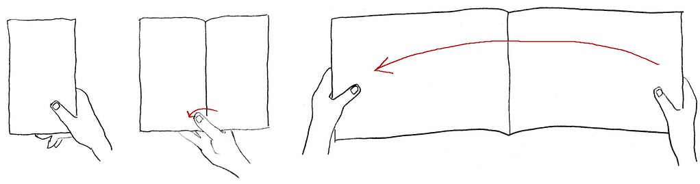
The Luc-trick allows you to transfer a copied image to another surface. In the process of photocopying (xerographic image transfer) the reflected light of the original renders a light-sensitive „master“ partially statically charged. On these areas the powder (toner) is attracted and then transferred onto a sheet of paper. This sheet runs through a heating element which melts the powder together into a waterproof plastic layer.
 Now the Luc-trick. Take a good copy. Preferably use a copier with precisely controllable light/dark adjustment. Use waterproof tape or adhesive plastic. The so-called “invisible” tape is perfect in every respect. Rub the tape firmly, turn the assembly over and make the paper wet, for example with coffee or spit. Rub with a folding bone across the paper so that it gets soaked more quickly. When the paper is wet enough, you can see the image shine through the paper. Now carefully remove the paper in its entirety or rolling. Related to the grain of the paper you should rub in two directions. There may remain a few fibers on the toner. The image (even very small print) is now neatly transferred onto the tape. Dry the tape (hair dryer) so it becomes sticky again and you can see if there is too much paper left on the piece that you need. You can now retouch the image if necessary.
Schæffer ink has about the same color as the toner or you can scrape off some with a knife. The image now seems relatively transparent, but when you paste it again it will mask quite well. Now you can stick the tape with the image on almost any surface. Very useful for sketching on packaging, when using colored and heavy paper and so on. For matte surfaces use matte tape, naturally; Cellux does not work, Scotch I does, II doesn’t. For glossy surfaces use Cristal Clear.
Color overlay with the Luc-trick
Take a photograph or other images, the more graphic the better e.g. with a coarse, magnified grain. Make a copy of it in one color. Luc-trick it and finish your overlay. Large areas covered with toner, for example white on black text, might leave too little free adhesive tape to paste it up well. A little spray adhesive provides a solution.
Forming an image
An additional, free invention is that the Luc-trick-ed tape is quite malleable at higher temperatures with a little skillfulness. Use fire, heater, iron or hair dryer. You can create nice image variations that are barely conceivable with computers even.
Modifying letters with the Luc-trick
Lay a grid over the letters to control the degree of distortion. Paste adhesive plastic strips on a good copy and remove the paper (Luc-trick). Now glue a strip of letters to a short comb (?) onto a solid and lined surface. Then with a hot hair dryer warming the tape, extend and affix it further. A piece of cardboard will prevent the pasted areas from getting loose again. If you want to italicize, use a diagonal grid for pasting. Make a copy of your work and adjust it, or repeat the trick.
De Luc-truc – een nieuwe schetstechniek voor iedereen
De Luc-truc maakt het mogelijk een gekopieerd beeld naar een andere ondergrond over te brengen. Bij fotokopieren (xerografische beeldoverdracht) maakt het van het origineel teruggekaatste licht een lichtgevoelige ‘master’ plaatselijk statisch geladen. Op die plaatsen trekt de master het poeder (toner) aan en zet dat vervolgens op een vel papier over. Dit vel gaat door een verhittingselement waar het poeder samensmelt tot een plastic watervast laagje.
Nu de Luc-truc. Neem een goede kopie. Gebruik bij voorkeur een kopieerapparaat met nauwkeurig regelbare licht/donkerafstelling. Gebruik watervast plakband of plakplastic. Het zogenaamde ‘onzichtbare’ plakband is in alle opzichte ideaal. Wrijf de tape stevig aan, draai het geheel om en maak het papier nat met bijvoorbeeld koffie of spuug. Wrijf met een vouwbeen over het papier, dan raakt het vlugger doorweekt. Als het papier nat genoeg is zie je het beeld door het papier heen schijnen. Verwijder nu het papier, voorzichtig in z’n geheel of rollend. In verband met de looprichting van het papier moet je in twee richtingen wrijven. Er mogen wel een paar vezeltjes aan de toner blijven zitten. Het beeld (zelfs hele kleine lettertjes) blijft nu netjes op de tape achter. Even drogen (föhn), dan wordt de lijmlaag weer klevend en zie je of er nog teveel papier is achtergebleven op het stukje dat je nodig hebt. Je kan als dat nodig is het beeld nu retoucheren.
Schæffer inkt heeft ongeveer dezelfde kleur als de toner en met een mesje kun je nog wat weg schrappen. Het beeld lijkt nu vrij transparant, maar als je het weer opplakt dekt het goed. Nu kan je de tape met beeld op bijna elke gewenste ondergrond plakken. Erg handig bij het schetsen op verpakkingen, bij het gebruik van gekleurde en zware papiersoorten, enzovoorts. Voor matte ondergronden gebruik je natuurlijk matte tape; cellux werkt niet, scotch I wel, II niet. Voor glanzende oppervlakten gebruik je cristal clear.
Een kleuroverlay met de Luc-truc
Neem een foto of ander beeldmateriaal. Hoe grafischer hoe beter, bij voorbeeld een uitvergrote grove korrel. Maak hiervan een kleurenkopie in een kleur. Luc-trucen en klaar is je overlay. Bij grote tonervlakken, zoals diapositieve tekst, blijft er misschien te weinig vrij plakband over om het nog goed te laten plakken. Een beetje spuitlijm biedt dan uitkomst.
Vervormen van een beeld
Een extra, gratis uitvinding is dat het ge-Luc-tructe plakband bij hogere temperaturen met een beetje handigheid flink vervormbaar is. Gebruik hiervoor vuur, verwarming, strijkbout of föhn. Je kunt leuke beeldvariaties maken die zelfs met een computer nauwelijks denkbaar zijn.
Het modificeren van letters met de Luc-truc
Zet, om de mate van vervorming te kunnen beheersen, over de letters een grid. Plak vervolgens op een mooie kopie hiervan stroken plakplastic en verwijder het papier (Luc-truc). Plak nu een strook met letters aan een korte kam vast op een stevige gelinieerde ondergrond. Dan met een hete föhn erbij al uittrekkende het plastic verder opplakken. Een stukje karton zorgt ervoor dat het opgeplakte gedeelte door de hete lucht niet weer loslaat. Als je wilt cursiveren plaats je het grid schuin, in de rekrichting. Maak een kopietje van je plaksel en werk het bij, of herhaal de truc.
Dutch text by Lucas de Groot. Translation into English by Indra Kupferschmid (please excuse any clumsiness)
From: Letters] & techniek, Werkgroep letters], KABK 1990, p. 43–45
I love this quote by John Hudson which just popped up in a discussion about type classifications:
Tinkering with the wheel alignment of a car that might turn out not to have an engine seems pointless, especially if you haven’t even decided where it is to which you wish to drive.
This actually fits all design processes. No, life in general.
I’m trying to help with type questions as much as time allows me – via email, on typophile or elsewhere. So why not share some on here too?
“When licensing fonts do you usually buy a whole family, or just select weights? I’m thinking especially in the case of some ••• supermegadeluxx families, I just can never afford to buy the whole family, yet normally my preference is to, thus I don’t buy those huge families but smaller ones.”
I hardly ever get whole families. First because of price, yes, but also because I never need so many styles. Sometimes so vast a choice rather confuses me than helps selecting fonts. It’s also kind of a great exercise for typographers to try get by with as few styles as possible, at least that’s what I love to challenge me with. In the case of ••• it’s also super customer friendly because you get reduction in price per total number of fonts in a purchase, regardless from which family (see my blog post from last Dezember for details). So the price of a single font drops from 40 to 30 $ pretty fast.
Start with a number you can afford, carefully pick styles and see how far you get with those. You can always come back and buy additional fonts later. Also, there are so many ways to emphasize or distinguish in typography apart from changing the weight or style, plus you can combine fonts too of course. So my advice is: get some 2–4 styles of a timeless workhorse (e.g. Miller, Starling, Amplitude, Benton, Titling, Salvo) and add some spice with an occasional display style or wacky font.
So one of the results of my two days web-interlude with the genius Florian Hardwig is a site that looks more basic every day. Not that this wordpress-theme got any simpler or managable, the only thing I’m capable of is removing stuff it seems.
Although I’m not happy with the general design and admin, I feel a great pull to revisit persitantly. To look at IbisRE, my wonderful loan from Webtype. This will continue for at least 29 more days. After that I’ll have to make do with visiting FontBureau’s website every now and then, which uses Ibis for all body copy (apart from the news section) since recently, too. Anymore sites you know of? Send them my way (or, even better, donate an obolus for the annual webtype fee so Ibis and me don’t have to part in the first place).
Tja, der Beitrag liegt immer noch hier rum. Und ich hätte auch gerne noch ein paar Dinge anmerken wollen zu Einkaufswagenerlebnissen, Schriftmustern, Testworten, Rechnungsstellung und Auslieferung. Aber gerade zum Thema Distribution habe ich mich neulich auf Twitter wohl etwas zu weit aus dem Fenster gelehnt, so dass ich von einigen Seiten was auf die Backe bekam.
Apropos Backe: irgendwie habe ich im Moment kein rechtes Händchen fürs Schreiben über Schriftdinge, zumindest nicht auf Englisch. Das führte letztens immer nur zu Missverständnissen. Vielleicht hat es auch etwas mit grundlegenden kulturellen Unterschieden in Diskursdingen zu tun. Jedenfalls scheint mir Deutsch gerade bisschen weniger Minenfeld.
In case someone actually still wants to buy fonts this year I better hurry up with my report. Alright, what more did I buy?
.
Okay Type:
They (Jackson and his cat) have some really super fonts in the making, but only Alright Sans is ready for licensing yet. I had kept track of this interesting amalgam of a sans for quite some time already as it gets mentioned almost every day on typophile. Not purely humanist in style and proportions it combines open forms with the regularities of a classic grotesque and daring slanted a’s and g’s as alts in the italic. Makes me think of good ol’ Syntax and the Ideal Italic again.
Due to my (meanwhile) mission to get as many different families as possible, I just boughts five single weights at MyFonts because one can only get the whole family on Okay Type’s website. (Why?)
Exljbris:
Now while I was there I did what probably everybody does at MyFonts from time to time—getting a couple of free fonts. Not many of them are suitable for professional design work, but in my opinion the typefaces by Jos Buivenga are. I got some complementary styles to the free version of Calluna, a versatile text face (and since Christmas joined by a sans to become a super-family) plus the flamboyant conceptional experiment that is Geotica—a high-contrast Didone only built up of geometric elements. The different fills, swashes and ornaments make it an exciting display venture.
.
The Asset:
All those typefaces hopefully complement the ones I got earlier this year:
Eames Century Gothic* Modern: I just had to order immediately, it simply is the impersonation of Erik van Blokland. One can dive deep into the individual shapes for days, the display styles make instant logos (beware, not allowed in basic license), the ornaments and numeral fonts are a playful plus. So enjoyable.
Hard to avoid the typefoundry Bold Monday this year, especially Nitty, which is surprisingly comfortable to type text in and Panno by Pieter van Rosmalen. I started out with the friendly priced sampler and got the full family of Paul van der Laan’s humanist sans Flex later.
Half way through my shopping spree Commercial Type, or rather Christian Schwartz announced the release of Neue Haas Grotesk to be near. Halleluja! Ever since working on the Helvetica Forever project I wished for that to happen. (We actually wanted to type-set the book in this newly digitized version back in 2007, but somehow either it wasn’t ready by that time or they didn’t manage to sort out the legal issues, so we ended up with Neue Helvetica.) I have no idea whether I’d ever use neue Neue Haas Grotesk, it’s just so tempting to get and be it only to show the world how Helvetica was meant to look like. But—maybe later.
Because all of a sudden the tide was turning: the notice of some unexpected debits abrupty shrunk my font-budget by almost 50% (now ~1500 €). But there was still so much left in my FontShop, A2 and MyFonts Carts :/
So these, among others, are typefaces I unfortunately had to skip (I should make a shortlist of nearly-bought fonts at some point):
Freight Micro, Text and Display I’m in love with this extensive super family by Joshua Darden/Garage Fonts for quite some time now. Especially the Micro (Italic) styles have great display qualities, too, although originally designed for extra small text.
Hercules, a quirky Modern/Scotch by František Štorm and also his
Farao, a playful take on the Clarendon genre. I like most of his typefaces although you realise some similarities after a while (the a’s e.g. are typical), but that is the case with other great type designers, too, like Gerard Unger or Fred Smeijers (his g’s and ß’s).
Lavigne got postponed as well, a dulcet text face by Ramiro Espinoza with great ampersand and complementing display styles for even more lavish demeanor.
Relato by Eduardo Manso attracted me with its distinct cursive. The rather low-contrast makes it a designated book face suitable for long-distance reading.
Iowan Old Style by John Downer, a calm, no-fuss text typeface, quite atypical for him actually.
Grot 10 from newly formed foundry A2. I especially like the true italics, which are still rather unusual for an “old-style” grotesque. There have been a lot of these kind of revivals popping up lately, like Plan by Typotheque, Fakt from Ourtype, Embarcadero by Mark van Bronkhorst or the recently expanded Founders Grotesque from Klim, to mention a few. Type expert Stephen Coles even names 2010 the year of the Helvetica replacements.
On that note, let me put you off until the third and final installment with some more shopping-occurrences, my final receipt and conclusion.
Last week I found myself faced with the rare and luxurious task to spend quite some money, quickly, and on something typography related.
I guess I’m not alone with this end-of-year-business-expence problem, so instead of a list with cool things in type 2010 I want to share my shopping experiences here.
As kind of a warm-up I ordered a couple of books and studio-material — easy — followed by some software, but I figured investing in fonts would be a lot less age sensitive and a more sustainable way to spend the remaining rest of this non-recurring source of capital. But what to pick?
I have a good overview and dialog with German and neighbouring European foundries, the classic Adobe Font Folio and ancient URW collection but what was kind of missing were the more independent anglo-american contributions of the past years.
so
So I started my stroll — at Font Bureau. I love them for their varied collection of part vernacular, part sophisticated typefaces, a lot with display styles available, and webfonts of course (but better avoid the “wacky” section).
My cart filled quickly, felt a bit like the old game »Ich packe meinen Koffer und nehme mit …«:
Amplitude: Because I fell in love with the triangular opening at the base of the a. A big fat wide compressed family presumably suitable for almost everything. Not too gruff, yet not too friendly (I got a bit tired of all those numerous humanist sans recently).
Farnham Text + Display: The a again, it won me over ever since I first saw it. I’m into baroque, Baskerville-ish typefaces for quite a while now and Farnham is a very amicable interpretation of the theme. I buy my daily Frankfurter Rundschau just because of this.
Giza: Yeah! Who can resist Nine Five? Now to find the right occasion to use and not only look at it.
Ibis Text + Display: “Very small and very big” are probably the best applications for Ibis. It resembles the feel of Zapf’s Melior and other squarish, almost-slab-seriffed 1950s typefaces I like a lot. Didn’t use it up to now, but Ibis does an amazing job as a webfont, especially on windows. Bold italic!
Meno: An irresistable cursive, like a bacchanal exaggeration of Galliard. Probably tricky to typeset but I definitely want to take the challenge and spend some time with her one day.
Miller Text + Display: Hard to go wrong with Miller, one of my all-time favourites. A versatile workhorse for tons of text with crispy, sexy display styles. Yum!
Prensa: As an admirer of Dwiggins one simply has to love Prensa (and Delicato and Enigma). Edgy, hardheaded, yet very legible and with great display qualities, too. Once again: bold italic!
Skilt Gothic: A better replica, derived from 1920s Danish signage lettering, this new release is a good alternative to DIN or when you want to say “industrial and undesigned”. Cool g and y, both one- and two-storey a’s and lots of other OT goodies (yeah, still rare but finally pro/premium OpenType arrived at Font Bureau, too).
Titling Gothic: Incredible, huge Grotesque families are FB’s specialty, so choosing a sans and picking styles from their ample palette was extra hard. I went for Titling Gothic because it somehow stands in the middle between the eccentric Bureau Grot and the more sane Benton Sans and Franklin. I would have liked Boomer Sans, too, but that sounded difficult to license.
Trilby: Well, what to do with Trilby, posters probably. It’s just so damn cool.
Whitman: I have to admit, it’s not my favourite but it seemed an expedient investment. Maybe it’s the a (again, they are my acid test), or that it is so perfectly balanced, but Whitman is a good alternative for Joanna, often described as a difficult diva. Or Scala.
Zocalo Text + Display: It definitely is the a! Freakish italics, cantilevered serifs in the caps, very readable in text, quirky at display sizes, simply a joy to look at.
so
I didn’t select all those typefaces at once. But after putting like 10 fonts in the cart I noticed a significant drop in price, even though I didn’t get the full families but only individual weights. From 40$ in the beginning the price per font decreased to 35, 30 and finally 25$ only. That’s awesome! And dangerous.
From then on I was lost. I forced myself to take a break, shopped at some other manufacturers and wholesalers and decided to fill my parked FB-cart with as many fonts as possible at the end of my trip.
so
Stop 2: Hoefler & Frere-Jones
They make very good, downright perfect typefaces, no doubt. I like them, really. But somehow everybody loves HFJ and regard them as the authority in quality fonts — it doesn’t make me want to use their typefaces so much anymore. Everybody else is using them already.
so
Stop 3: Process Type
Right on time the nasty* guys at Process Type announced a 25%-off christmas sale. Not easy to keep me from buying something with a wallet so loosely in my pocket. I got Locator, a versatile, uncluttered Sans with cool Q, J and l (a bit like in Neuzeit) and freaky Maple because I couldn’t resist the g and e, r and a are so cheerful in bigger sizes.
so
Intermezzo:
As mentioned earlier I mainly roamed through the collection of the smaller independent foundries and I have to admit “evil”* MyFonts came in really handy during my expedition. I’d rather spend my money directly on the foundry’s site but it can get quite tedious to look up all of them individually, creating an account, providing payment info etc. So I lazily filled my cart at this central market place. Besides MyFonts’ search, mark, save, rate, tag and easy-use test-facilities are just super practical (plus some foundries don’t even sell their fonts on their sites).
While browsing some “new-and-noteables” I went astray and came across an ancient all-time-favourite of mine — and simply melted away confronted with its light italic: Bitstream’s Schadow by Georg Trump, one of my favourite designers anyway. Look at the g!
so
End of day 1. To be continued with some okay type, more hands-on shopping experiences, my in- and out-takes, reciept and conclusion.
so
Typography can look like lettering (Liza Pro, fancy OpenType fonts) but it’s not the same. It can even look like writing (formal scripts or handwriting fonts like FF Mister K), where the major parts of the letter or whole words are formed out of one stroke. In the same way lettering can look like typography (rub-down letters, fine rendering) or writing and still has nothing to do with those techniques.
The key nature of typography is that it makes use of prefabricated glyphs which are set according to abstract parameters. If you send a setting instructions like the following to someone at the other end of the world, he will be able to reproduce the exact same column of text, typographically, but never with one of the other methods.
Typographic parameters are font, size, leading, alignment (justified or ragged), tracking, kerning, line length like for example in:
ITC Garamond light, 14/18 pt, flush left, no hyphenation, tracking 0, line length 140 mm, paragraphs indented by 1 em.