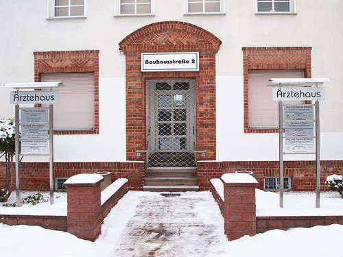
Bauhaus, but not in Bauhaus
Certainly Bauhaus and Avantgarde are the most common cases of LTypI (Lacking Typographic Imagination aka choosing a font because of its name for an application of that name).
It might disappoint you vastly but the initial Bauhaus manifest 1919 and most of their printed matter in early years were set in art-nouveau flavoured seriffed faces, in the case below Ohio by Schriftguss AG/Brüder Butter. Back then one had to content oneself with the fonts a printer had in stock.

Later the typefaces chosen better complied with the ideas of the New Typography:
a clear, modern, industrial atmosphere achieved with anonymously designed, rather dark Grotesque faces — stripped of all unneccessary decorative elements.
A font often used f.e. was Breite Halbfette Grotesk by Schelter & Giesecke, recently revived as FF Bau by Christian Schwartz. Others were Ideal-Grotesk and Venus, recycled in Monotype Grotesque.


above: Breite Halbfette Grotesk by Schelter & Gieseke ca. 1895
below: Venus by Bauer, 1907 and Ideal-Grotesk by Klinkhardt, 1908


But the typographic ideas of the Bauhaus, above all Herbert Bayer and Joost Schmidt, went further. The radical constructivist designs we now immediately connect with “Bauhaus” however were only carried out in drafts, drawings and lettering, never in a typeface.
Paul Renners Futura was clearly inspired by the concepts of the Bauhaus (see alternative letters) but came out not earlier than 1928. Then however it was accepted as the “type of our time”.

The typeface ITC Bauhaus is a design from 1975 by Ed Benguiat and Victor Caruso inspired by the ideas of Bayer, Schmidt et al, but it is not a revival of any Bauhaus design.
So, what typefaces should we choose to be more imaginative?
Typefaces like the ones used by the Bauhaus: for example
FF Bau, Venus, Monotype Grotesque, Basic Commercial, Gothic 726, ARS Region
Geometric, contructivist typefaces based on the design ideas of the Bauhaus:
Albers, Bayer Universal, Joost, Erbar, Futura, Dessau, Neuzeit, Nobel, Super and more Futura alternatives like Avenir, Faricy, Superla, Twentieth Century.
Also check out this Bauhaus-fontlist at FontShop.